How to create an Option Set manually
Last updated: April 28, 2026
While most merchants use option sets created automatically from a design or template, there are cases where creating an option set from scratch is the best way to go. This method is recommended for advanced users who want complete control over the personalization experience.
Why create an option set manually?
Manual creation gives you full flexibility to:
Build an option set without needing a design first
Reuse the same set across multiple products and designs
Create complex or conditional flows tailored to your product
Customize each option’s logic, style, and layout from the ground up
How to create an option set manually
- Open your Option Sets panel and Click + New Option Set
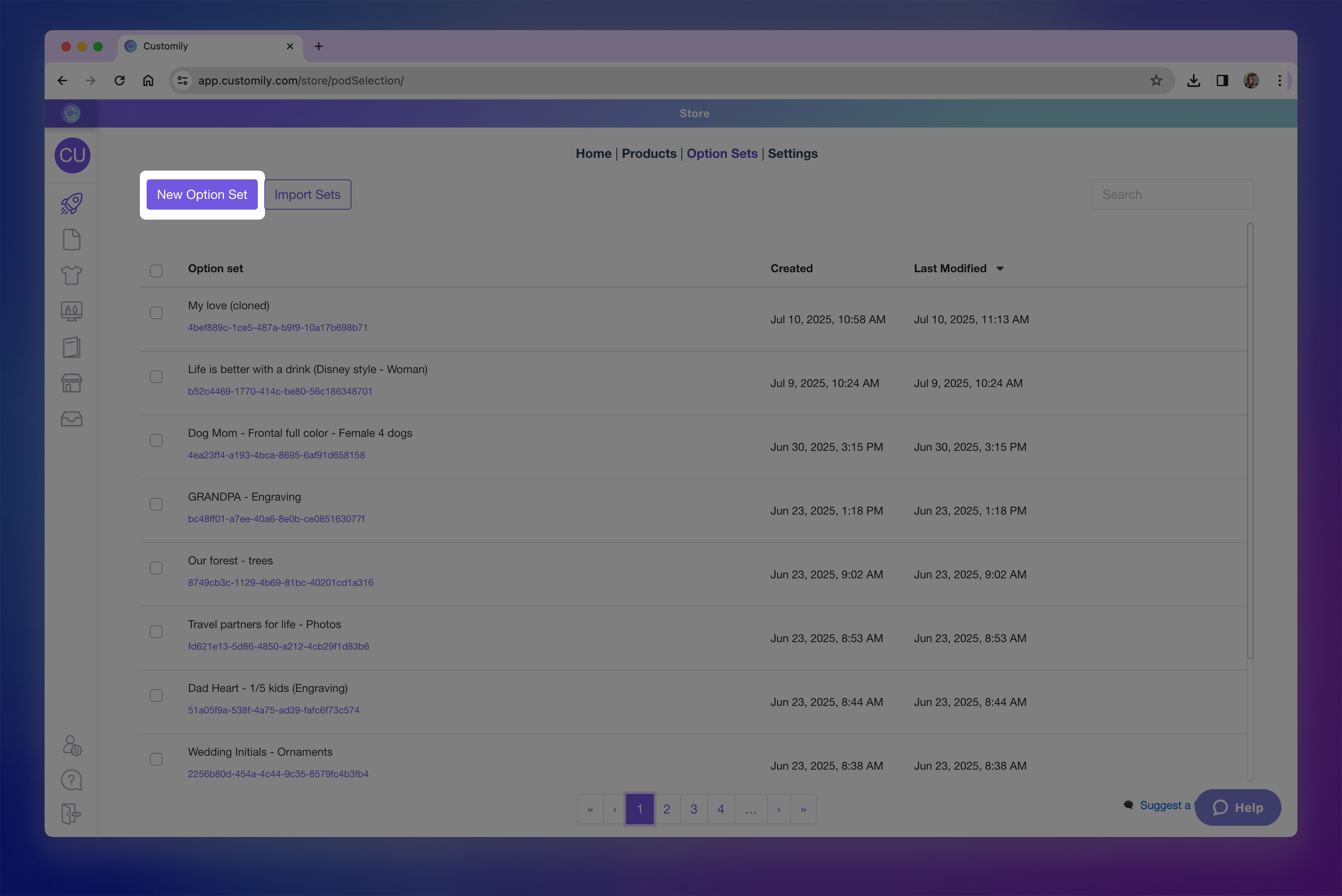
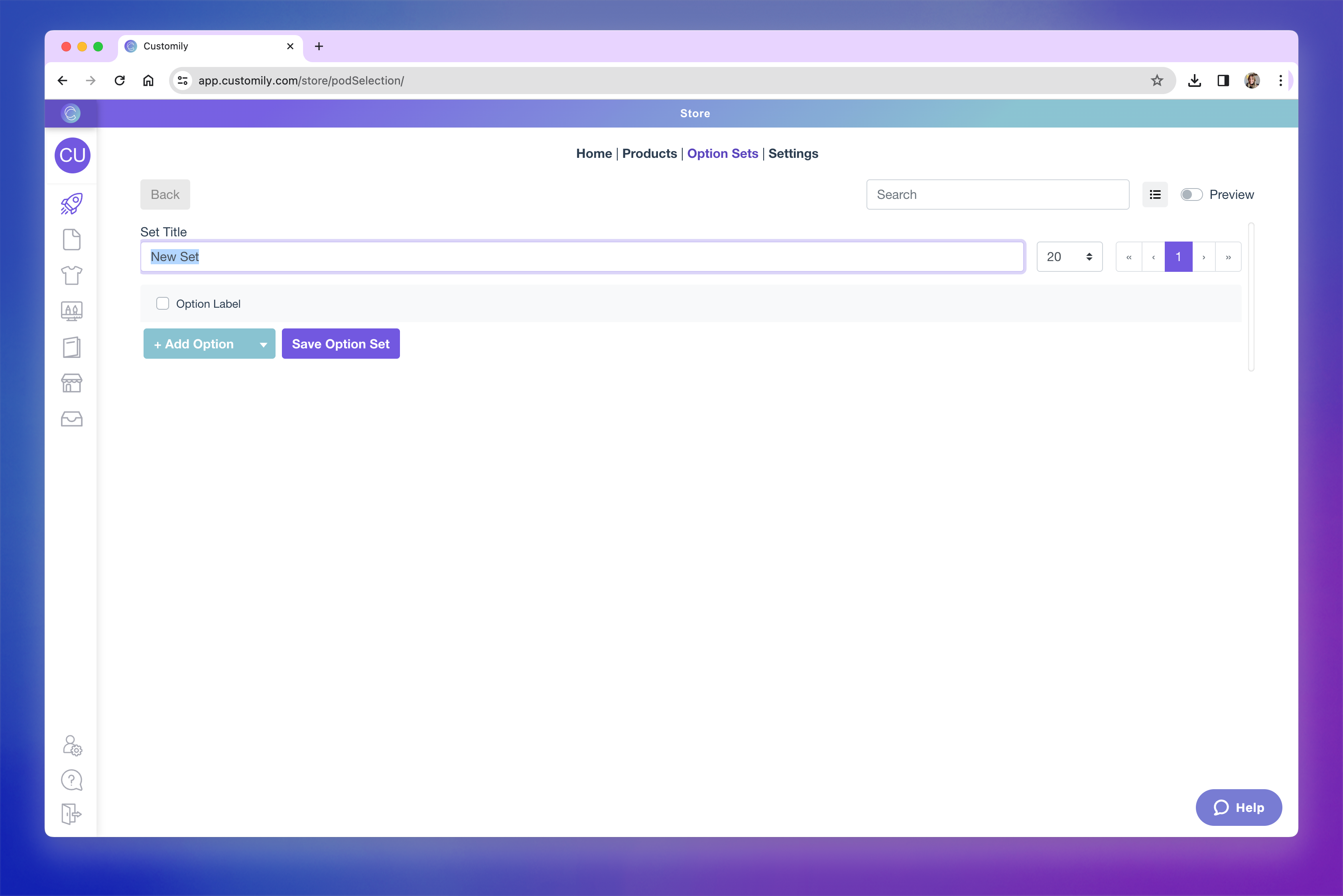
- Give the option set a name, this is visible only to you, not the shoppers.
-
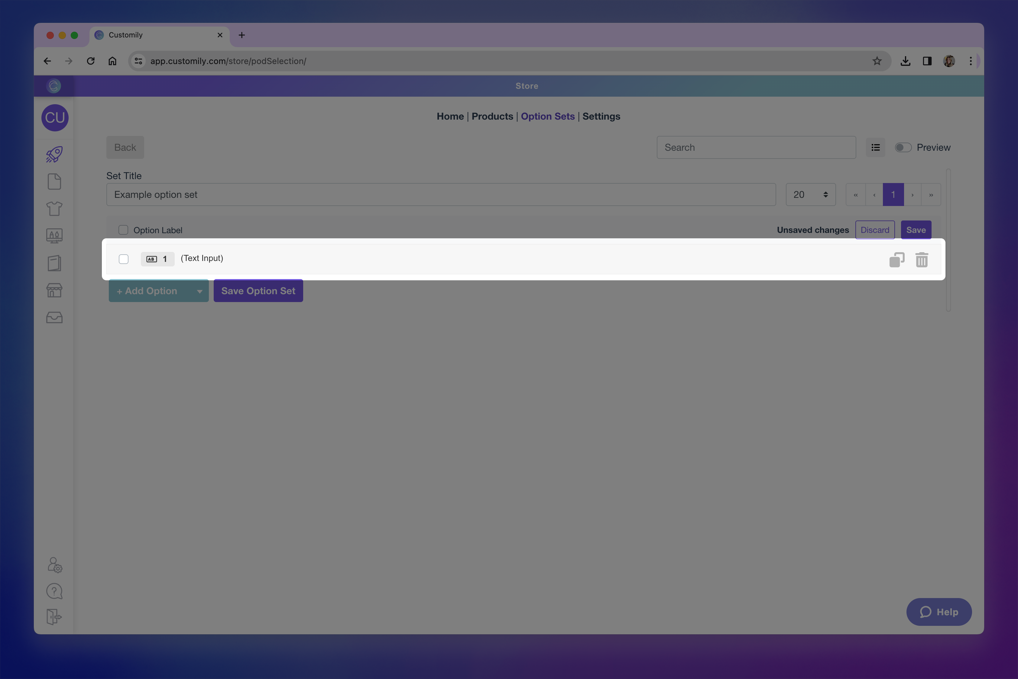
Add your option
Click +Add Option to add your first option manually.
If you click the toggle icon, you may also see options to Create from a template element or Import from another set — but for this walkthrough, we’ll focus on building manually.
- Click on the newly added option to expand it and access its settings. This is where you'll configure the behavior and appearance of the option.
-
Choose the type of option
By default, the option is set to a text input. You can change this to any other input type — such as dropdown, swatch, image upload, or date picker — using the Option type dropdown.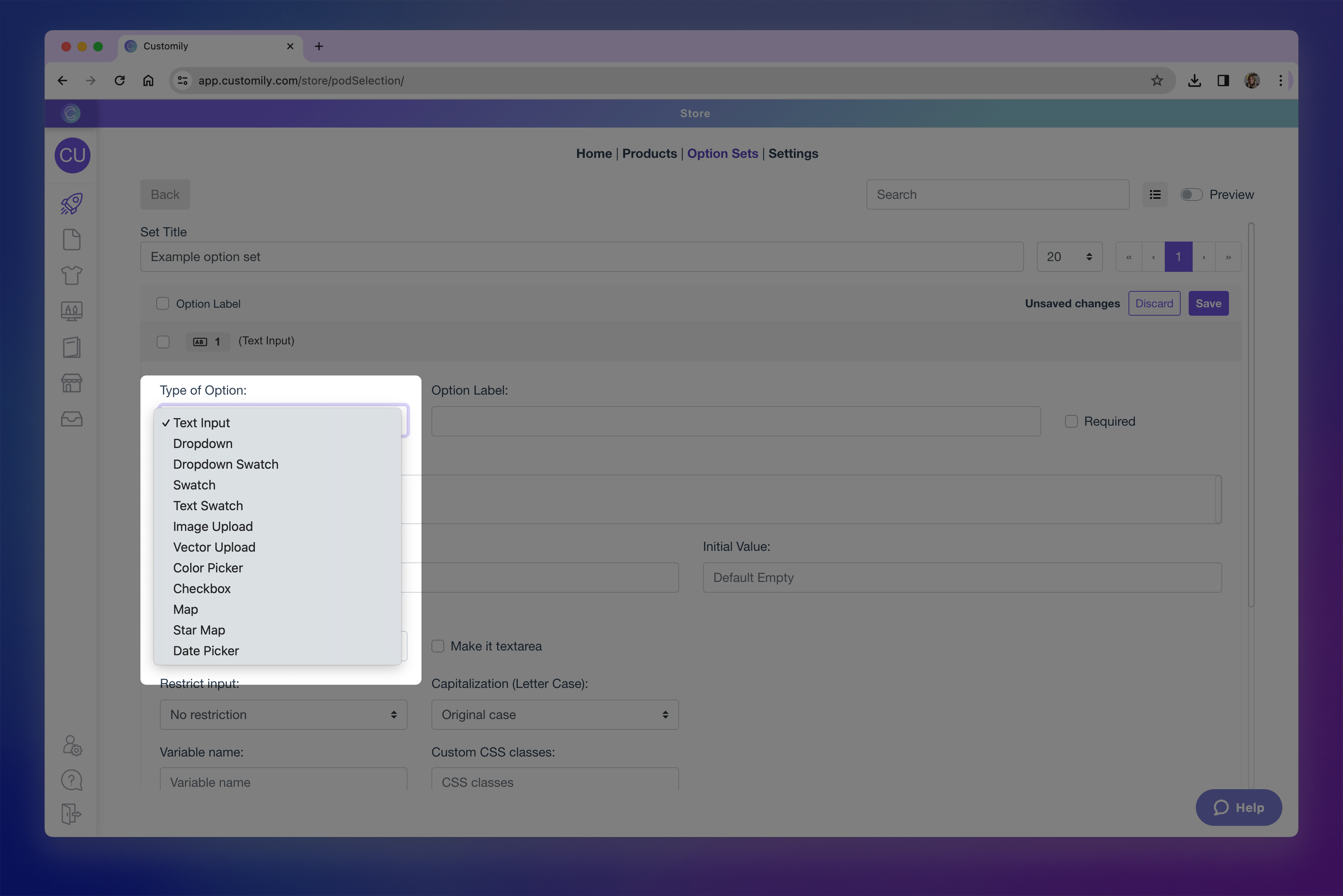
Here’s a quick overview of the available types:
→ Text inputs (single-line and multi-line): Let shoppers enter custom text, such as names or messages.
→ Dropdowns: Show a list of values for the shopper to choose from (like font options or styles).
→ Dropdown with swatch: Combines dropdown functionality with visual swatches for each value.
→ Swatches (colors, images): Display visual choices like colors or images as clickable options.
→ Text Swatches: Display text-based options as clickable buttons.
→ Image uploads: Let shoppers upload their own images to be added into your design.
→ Vector uploads: Allow uploading vector files when high-resolution artwork is needed.
→ Color picker: Gives shoppers a color selector to choose any custom color (instead of pre-set swatches).
→ Checkbox: Use for toggling on/off elements or including optional personalization.
→ Maps: Add a searchable location input that generates a stylized map in your design.
→ Star Maps: Add a searchable location and date input that generates a custom star constellation map.
→ Date Picker (calendar): Let shoppers select a specific date using a calendar widget.
→ QR Code: Let shoppers add a URL to automatically generate a QR code.Want to learn more about what each option type can do? Check the articles linked above to explore how to best configure each one.
Define the option label
This is the name that will appear to shoppers above the option on your storefront (e.g. “Enter your name” or “Choose a color”).
It’s also the name you’ll see listed in the option set panel, so it’s helpful to keep it clear and descriptive.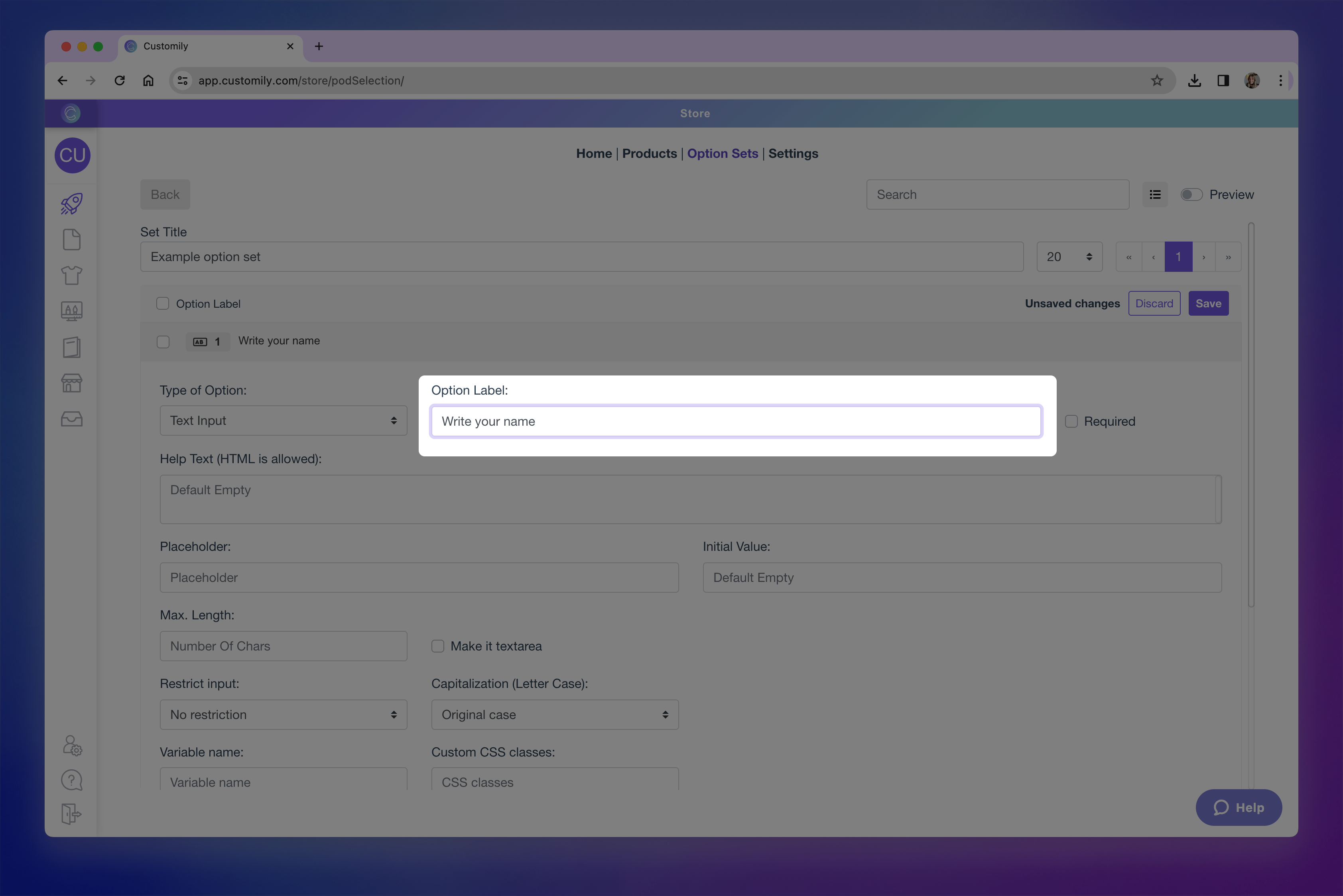
-
Format the option's settings
Each option type has its own formatting settings. For example, text inputs can have character limits or placeholder text, while swatches can be styled with custom thumbnails, color pickers, and more.Explore the linked articles in step 5 to learn what formatting options are available for each input type and how to configure them.
-
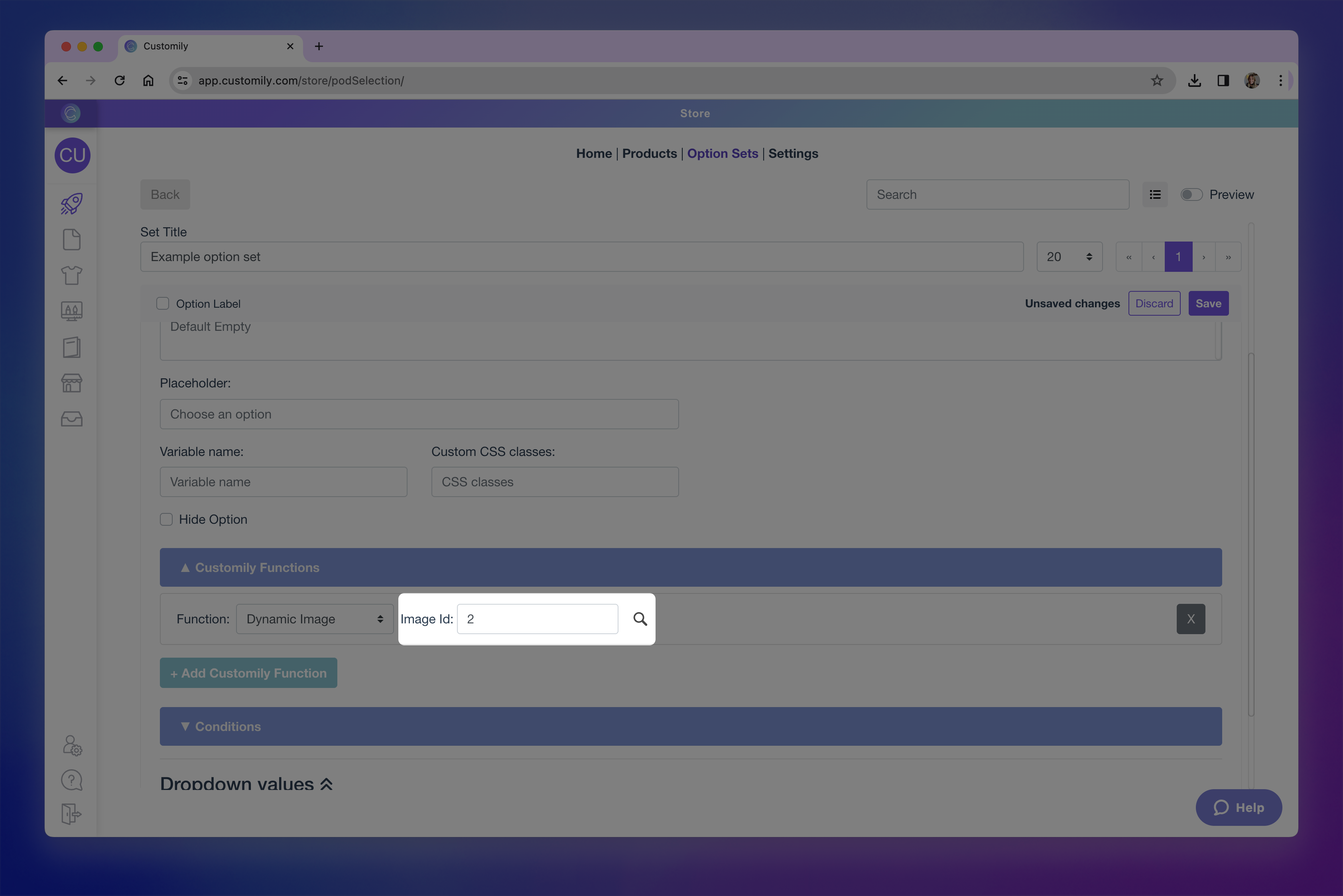
Assign the option's function
Functions define what the option actually controls in the design — this is what tells Customily what the option will change. For example like changing a text color, switching an image, or updating a map.When you create option sets automatically (through a design or template), these functions are applied for you. But when building a set manually, assigning a function is a key step.
Click the Functions tab inside the option to, and click +Add Customily Function to assign one.

Available functions vary depending on the type of option you are usingHere are some of the most common functions:
→ Text – Replaces the content of a text box.
→ Text color – Changes the color of a text element.
→ Font type – Changes the font style used.
→ Dynamic image – Switches between multiple images inside a dynamic image element.
→ Image upload – Applies shopper uploaded image into image placeholder.
→ Change template – Replaces the entire design template with another one.
→ Add Shopify product – Adds a Shopify product as part of the personalization (bundling).
Want to learn more about all available functions and how they work? Check Understand Functions in Option Sets for a full list of functions and how they interact with your options.
-
Link the Option to a Design Element
After selecting the function, you need to connect it to the specific element in your design it should control — this is done by assigning the Element ID.
You can:
→ Type the ID manually if you know it
→ Or click the Search Iconto browse your template and select the layer visually
If you skip this step, the option won’t affect anything — so double check that the correct element is linked.
-
Add Conditional Logic (Optional)
Use the Conditions tab to make this option appear only when certain values are selected in previous options. This is useful for creating dynamic, streamlined forms where shoppers only see what’s relevant to them. To set up a condition: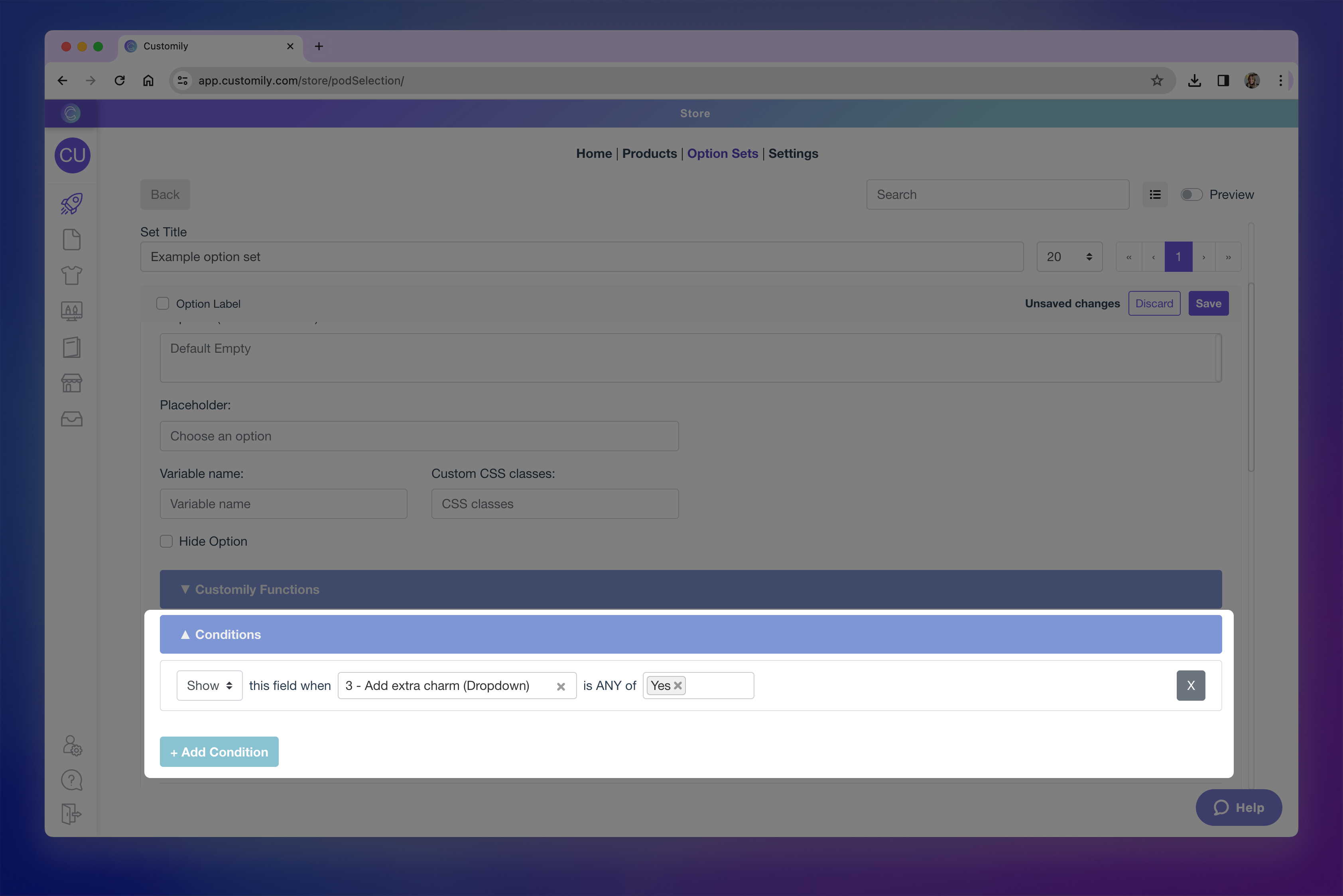
1. Expand the conditions tab and click + Add Condition
2. Choose wether to show or hide this option
3. Define the trigger option and value: "show/hide this field will when [option] is [value]"
Want to dive deeper into conditional logic? Check out Conditional Logic in Option Sets.
-
Add Values (for Select-Type Options)
If your option is a dropdown, swatch, text swatch, or dropdown with swatch, you’ll need to define its values — these are the choices shoppers will select from.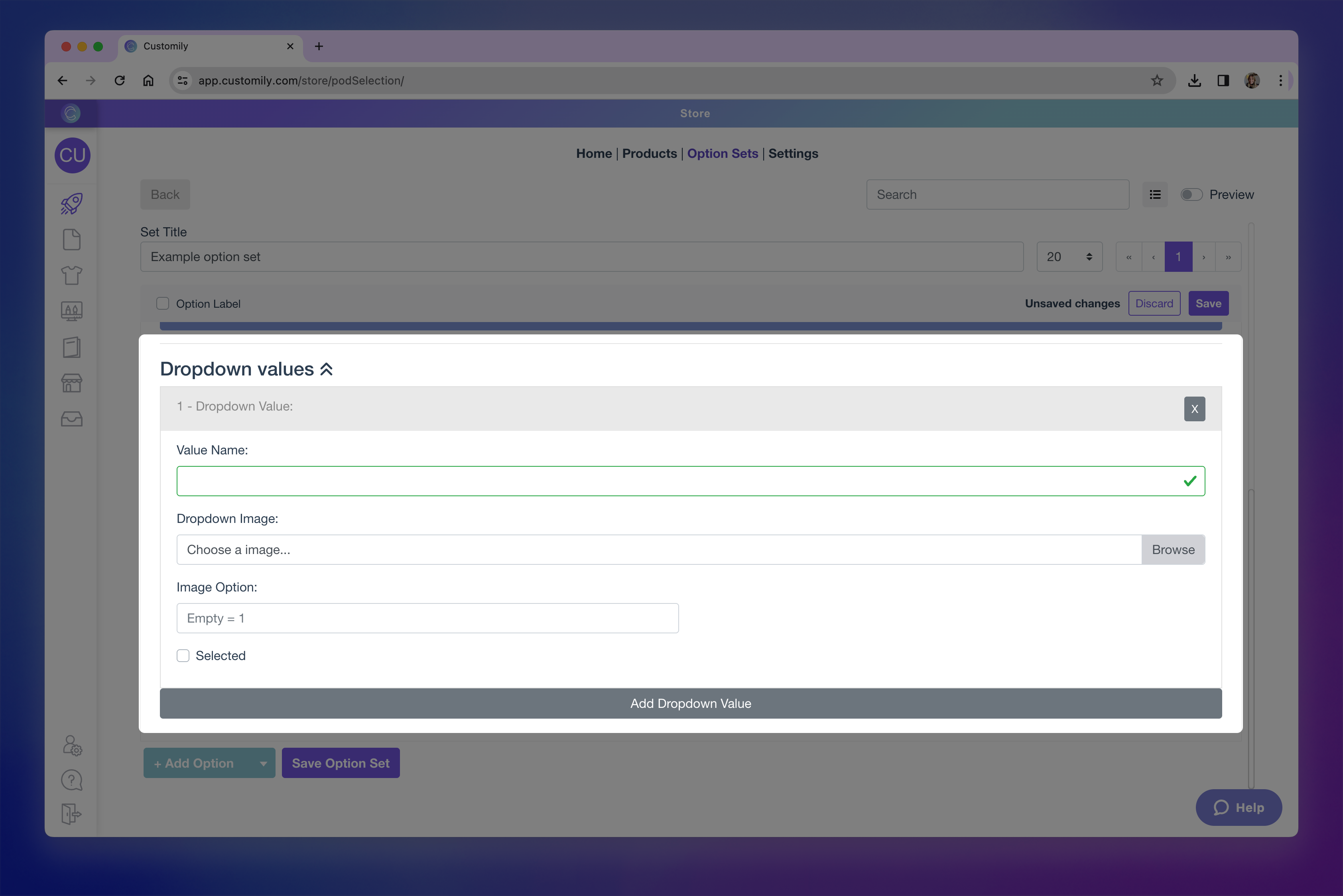
To add a value:1. Expand the values sections
2. Click Add value
3. Configure the value. For each value you can:
→ Set a value name (what the shopper sees)
→ Assign a color or image thumbnail (if using swatches)
→ Set one value as the default selection4. Link each value to a corresponding option from the element. If your design element includes predefined options (like a dynamic image or text with font options), you need to match each value you create to the correct option from that element.
For example, if your dynamic image has 5 clipart options, you'll have to add 5 values to your option set, and link each one to the matching option ID from the element.If you don’t assign options, Customily will automatically assign them as 1, 2, 3, etc. — but this may not match your actual element options and could result in incorrect personalization.
Pro Tip
When option sets or individual options are created automatically (from a design or template), this linking is done for you. But when building manually, don’t skip this step!
-
Repeat and Save
Once your first option is fully configured, you can continue adding more by clicking + Add Option.
Repeat the same process—choose the type, set the label, configure its settings, assign the function and element, apply conditions if needed, and add values if applicable.You can create as many options as your product needs!
When you're done, don’t forget to click Save Option Set to apply all your changes.