Text box
Last updated: April 29, 2026
Text boxes are places where customers can type their own custom text. The box sets the boundaries where text can be typed, and is represented on the canvas by a dashed line around the text. You can format texts in many ways to give customers further options.
How It Works
When you add a Text element to your design:
Shoppers will see a text input to type custom text.
As they type, their custom text appears live in the design preview.
You control the font, size, color, alignment, and styling.
If multiple font or color options are added, shoppers will see options to pick from them.
You can add a shadow and control its offset setting, angle, and color.
If Movable Text is enabled, shoppers can also reposition or resize the text within the area you define.
In this article:
To add a text box
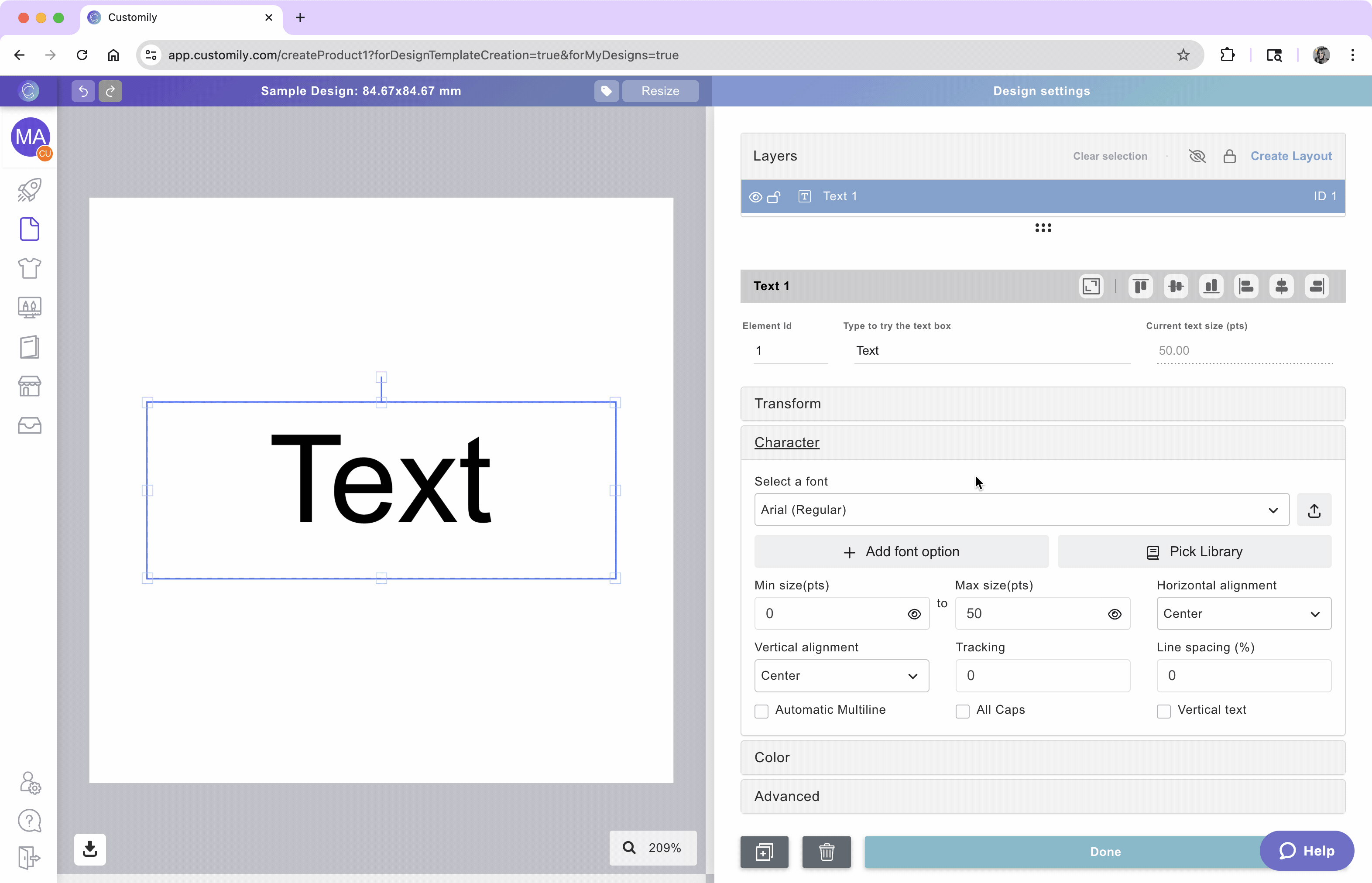
You can add text boxes on Designs and on Templates, by clicking the text box button.
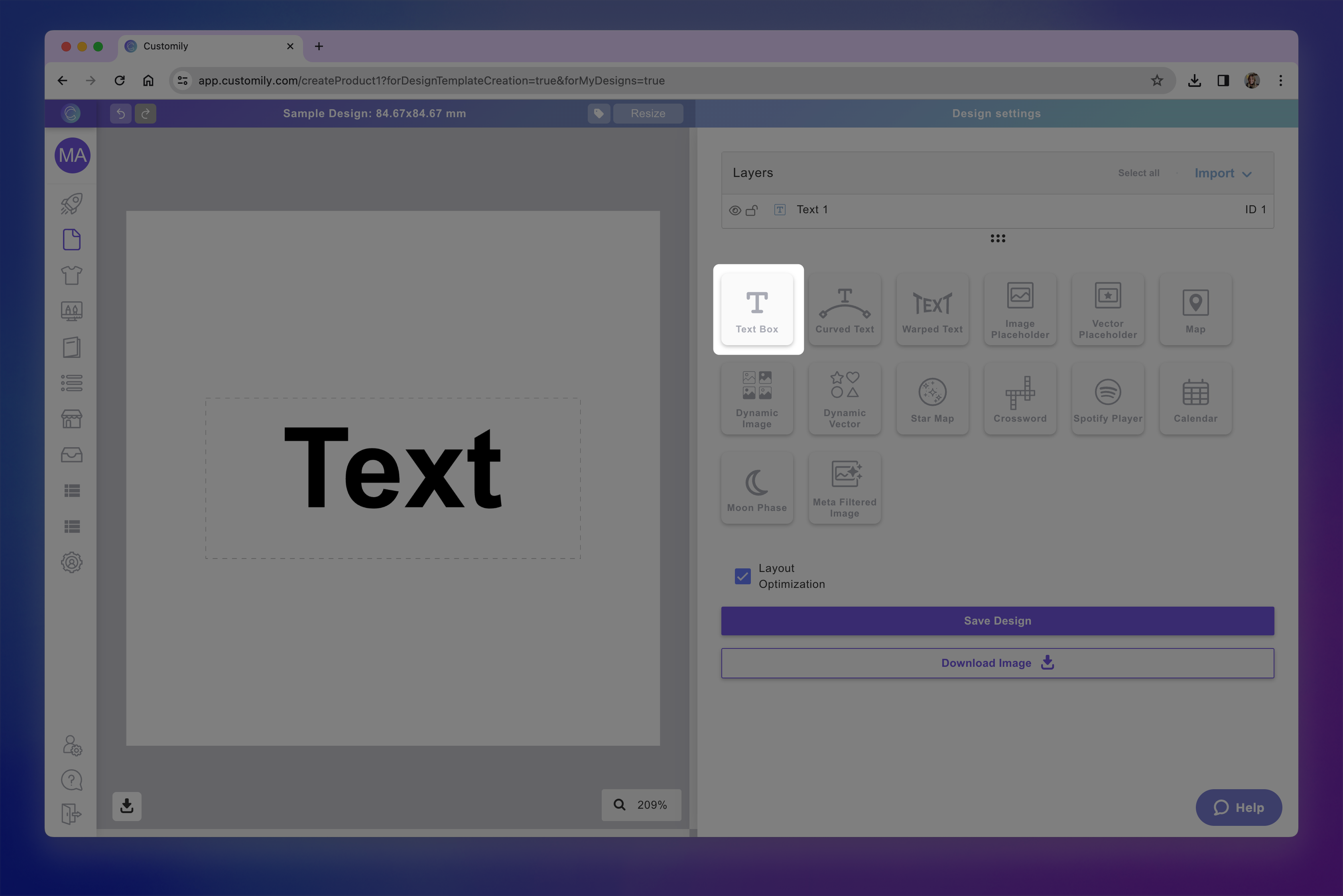
Each text box that you add will have a Name that you can edit, and a Unique Id for you to easily identify it.
How to move, resize and transform the text box
Directly on the canvas or by expanding the Transform toolbox, you can transform the text box:

How to style and format the text
After selecting the element, expand the Character toolbox to format the text inside the text box. Click on each item to learn more:

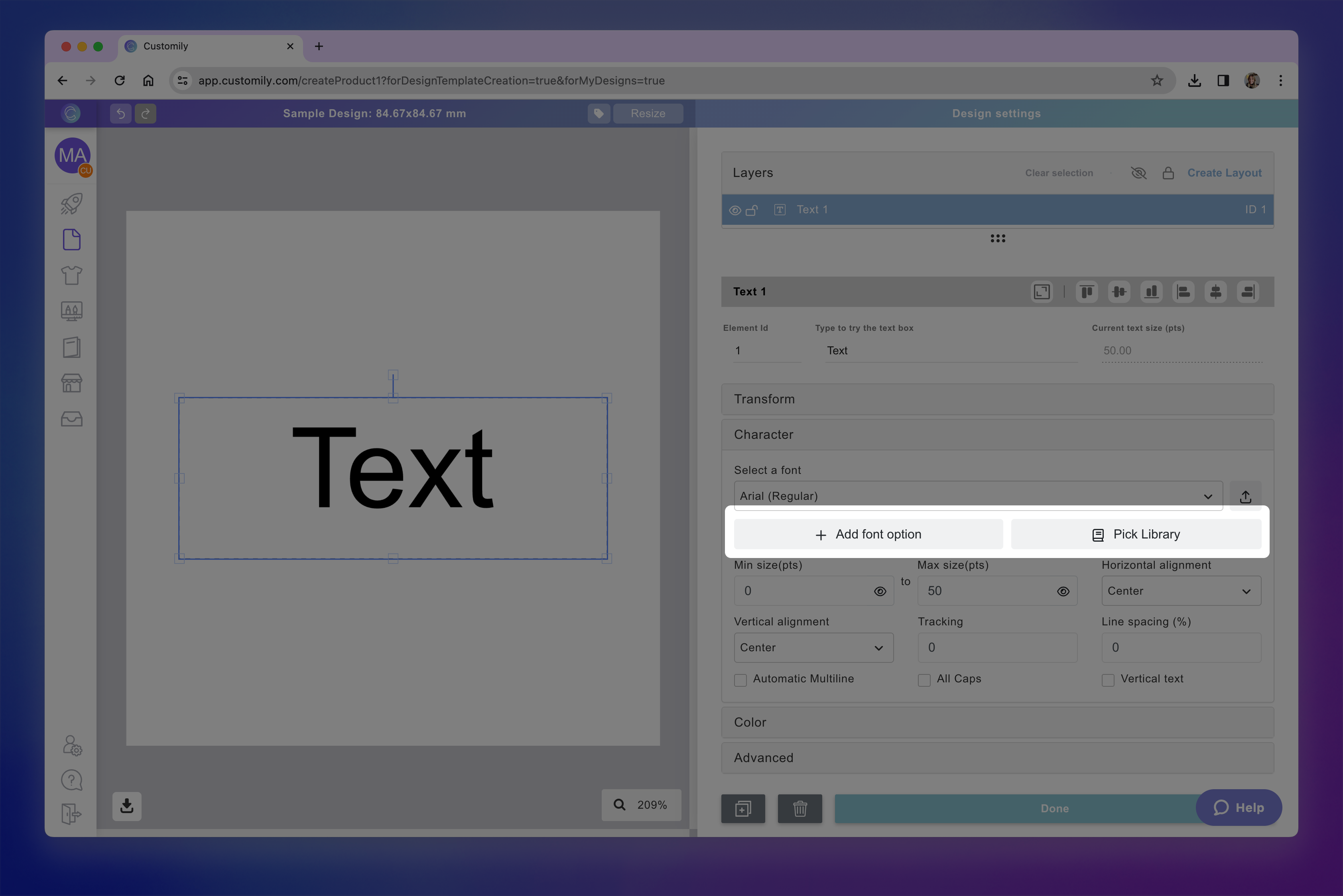
Font Option
You can apply one or multiple fonts to a text element.
Select the text element
Expand the Character toolbox
Click to expand the Select a Font list
Pick a font from the list
New accounts will just have a couple fonts available. You can easily add as many fonts as you want to your font list.
Learn how to add fonts into Customily here.
Tip
You can add multiple font options to a text element. To add more than one font option you can either use a font library or assign multiple font options by clicking + Add font option and choosing a new font.
Font Size
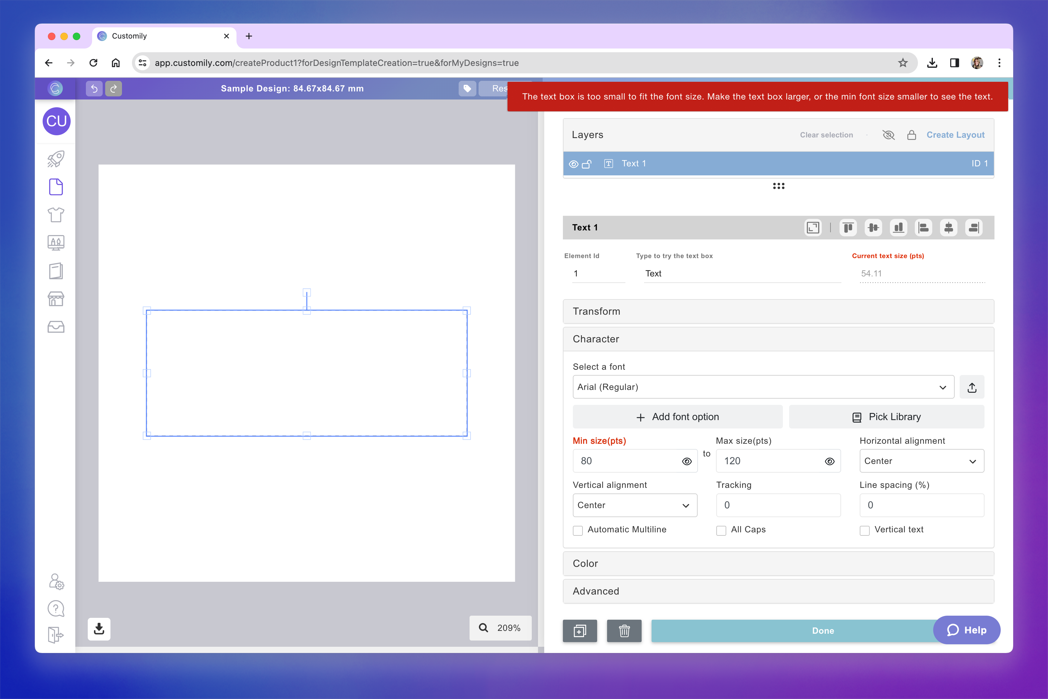
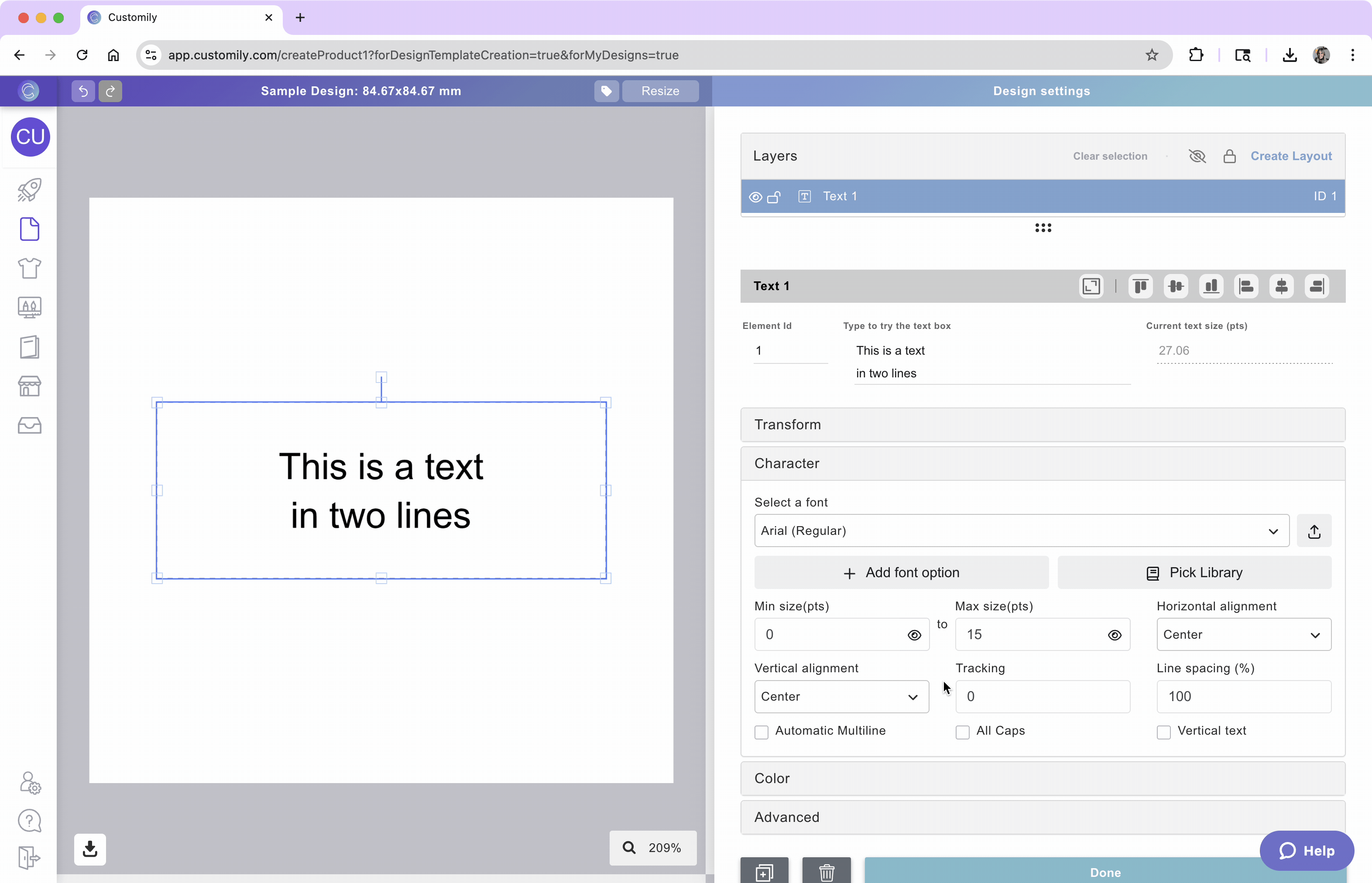
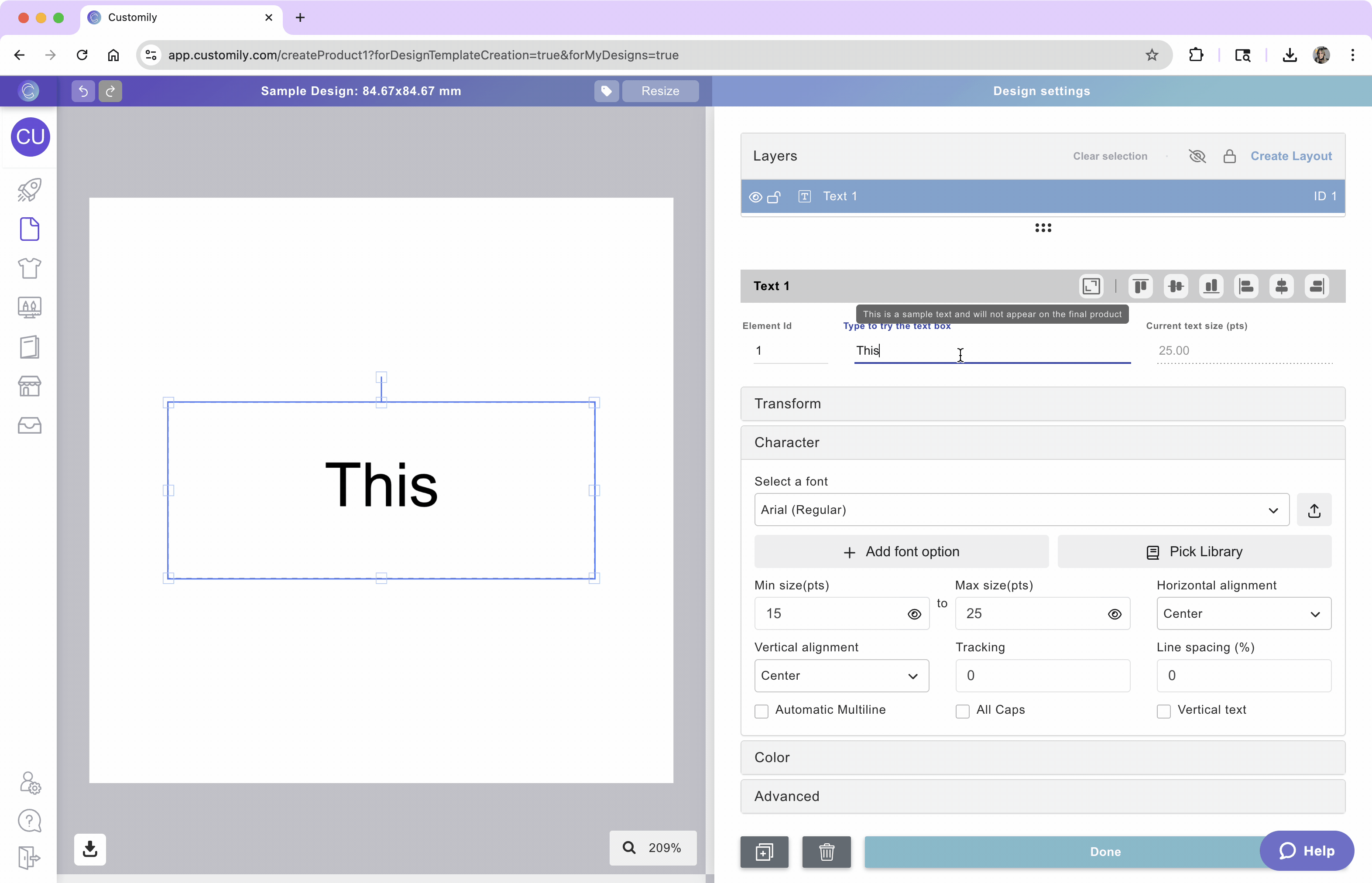
Text boxes in Customily have a font size range, meaning you can set a minimum and a maximum font size. This is to allow text to resize when customers type something super long (making the text smaller to fit more characters).

We recommend using the Max Size as the size that you want. The Min Size will be the limit of the resizing, to ensure that small texts still look good and are printable, leaving the value that comes by default is a great choice. If you don't want the text to be able to resize at all, you should use the same value on both.
Select the text element
Expand the Character toolbox
Type in the Max (and Min if desired) font size in points (pts)
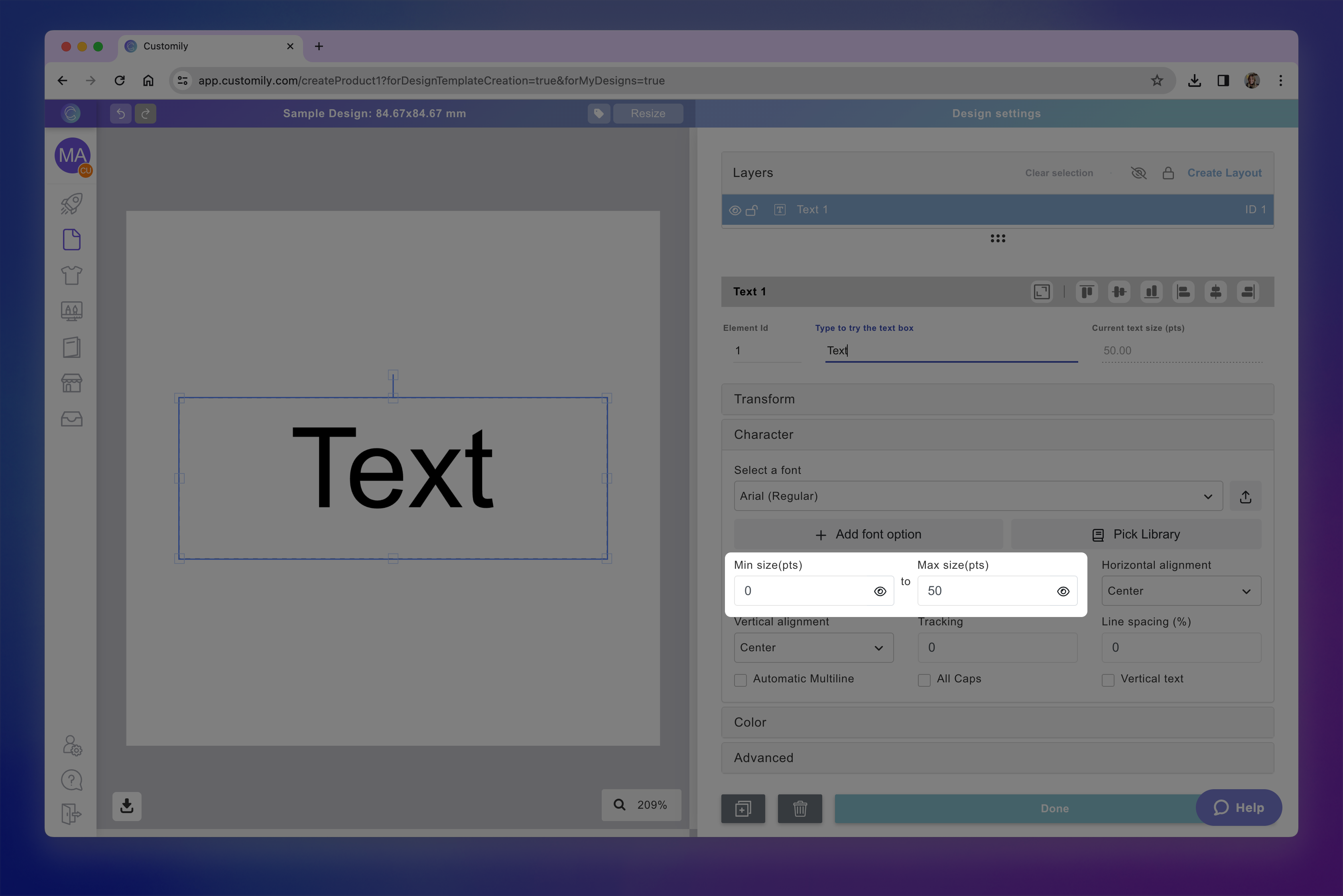
Tip
To preview how the Min or Max font size will look on your design you can click the 👁 next to them.
If the sizes you choose are too big for the text box, the size will paint red and you will see a warning letting you know that the font size should be smaller to fit within your text box boundaries.
Alignment
You can align a text inside the textbox horizontally and vertically.
Horizontally: Left, Center, Right, Justified
Vertically: Top, Center, Bottom
Select the text element
Expand the Character toolbox
Select from the dropdown the Horizontal Alignment and the Vertical Alignment.

Tracking and Line Spacing
You can adjust the tracking (character spacing) and/or leading (line spacing) of your text by inputting the values. Both tracking and leading are expressed in %.
Select the text element
Expand the Character toolbox
Type in a value you want for Tracking or Line Spacing.
Automatic Multiline
When a text box has enough height to fit multiple lines, it is multi-line by default. However, in order to jump to the next line, customers will have to hit Enter (return). If you want the text to jump to the next line automatically, then you should activate Automatic Multiline. This way, when the text hits the boundaries, a breakpoint will be added automatically.
So for long texts, they will automatically continue to the next line without the customer having to press the Enter key.
Select the text element
Expand the Character toolbox
Click the Automatic Multiline checkbox
Keep in mind
If you have a Min and Max font size setup, when reaching the boundaries the text will first resize until it reaches the Min font size. Then it will jump to the next line automatically.
All Caps
By checking All Caps, you'll force whatever text a customer types into capital letters.
Select the text element
Expand the Character toolbox
Click the All caps checkbox
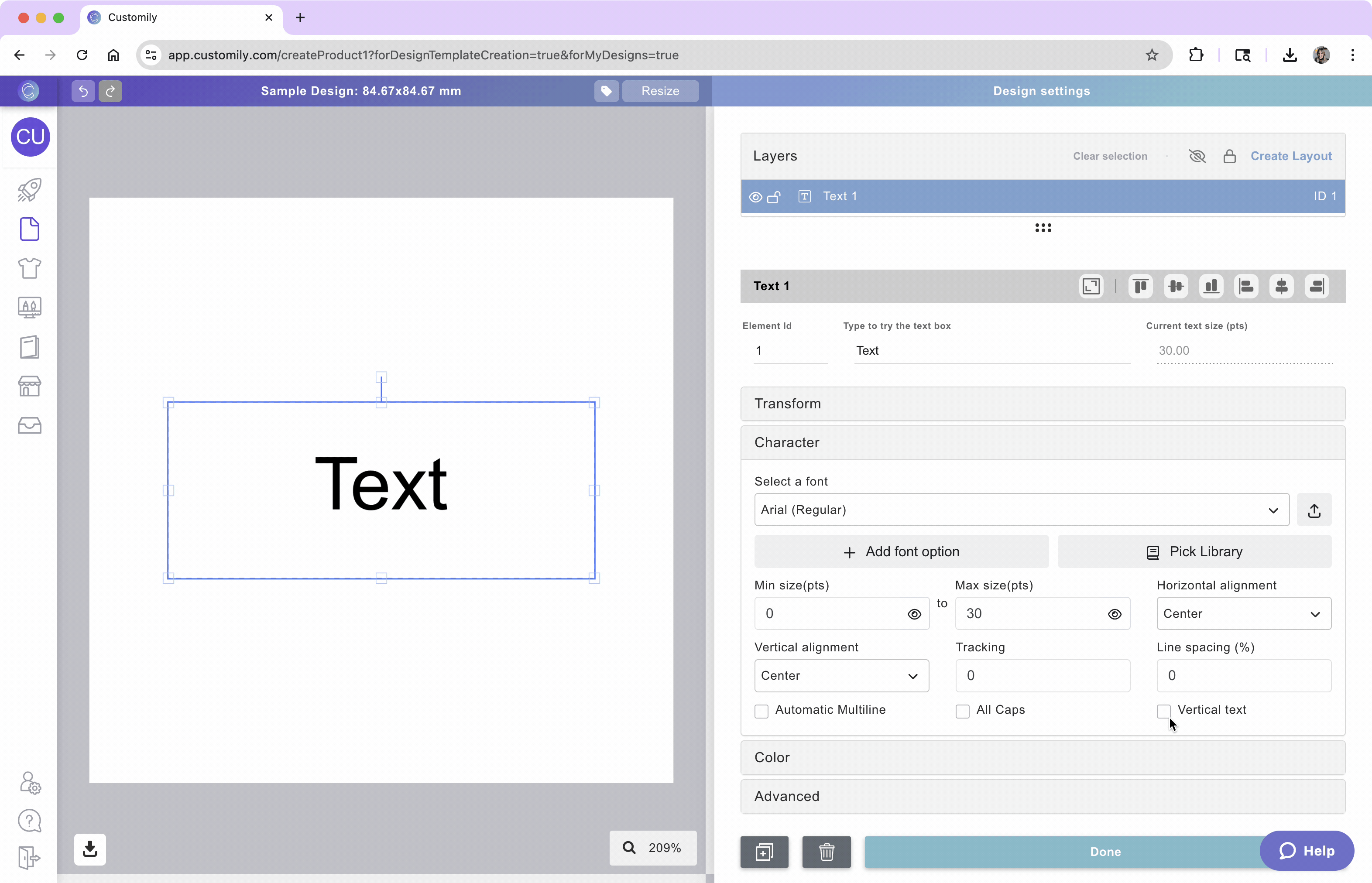
Vertical Text
By checking Vertical Text, you'll change the text direction.
Select the text element
Expand the Character toolbox
Click the Vertical Text checkbox

How to apply color, outlines, and textures
After selecting the element, expand the Color toolbox to add color options to the text inside the text box. Click on each item to learn more:
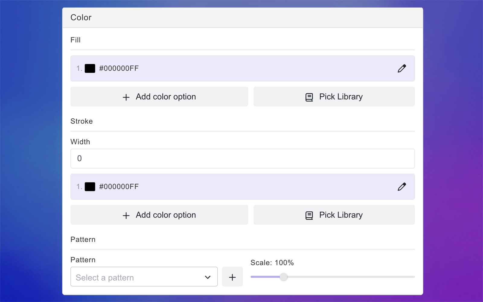
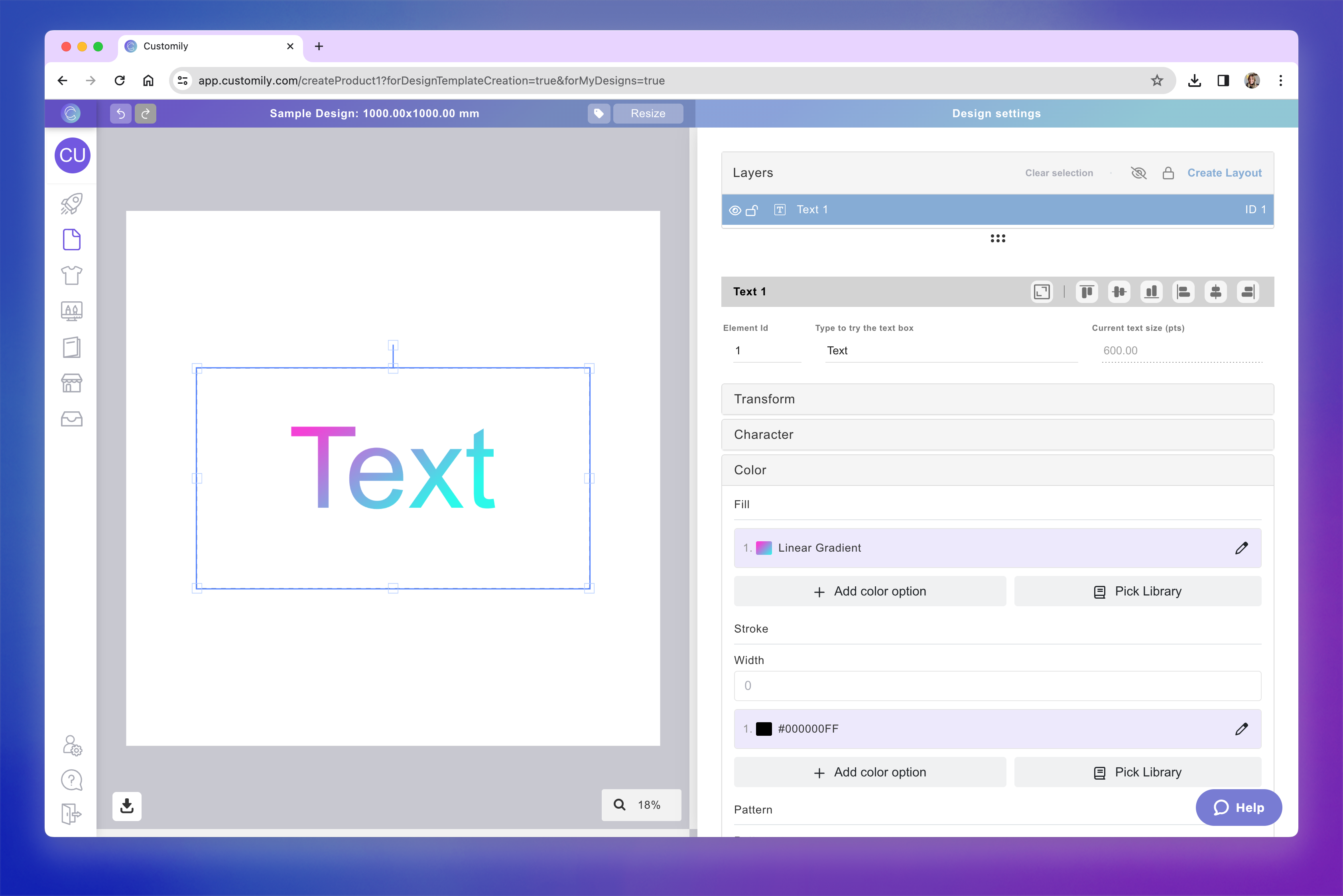
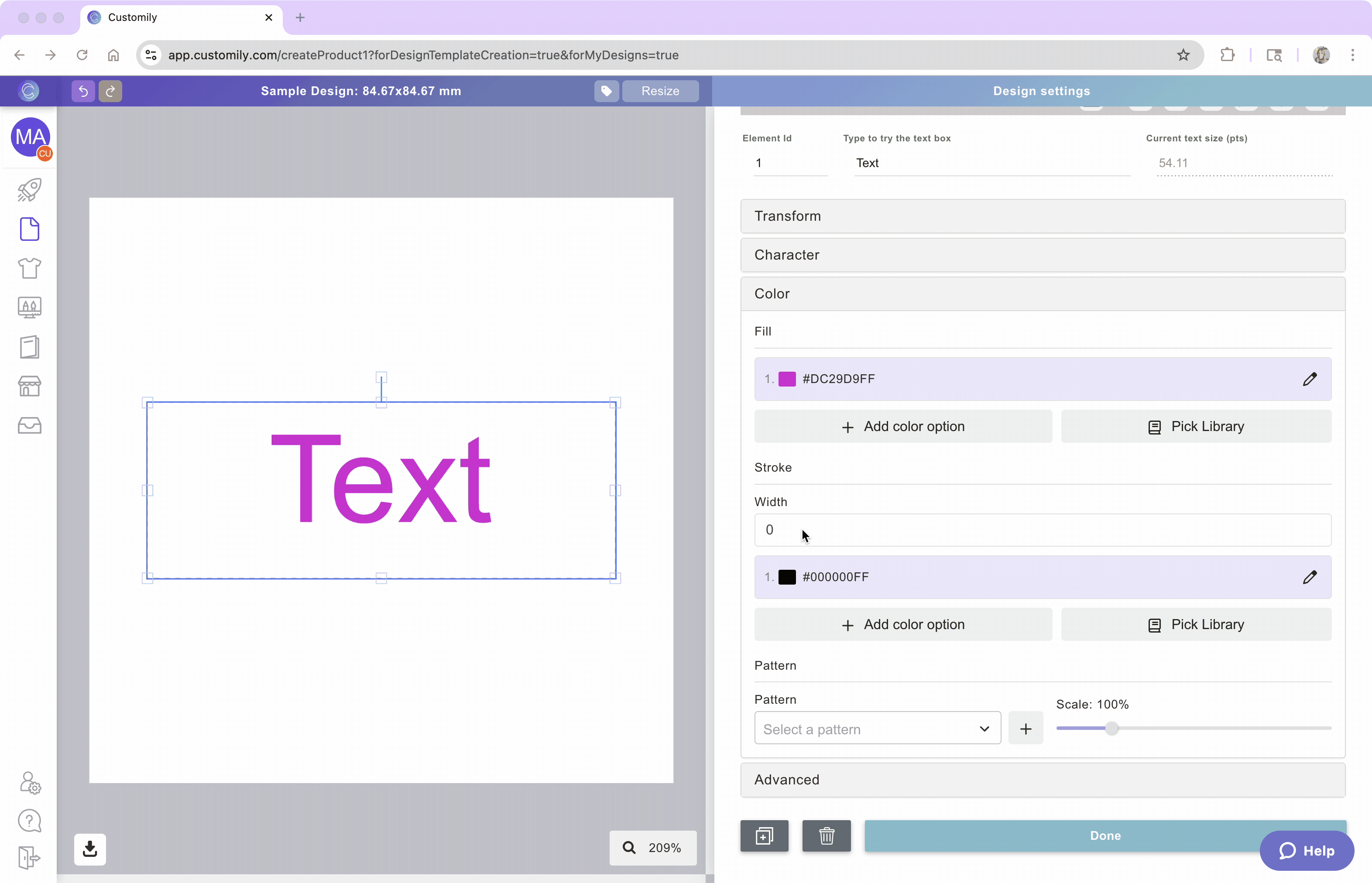
Fill Color
You can apply one or multiple fill colors to a text element. You can assign colors by Hex value, RGB-A, CMYK-A, or by using a color picker. The color chart will change from RGB-A to CMYK-A, according to the color mode of your workspace. The A stands for Alpha, which means you can also add transparency to your text colors!
When setting the fill, you can now choose between different coloring styles:
Solid
Apply a single color to the entire text.

Gradient
Blend two or more colors smoothly across the text.
Alternating colors
Apply different colors to letters in a repeating sequence.

Select the text element
Expand the Color toolbox
Click the color swatch or the pencil to select a color.
Choose your coloring style: Solid, Gradient, or Alternating.
Using the swatch you can add colors with Hex, RGB-A, or CMYK-A values (the last 2 depend on the color mode of your design). You can also use the color picker to choose a color from your screen. If you want to add transparency, just slide the Alpha control on the bottom of the chart.
Click Apply

Tip
You can add multiple color options to a text element. To add more than one color option you can either use a color library or assign multiple color options by clicking Add color option and choosing a new color.
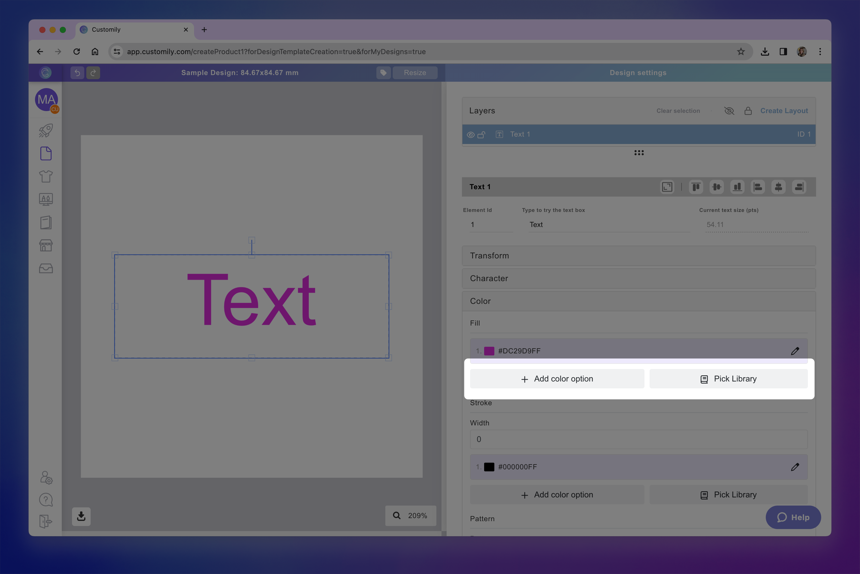
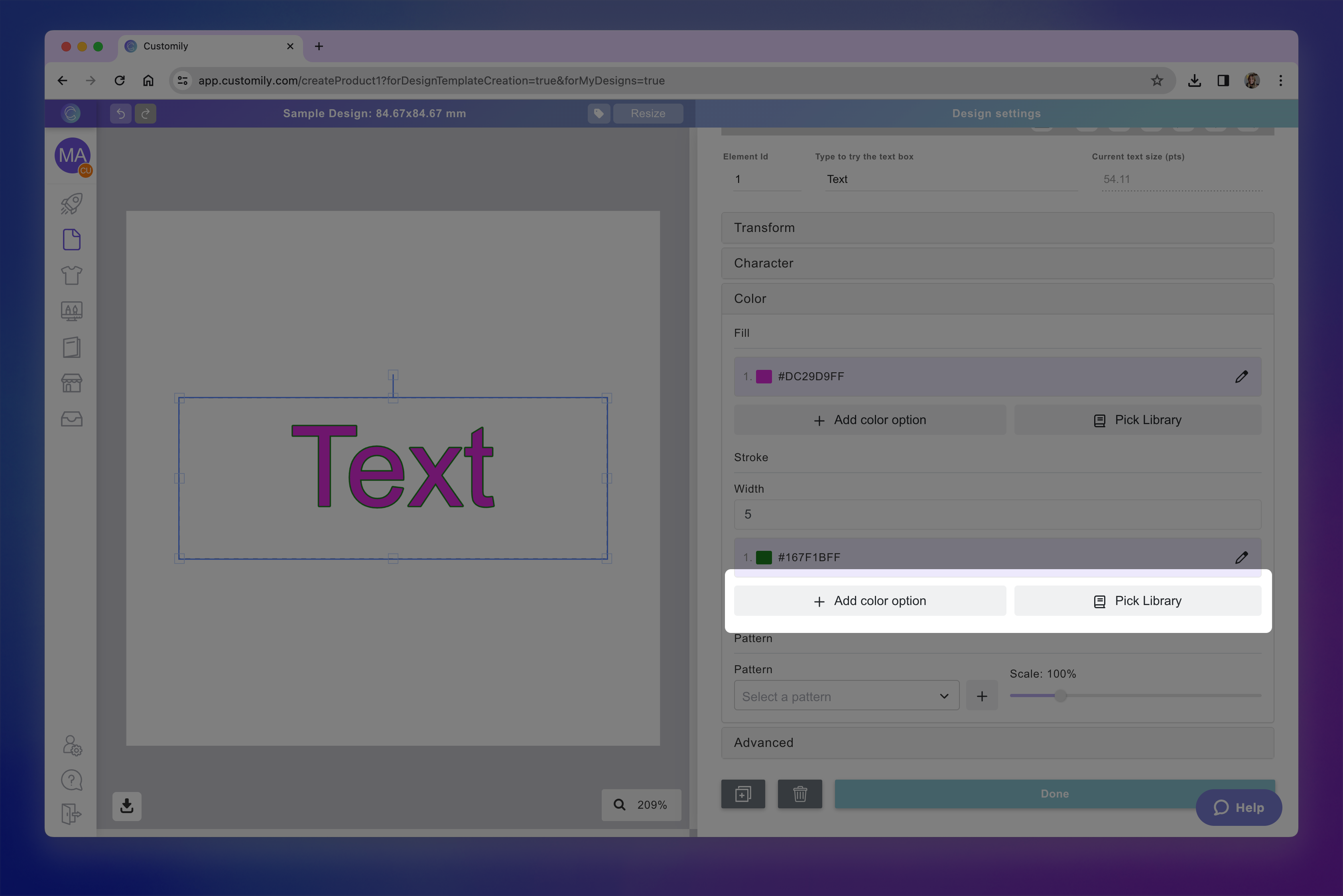
Stroke
You can apply a colored stroke to the text element, this can be a different color from the fill color. The stroke will apply to the text always, so if you have multiple font options and multiple color options, the stroke will apply to all of them.
Select the text element
Expand the Color toolbox
Set the Stroke width
Click the color swatch to select a color for the stroke.
Tip
You can add multiple color options to the stroke. They will be independent from the text fill color options if you have them. To add more than one color option you can either use a color library or assign multiple color options by clicking Add color option and choosing a new color.
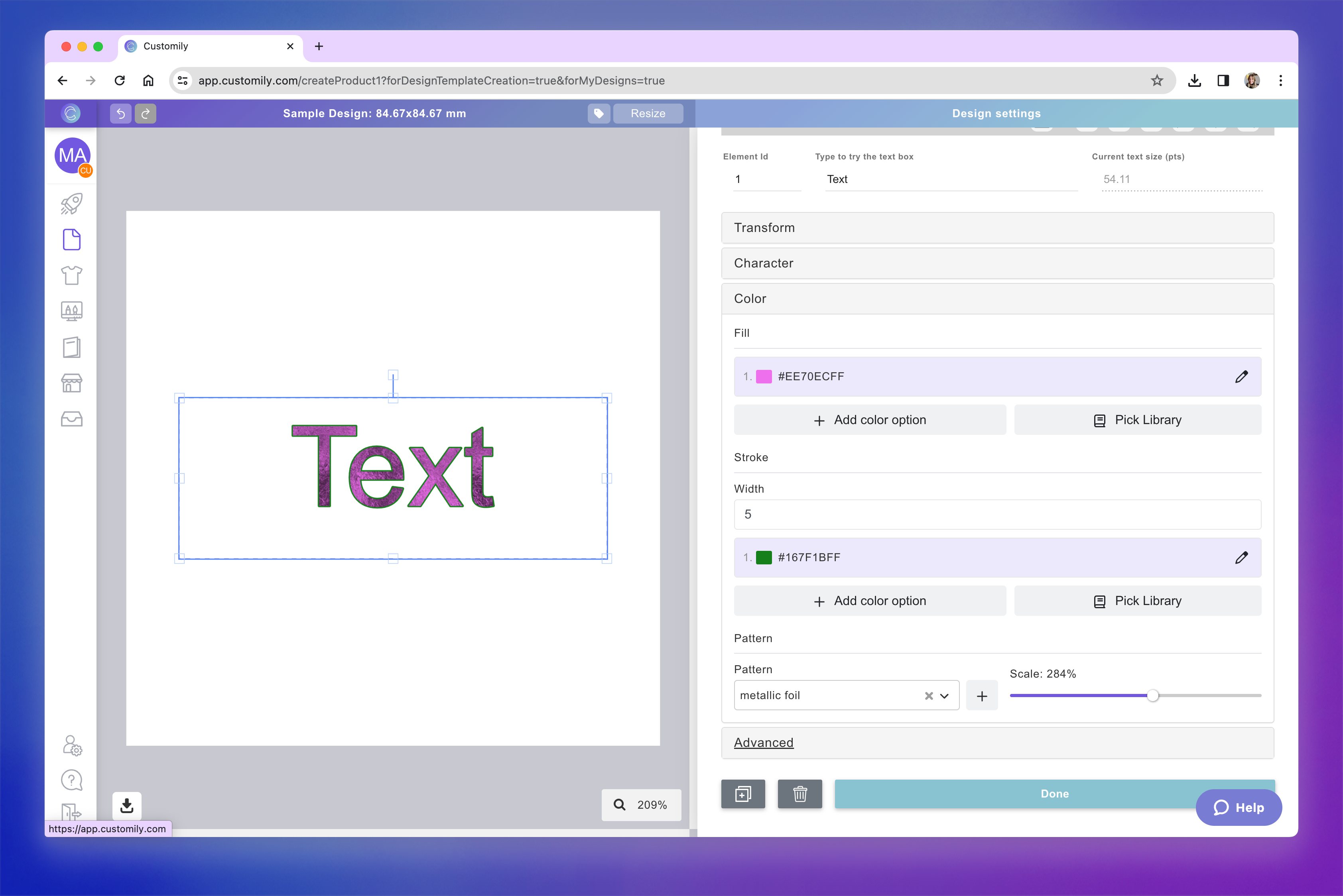
Patterns and Textures
You can enhance your text with patterns or textures, giving it unique visual effects like metallic finishes, watercolor fills, glitter, or fabric looks.
Select the text element
Expand the Color toolbox
Choose a pre-defined pattern from the Customily library, or upload your own image.
Adjust the scale of the pattern to control how it appears within the letters.

Tip
If you use a transparent PNG as your texture, the selected text color will show through behind the pattern. This is great for effects like gold foil, brushed metal, or neon glow. Customily comes with several patterns ready to use as textures.
How to apply a shadow
You can apply a shadow effect to a text element to add depth and contrast. You can choose the shadow color and configure both the offset percentage and the angle to control the shadow’s position and intensity.
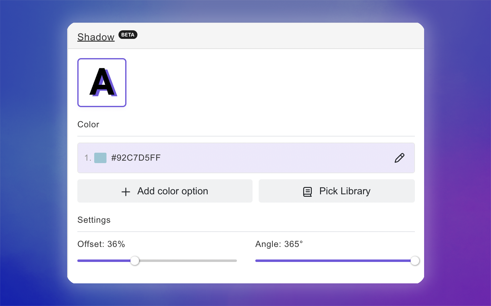
Select the text element
Expand the Shadow toolbox
Add the shadow
Click the color swatch to select a color for the shadow
Configure the offset and angle settings

Tip
You can add multiple color options to the shadow. They will be independent from the text fill and stroke color options if you have them. To add more than one color option, you can either use a color library or assign multiple color options by clicking Add color option and choosing a new color.

Advanced text settings
Inside the Advanced toolbox, you’ll find a few extra options that can help you fine-tune the behavior of your text boxes. Some of the advanced features are only available when creating templates manually, and not when creating designs. Click on each item to learn more:
* these advanced settings are only available when creating templates manually, and not when creating designs.

Prefix and Suffix
Prefix and Suffix to your text are fixed texts that will be visible when customers start adding their custom text.
Prefix: a fixed text will be added before the custom text
Suffix: a fixed text will be added after the custom text
To add a Prefix or Suffix
Select the text element
Expand the Advanced toolbox
Type in your Prefix and/or Suffix
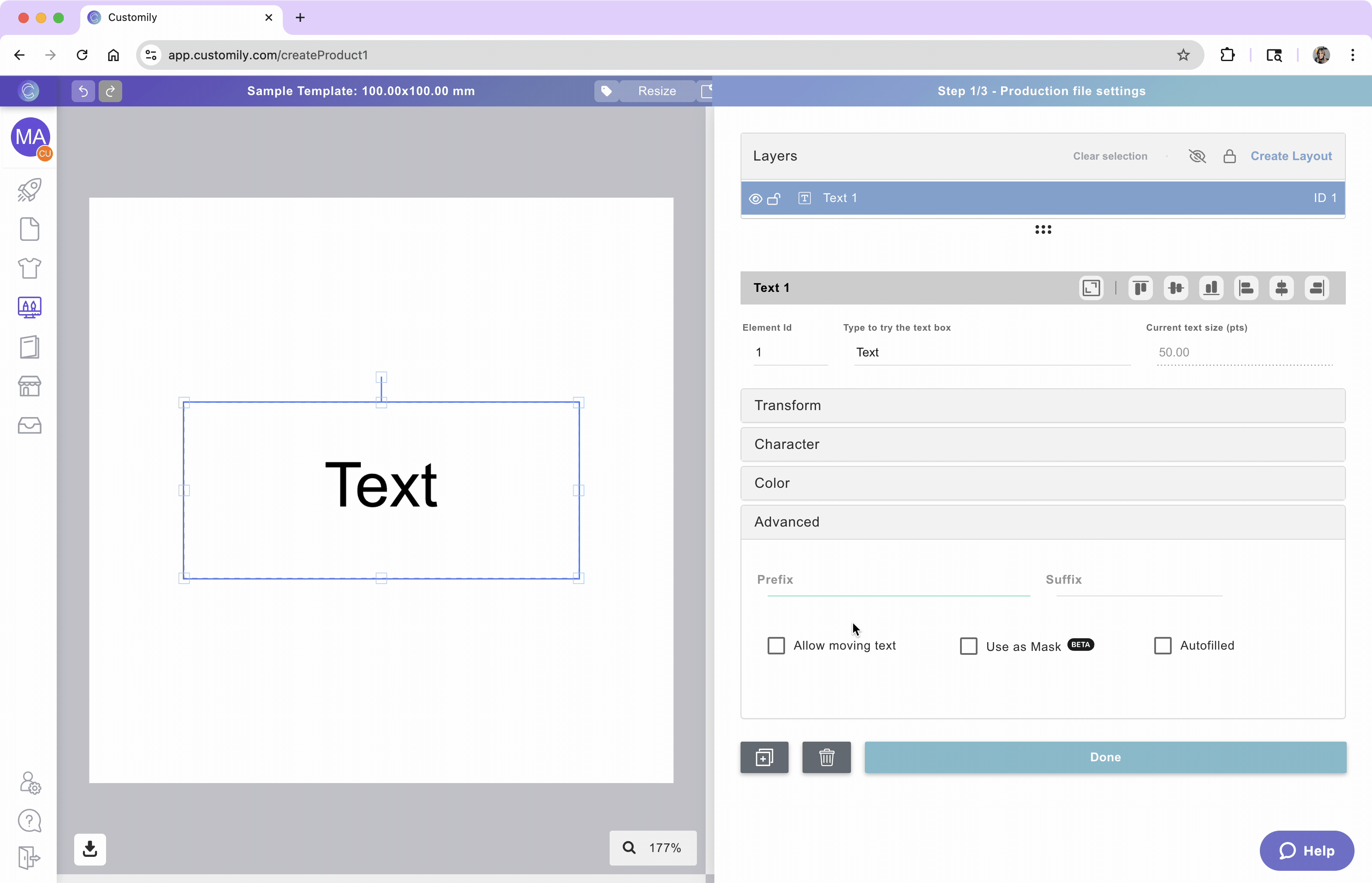
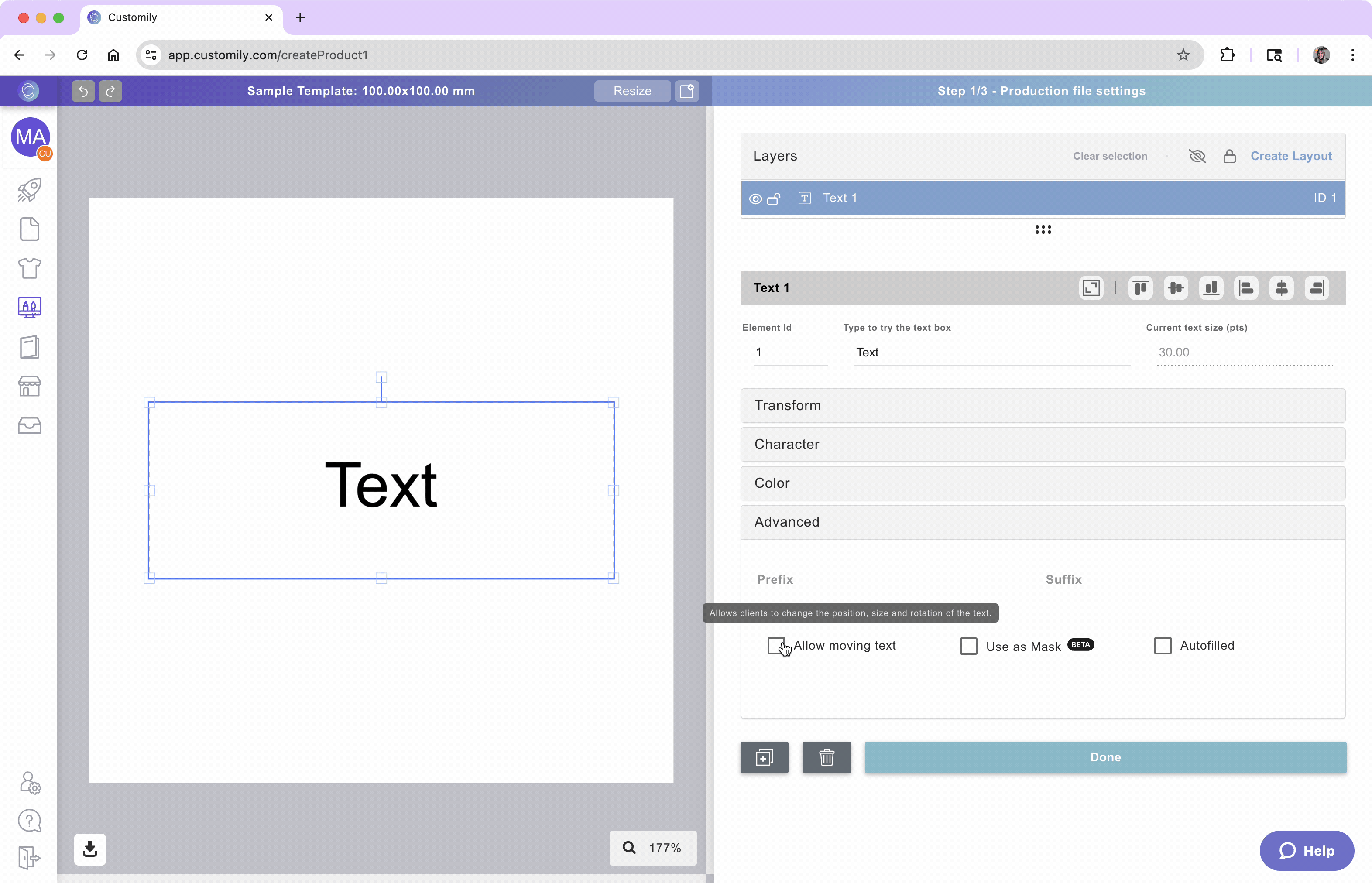
Allow Movable Text
Enabling this option allows customers to move and resize the text inside the defined area. This is useful when you want to give shoppers more freedom in adjusting the layout—like repositioning a name within a frame or shifting a message around a photo.
To allow Movable Text
Select the text element
Expand the Advanced toolbox
Check Allow moving text
The text box will become red, indicating the area of movement.
Tip
When this option is enabled, the texts bounding box will become the area of movement. Customers will be able to click and drag the text to change its position within that area. If you want to make the area bigger, just resize the text box on the canvas or with the tool box. To test it out, double click the textbox to move the text around.
If disabled, the text will stay locked in the position you define.
Use text as mask
This setting turns your text into a mask, letting it cut through the image or element placed behind it. It’s commonly used to create photo-filled text effects—like showing a shopper uploaded image through the letters.
To use a text as a mask
Make sure you have an image layer below the text layer (this could be an image upload, or dynamic image)
Select the text element
Expand the Advanced toolbox
Check 'Use as Mask'
The image layer beneath the text will be masked to fit within the text outline, creating a seamless, one-of-a-kind design!

Text working as a mask will be marked on the layer panel with:

and images being masked will be marked with:

Text Autofill
The Autofill feature allows you to automatically insert dynamic order information—such as the Order Number or File Name—directly into the print file. This is particularly useful for:
Tracking: Easily identify and organize print files during the fulfillment process.
Labeling: Include order-specific details on products or packaging.
To set up Autofilled Values
Select the text element
Expand the Advanced toolbox
Check 'Autofilled'
From the dropdown menu, select the value you want to insert:
Order Number
File Name
Optionally, you can add a Prefix or Suffix to include additional text before or after the autofilled value (e.g., "Order: 12345").
Tip
The autofilled text will appear in the print file but is not visible to customers during the customization process. They won't be able to edit this text.
Test how the shopper experience will look
At any moment while configuring your text box, you can test how it will look on your design, by typing on the spot that reads Type to try the text box.
This is just for you to test, whatever you type there won't be saved, and won't be visible to your customers ever.

Tip
If you type text and you don't see anything, go check your font size! It is because your font is too big for the size of your textbox, so the text doesn't fit. You can also resize the text box and make your textbox taller until you start seeing the text.