Text box
Last updated: November 18, 2026
Text boxes let you add text to your designs, whether it's fixed text or something shoppers can personalize. The text box defines the boundaries where text can appear, not the size of the text itself. On the canvas, it's represented by a dashed line around the text.
You can customize the font, size, color, alignment, and styling to control how the text looks.
How it works
When you add a text box to your design, it's personalizable by default.
Shoppers see a text input where they can enter their own text.
As they type, their text appears live in the product preview.
If you offer multiple fonts or colors, shoppers can choose between them.
You can make the text movable so shoppers can reposition or resize the text within the area you define.
You can also make the text fixed, so it appears in the design without being editable by shoppers.
How to add a text box
Open your Design or Template in the Design Studio.
In the left toolbar, click Text.
Click Text Box to add a new element.
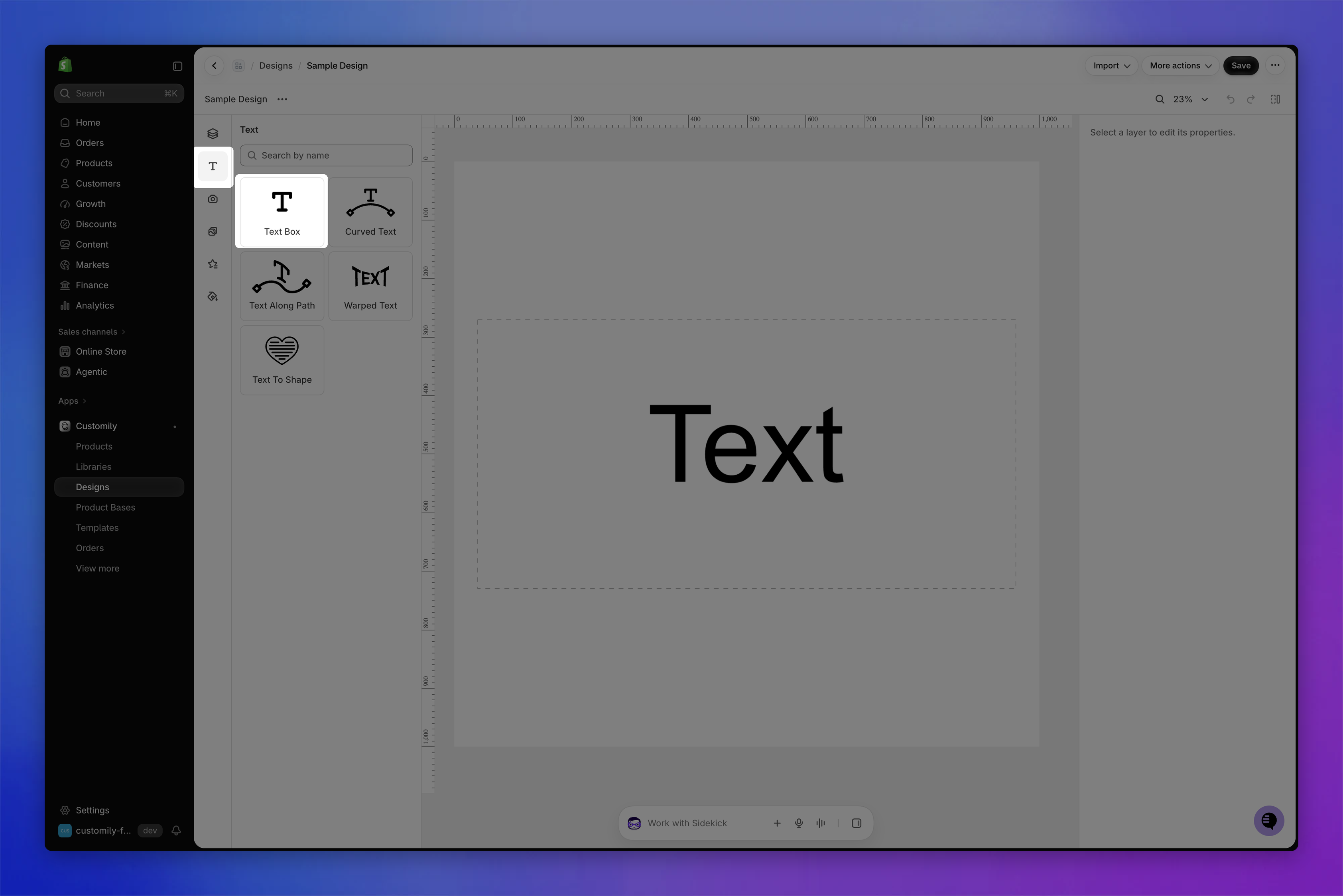
Each text box has a name you can edit and a unique ID to help you identify it. You can see both at the top of the settings panel and in the Layers panel. The ID can be changed in the General section.
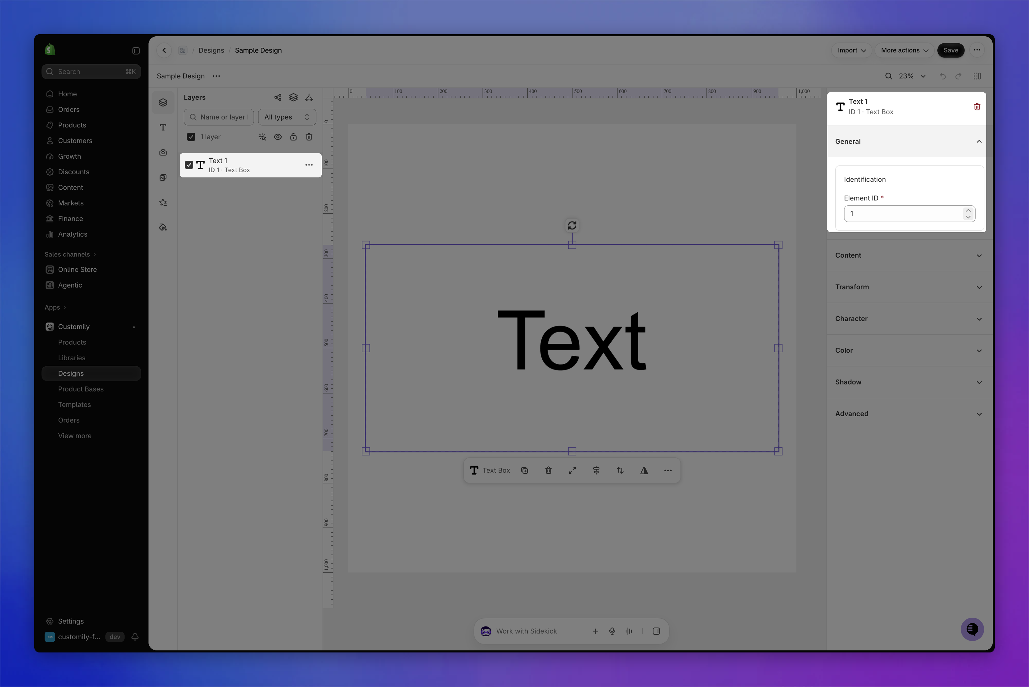
Content
The Content section controls what the text box shows and how shoppers can interact with it.
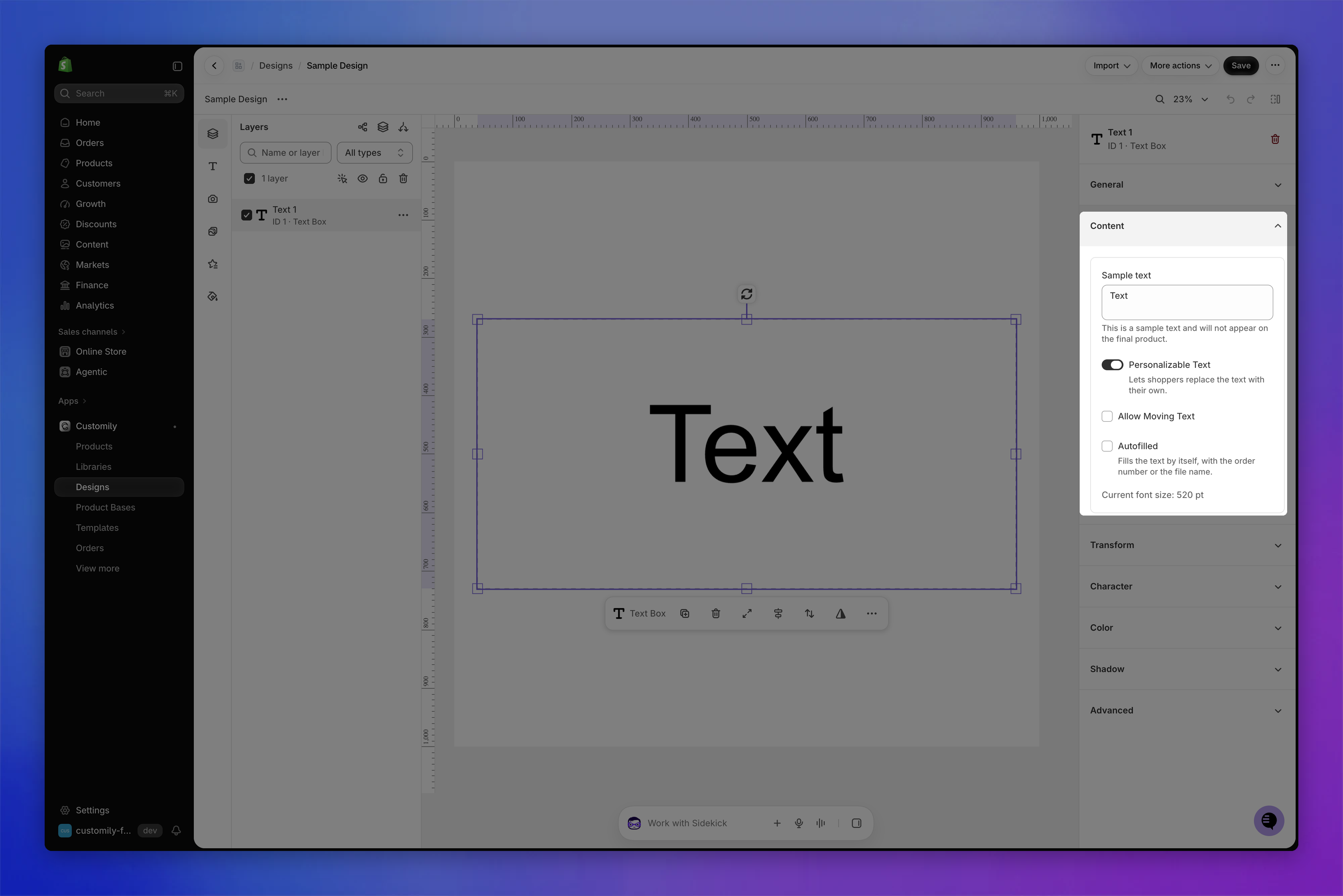
Test how the shopper's text will look
While configuring your text box, enter text in Sample text to see how it looks in your design.
This text is only for testing. It won't appear on the final product unless Personalizable Text is disabled.
Make text fixed or personalizable
By default, every text element you add is personalizable, meaning shoppers can replace its content with their own text when customizing a product.
If you want to display fixed text that shoppers cannot edit, disable personalization for that element.
To make a text element fixed:
Select the text element.
Expand the Content section.
Disable Personalizable Text.
The text you entered in Sample text becomes the fixed text. To make the text personalizable again, enable the setting.
Allow moving text
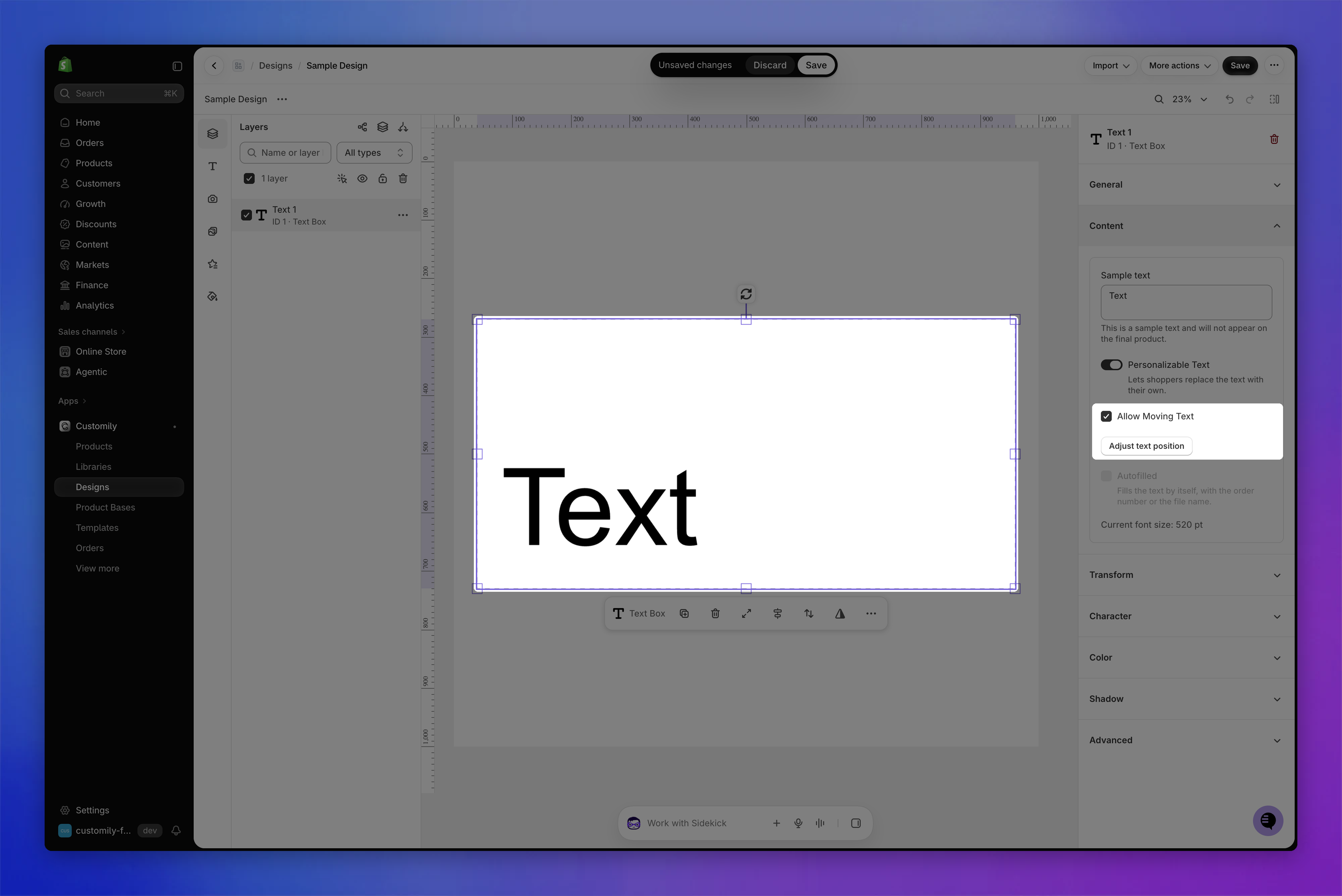
Enable Allow Moving Text to let shoppers move and resize their personalized text within a defined area. This is useful when you want to give shoppers more freedom to position their text.
To allow moving text:
Select the text element.
Expand the Content section.
Enable Allow Moving Text.
The text box becomes the area where shoppers can move their text. Click Adjust text position to set where the text appears initially.
Tip
The text box defines the area where shoppers can move their text. To make this area larger, resize the text box on the canvas or using the Transform section.
Autofill the text
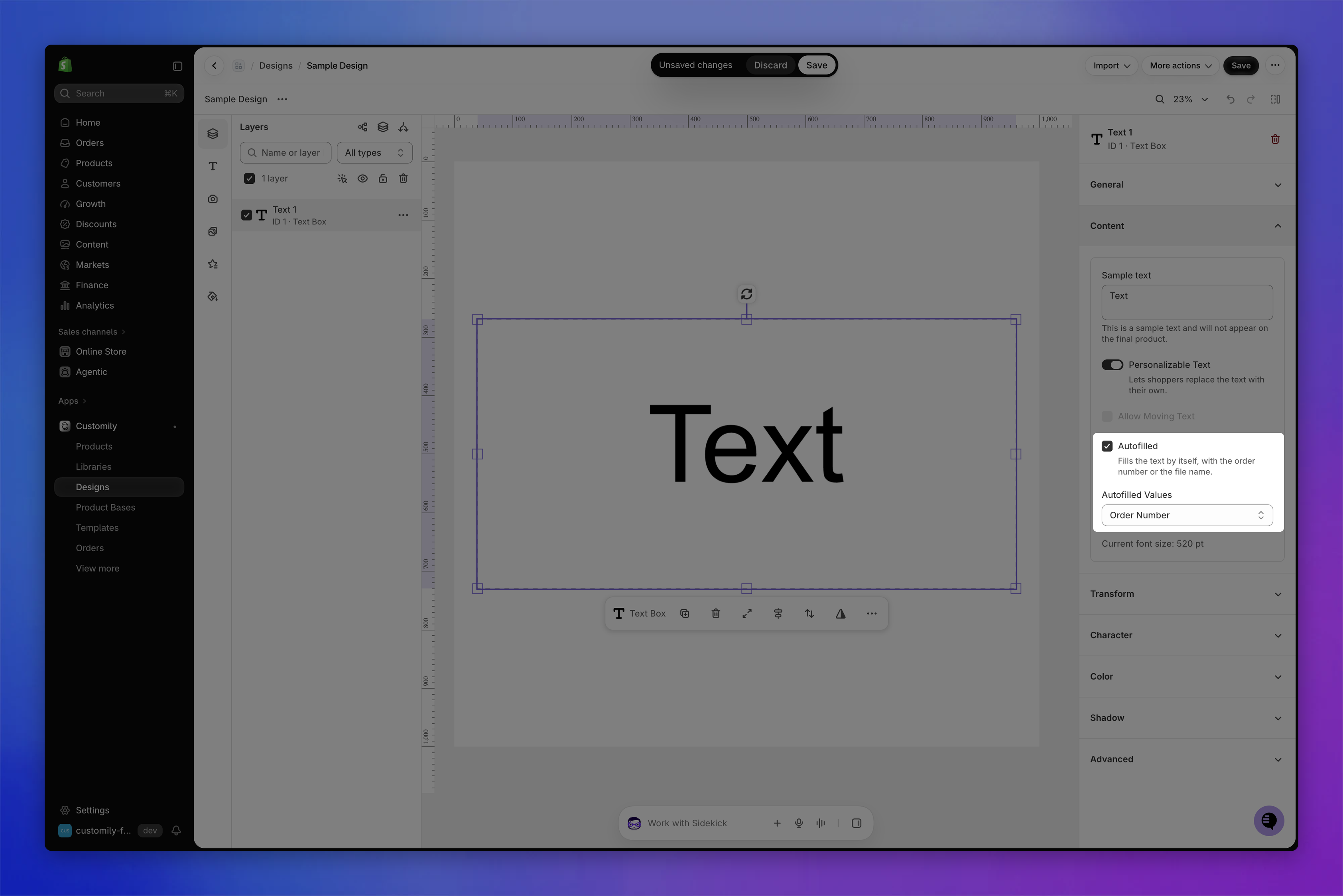
Use Autofilled to automatically fill a text element with the order number or the file name.
This is useful when you want to include order-specific information in your production file without requiring shoppers to enter it themselves. Shoppers cannot see or edit autofilled text during customization.
To enable Autofilled:
Select the text element.
Expand the Content section.
Enable Autofilled.
Under Autofilled Values, select Order Number or File Name.
Note
Allow Moving Text and Autofilled can't be used at the same time. Enabling one disables the other.
Transform: move, resize and rotate the text box
You can move, resize, and rotate a text box directly on the canvas.
When you select a text box, a quick-action toolbar appears below it, with shortcuts to duplicate, delete, fit, align, arrange, and flip the element.
For more precise adjustments, expand the Transform section. Use these controls to set the text box's exact size, position, rotation, and skew.
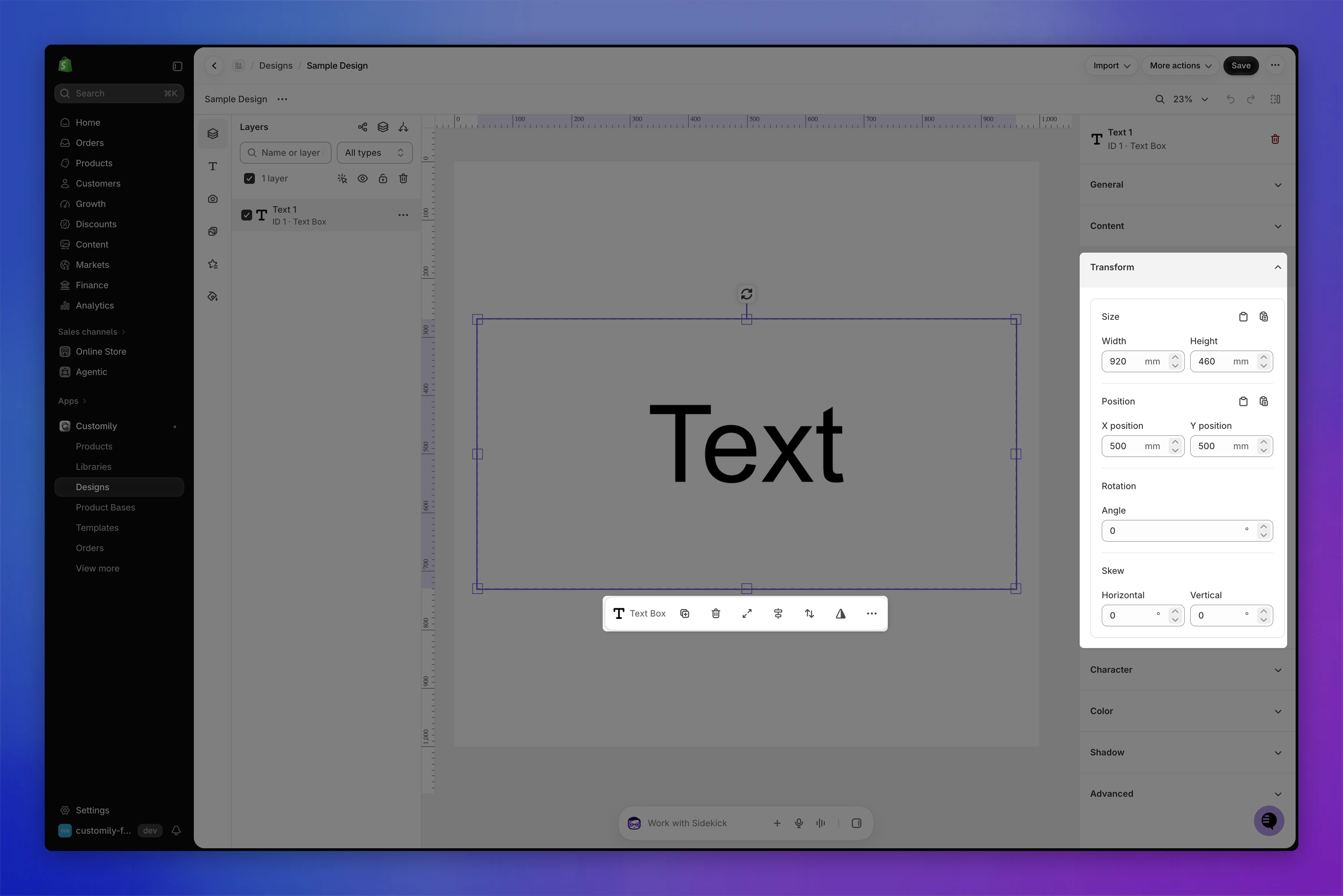
For detailed instructions on each transformation, see 📄 Transforming an element.
Character: style and format the text
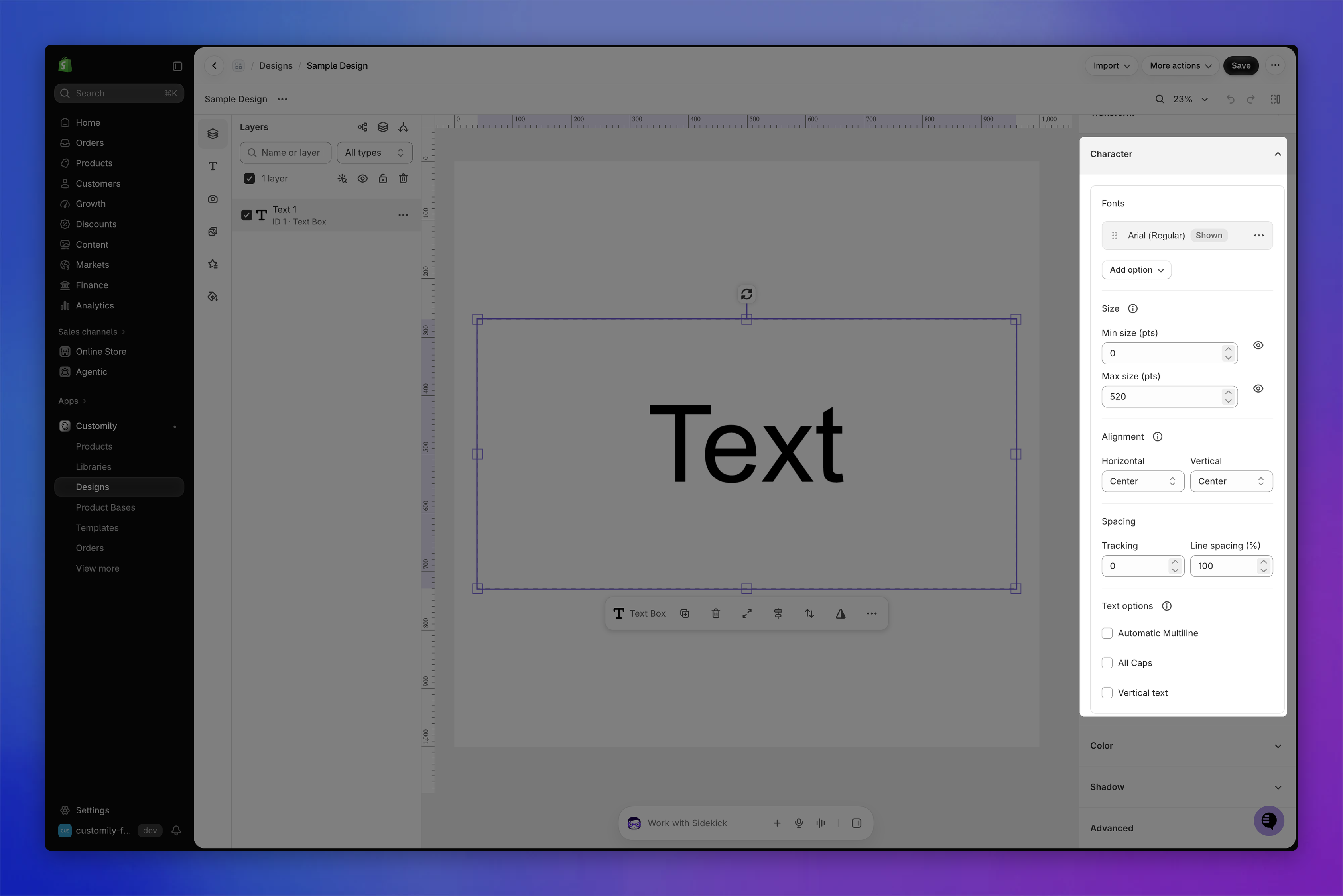
Select the text element and expand the Character section to customize its font, size, alignment, spacing, and other formatting options.
Fonts
You can apply one or multiple fonts to a text element.
To change the font:
Select the text element.
Expand the Character section.
In Fonts, click the ⋯ menu next to the current font and choose Replace.
Select a font from the list. You can also search fonts or click Upload font to add your own.
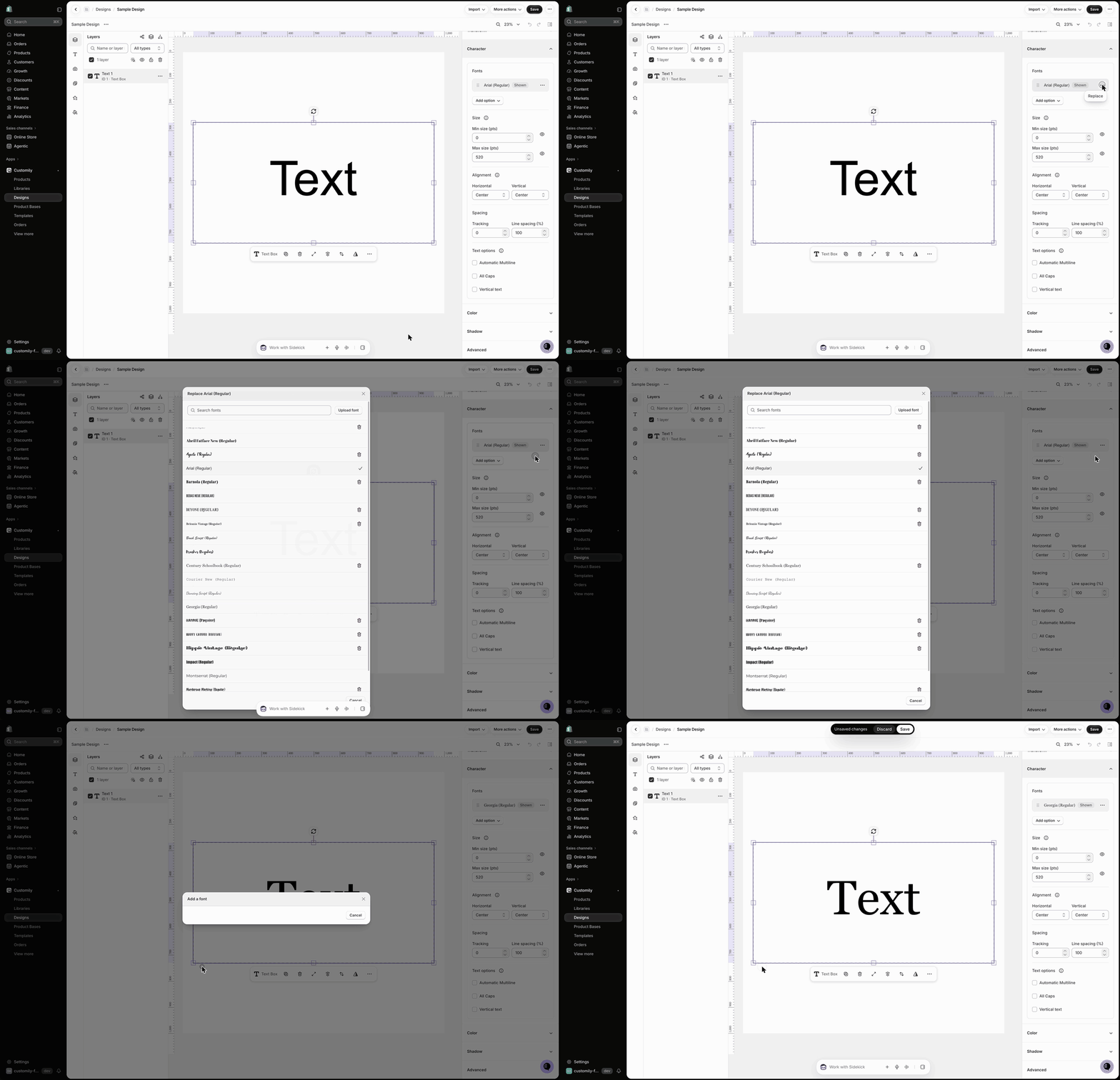
New accounts only have a couple of fonts available. To learn how to add your own fonts, see 📄 Upload custom fonts.
Tip
You can offer multiple fonts to shoppers. Click Add option and choose Add font to add another font, or Use a font library to use a Font Library.
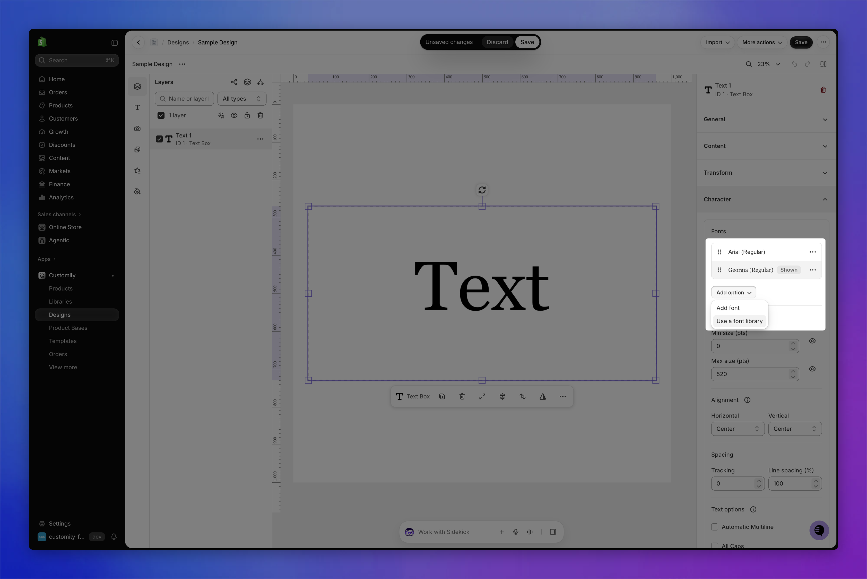
For detailed instructions, see 📄 Text with multiple font options.
Size
Text boxes in Customily have a font size range, meaning you can set a minimum and a maximum font size. This allows text to shrink when shoppers type something long, so more characters fit.
We recommend using the Max size as the size you want. The Min size is the limit of the resizing, to make sure small texts still look good and are printable. If you don't want the text to resize at all, use the same value in both fields.
To change the font size:
Select the text element.
Expand the Character section.
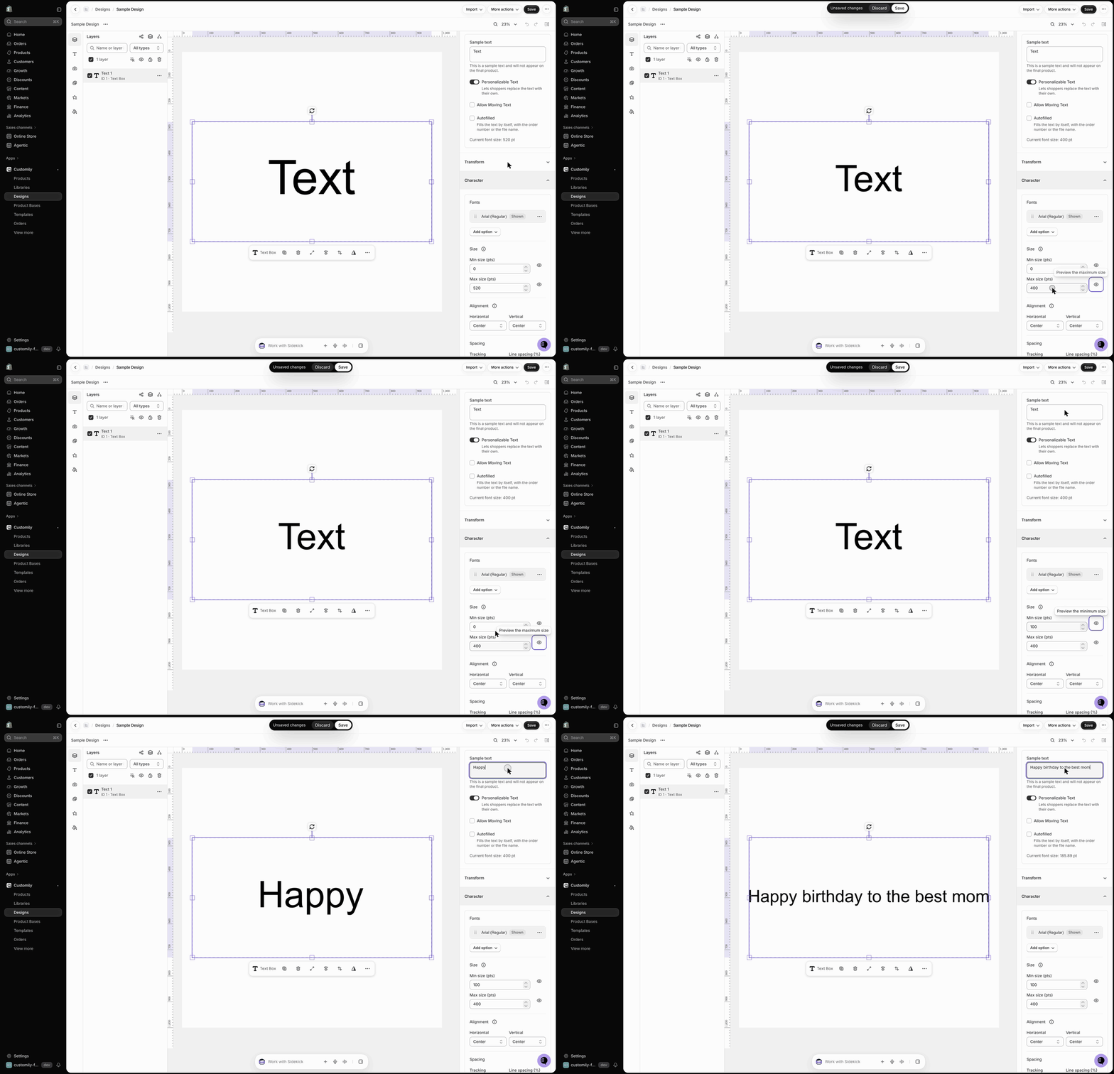
Under Size, enter the Max size (pts). You can also set a Min size (pts) if needed.
Tip
Click the eye icon next to the Min or Max size to preview that size on your design.
Alignment
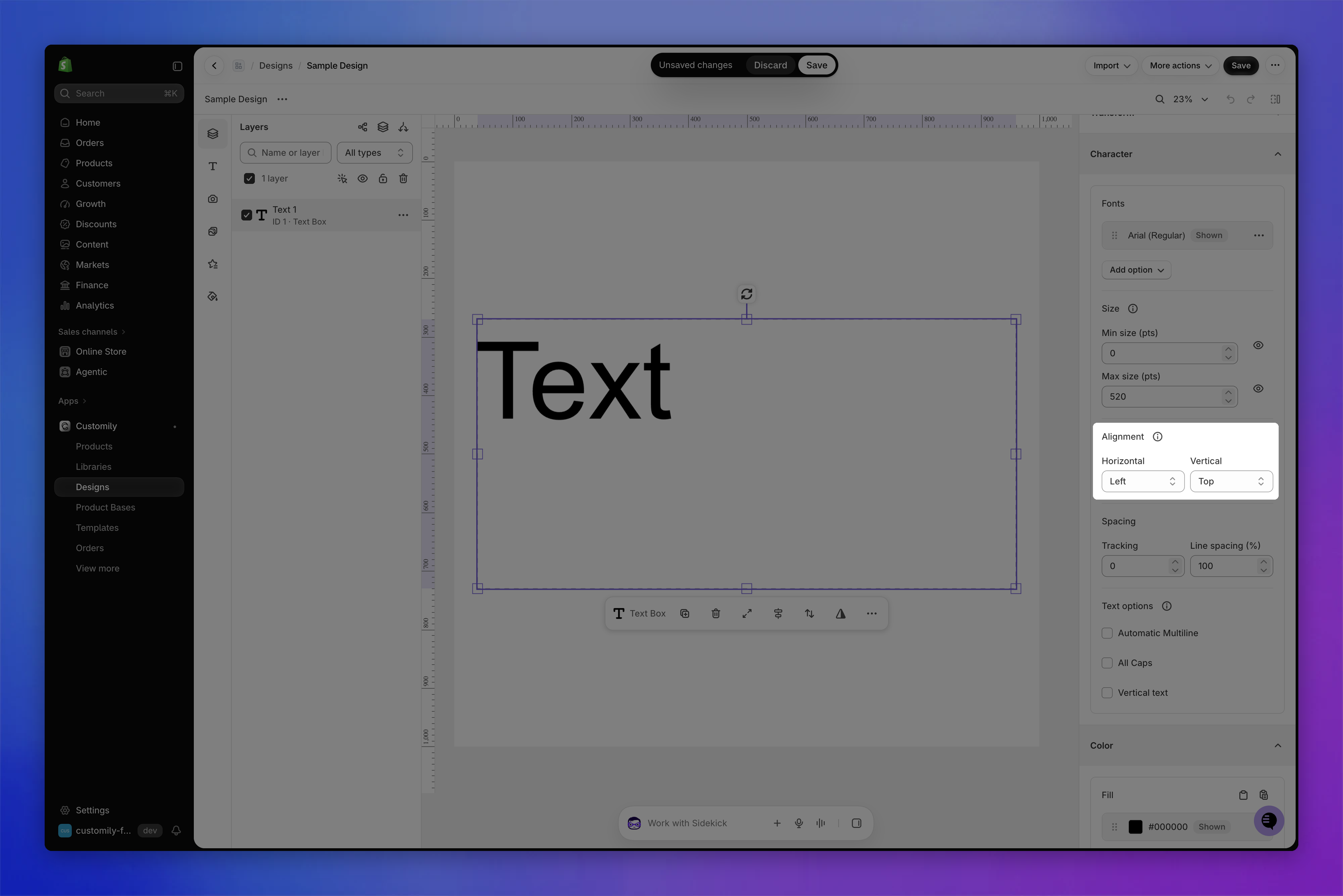
You can align the text inside the text box horizontally and vertically.
Horizontal: Left, Center, Right, Justified
Vertical: Top, Center, Bottom
To align the text:
Select the text element.
Expand the Character section.
Under Alignment, choose the Horizontal and Vertical alignment.
Spacing
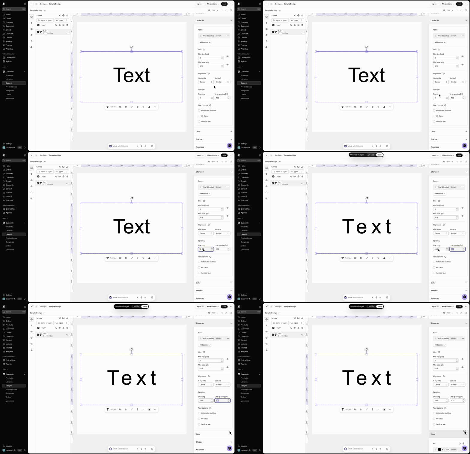
You can adjust the tracking (space between characters) and the line spacing of your text.
Select the text element.
Expand the Character section.
Under Spacing, enter a value for Tracking or Line spacing (%).
Text options
Automatic Multiline
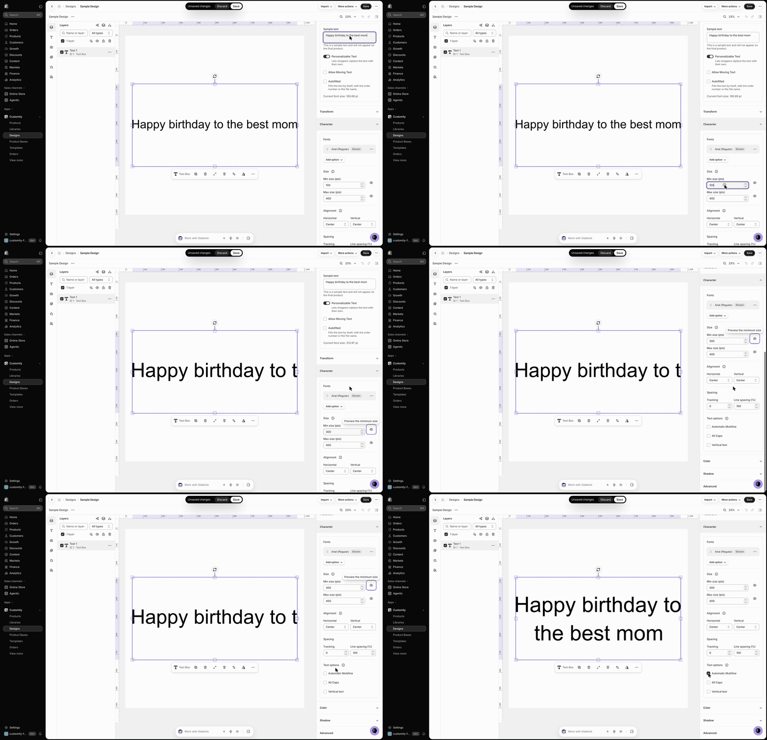
When a text box is tall enough to fit multiple lines, it's multi-line by default. However, shoppers need to press Enter to jump to the next line. If you want the text to break into lines automatically, enable Automatic Multiline. When the text doesn't fit at the minimum size, it continues on the next line.
Select the text element.
Expand the Character section.
Under Text options, enable Automatic Multiline.
Note
If you have a Min and Max size set up, the text first shrinks until it reaches the Min size. Then it jumps to the next line automatically.
All Caps
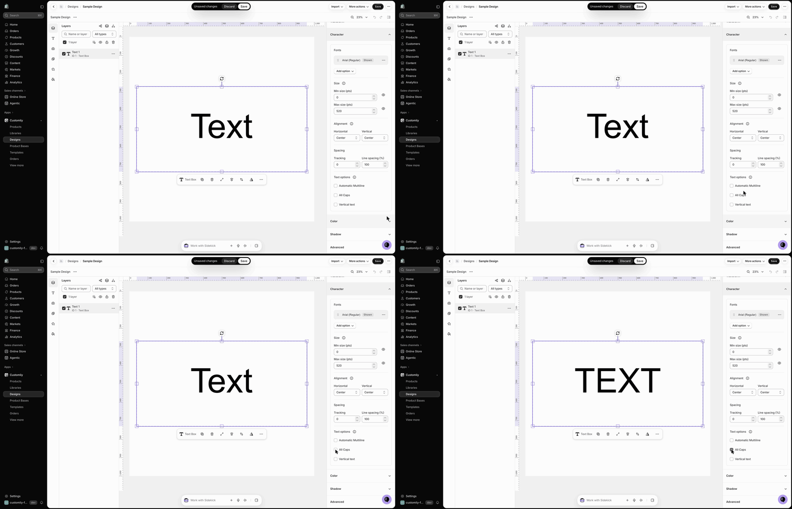
Enable All Caps to force whatever text the shopper types into capital letters.
Select the text element.
Expand the Character section.
Under Text options, enable All Caps.
Vertical text
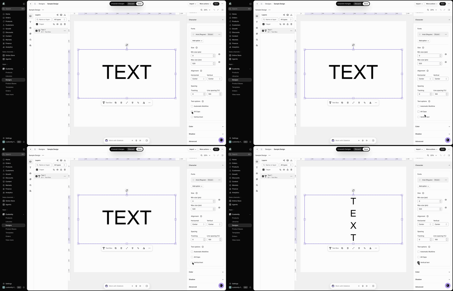
Enable Vertical text to change the text direction so letters stack vertically.
Select the text element.
Expand the Character section.
Under Text options, enable Vertical text.
Color: apply color, outlines, and textures
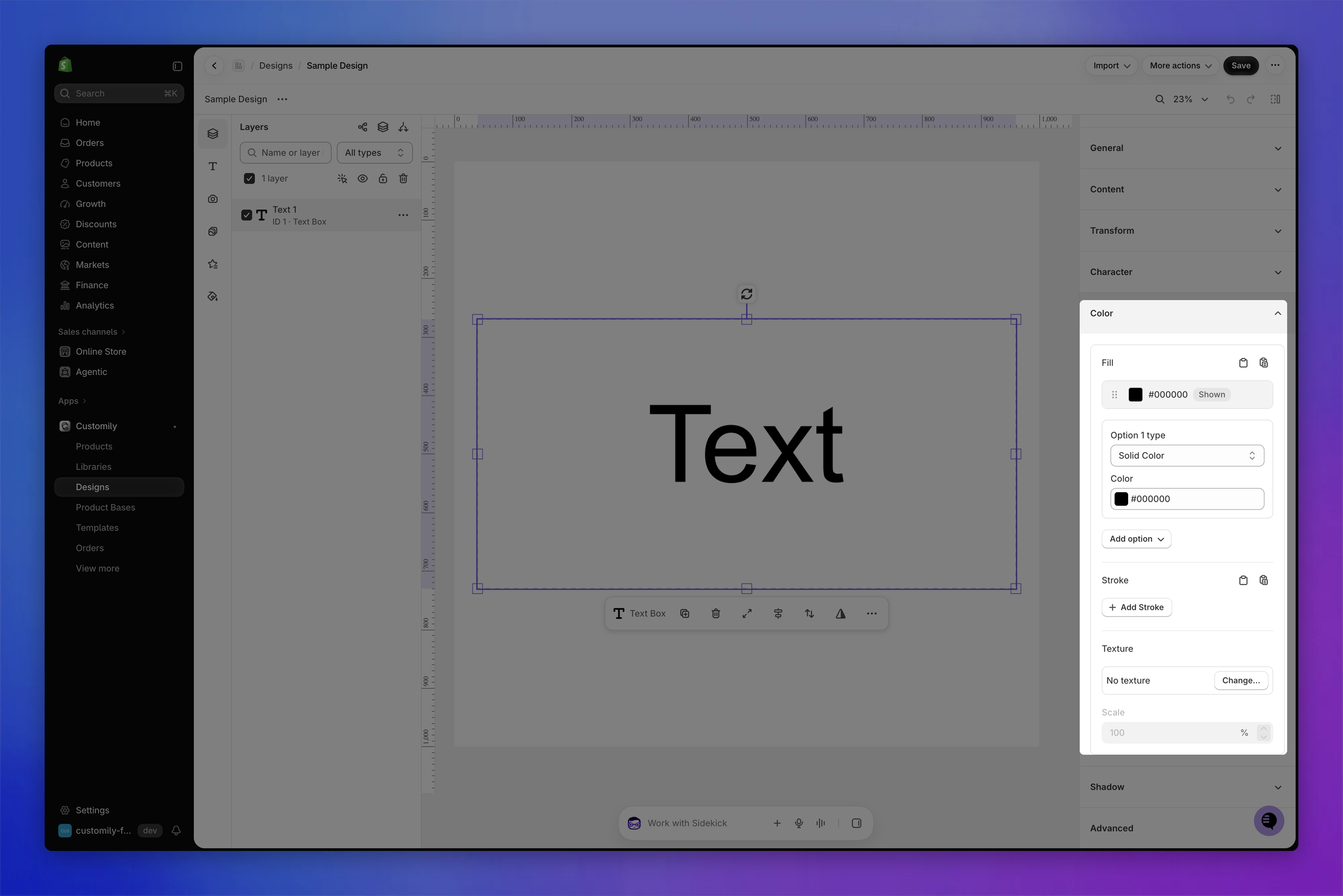
Select the text element and expand the Color section to customize its fill, stroke, and texture.
Fill
You can apply one or multiple fill colors to a text element. You can enter a HEX value or use the color picker. You can also add transparency to your text colors.
For each color option, choose one of these types:
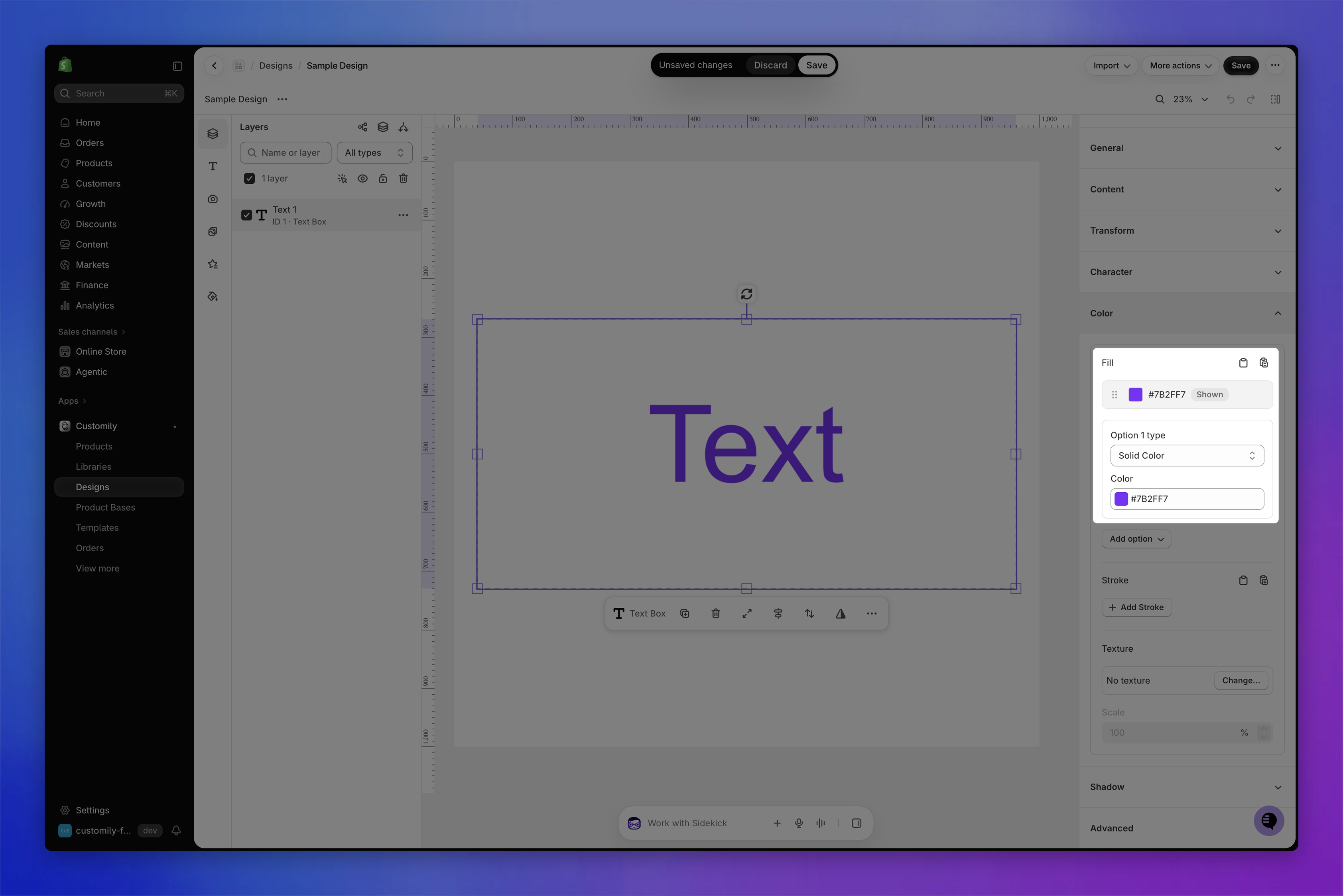
Solid Color
Apply a single color to the entire text.
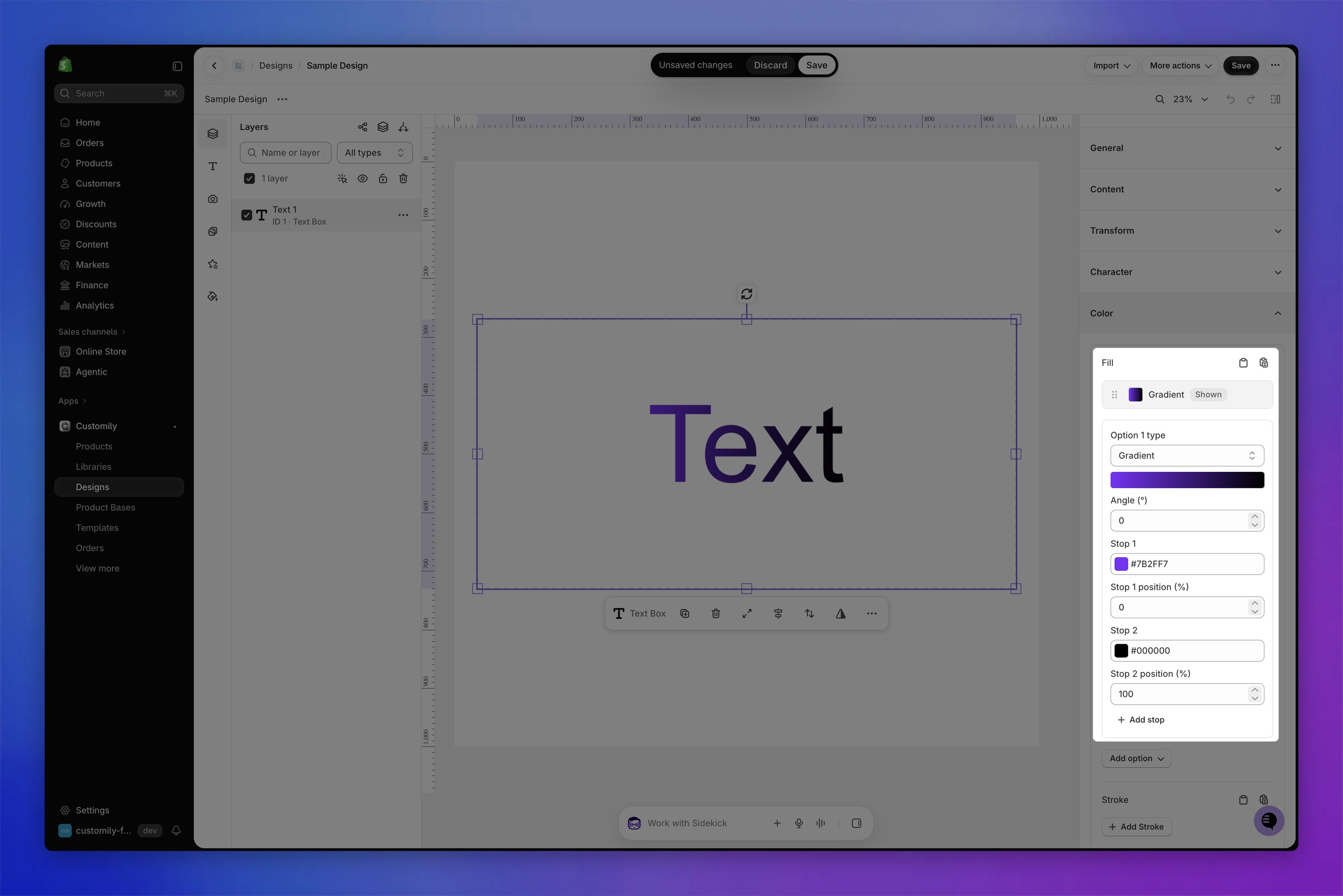
Gradient
Blend two or more colors smoothly across the text. Set the Angle and the color and position of each stop. Click Add stop to add more colors.
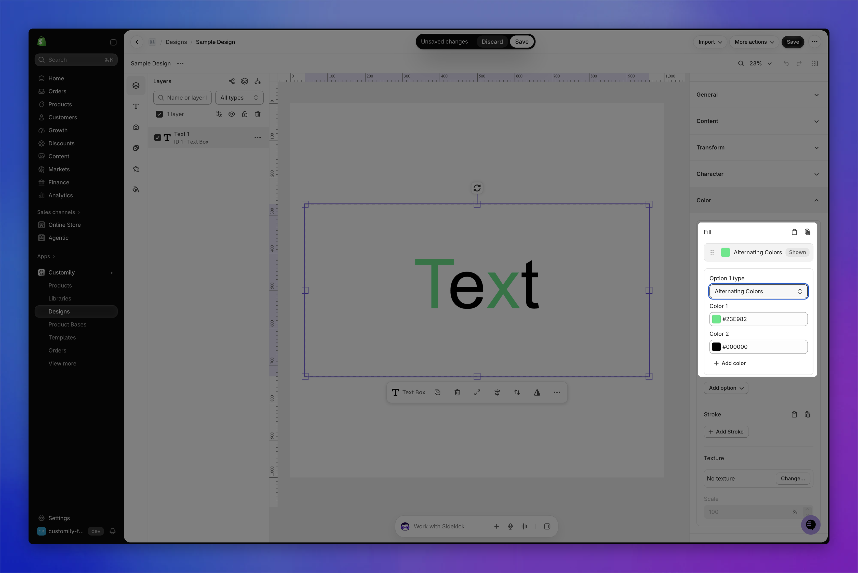
Alternating Colors
Apply different colors to letters in a repeating sequence. Click Add color to add more colors to the sequence.
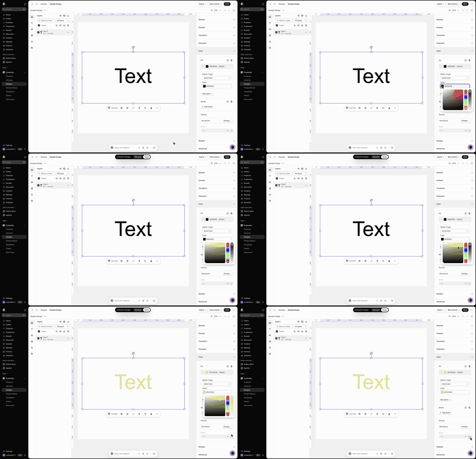
To change the fill color:
Select the text element.
Expand the Color section.
Under Fill, choose the Option type: Solid Color, Gradient, or Alternating Colors.
Click the color swatch to open the color picker, or enter a HEX value.
Tip
You can offer multiple colors to shoppers. Click Add option and choose Add color to add another color, or Use a color library to use a Color Library.
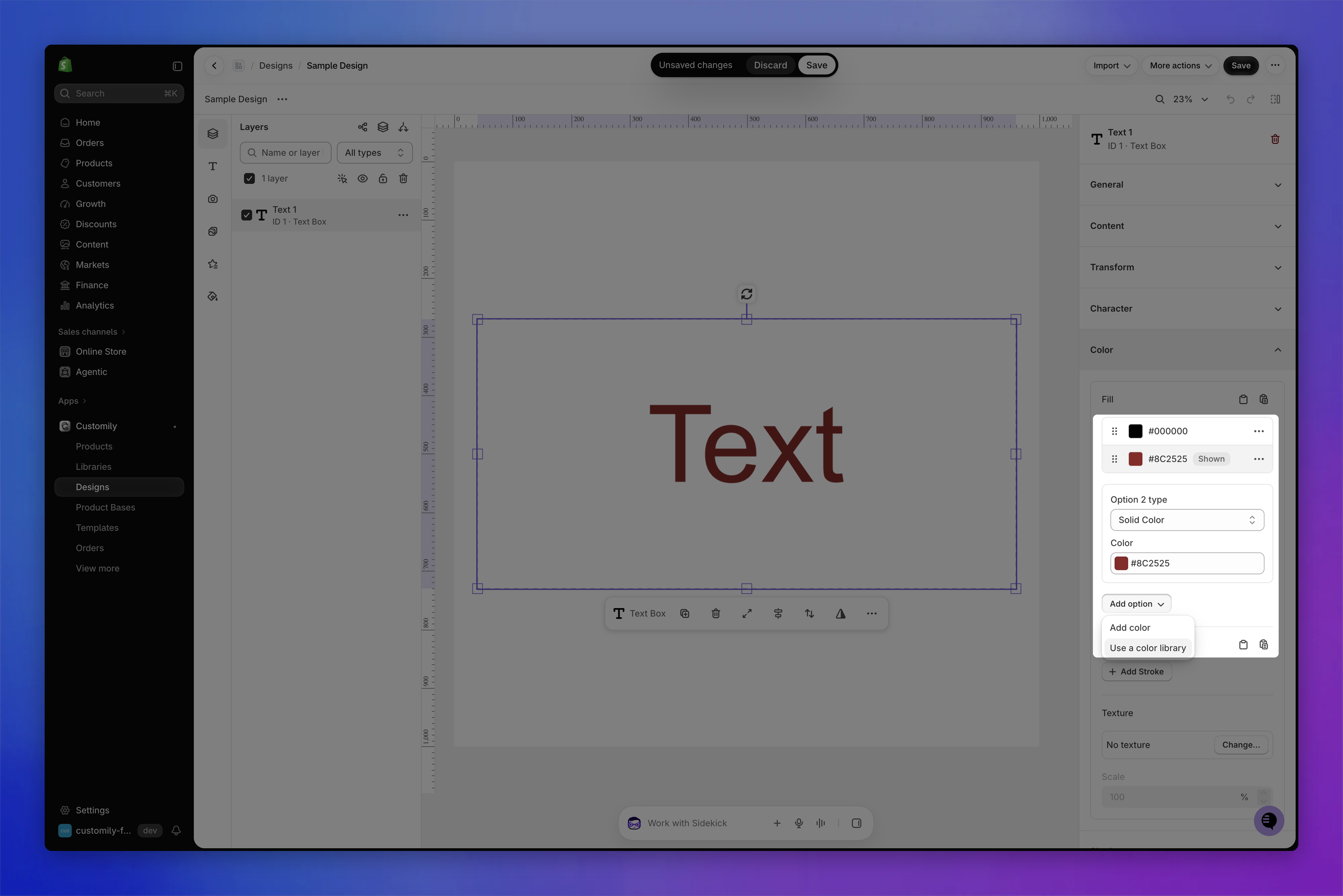
For detailed instructions, see 📄 Add multiple color options to text.
Stroke
You can apply a colored stroke (outline) to the text element. It can be a different color from the fill. The stroke always applies to the text, so if you have multiple font and color options, the stroke applies to all of them.
To add a stroke:
Select the text element.
Expand the Color section.
Under Stroke, click Add Stroke.
Adjust the stroke Width and choose its color. You can add more color options with Add option.
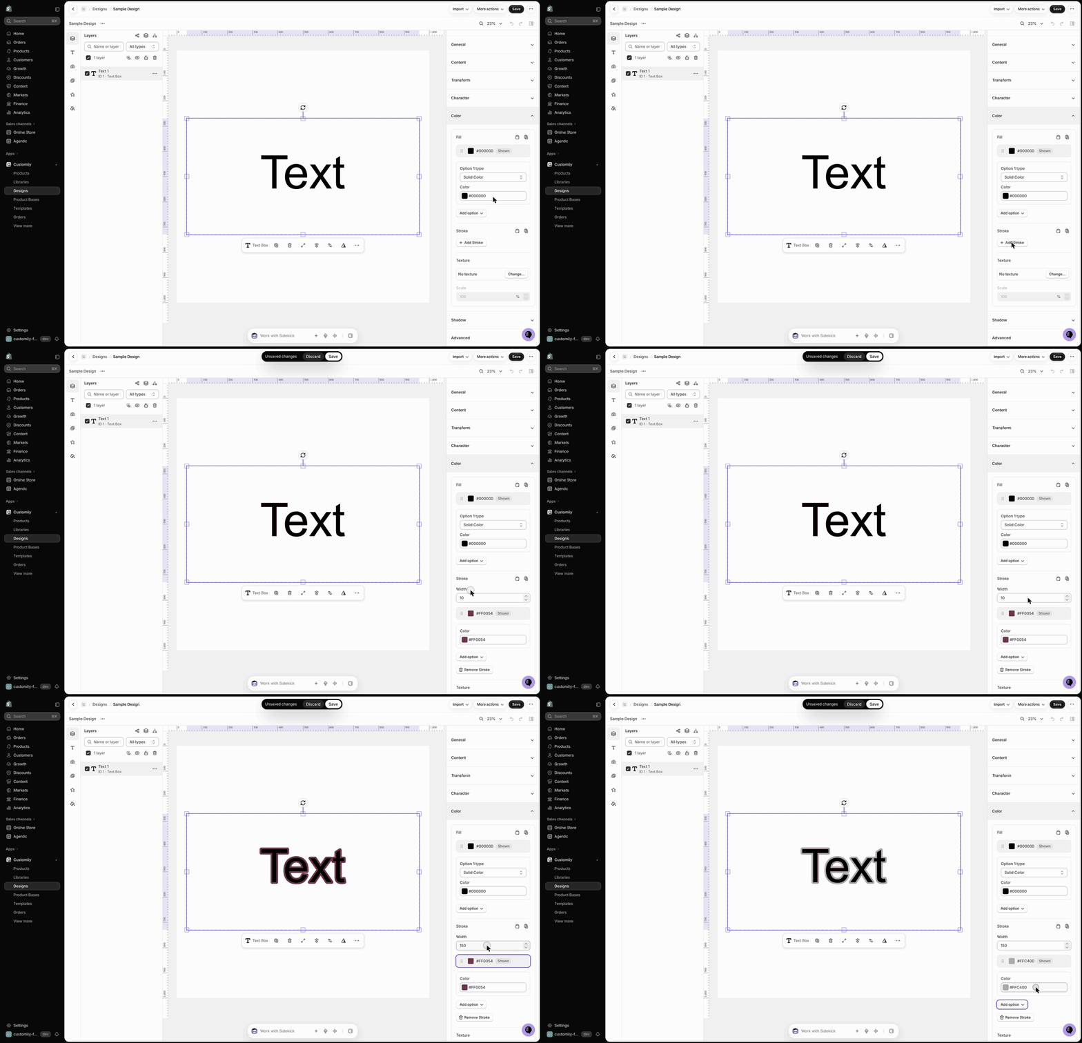
To remove it, click Remove Stroke.
Texture
You can enhance your text with textures, giving it visual effects like metallic finishes, watercolor fills, glitter, or fabric looks.
To apply a texture:
Select the text element.
Expand the Color section.
Under Texture, click Change….
Choose a texture from the list, or click Upload texture to use your own image.
Adjust the Scale to control how the pattern appears within the letters.
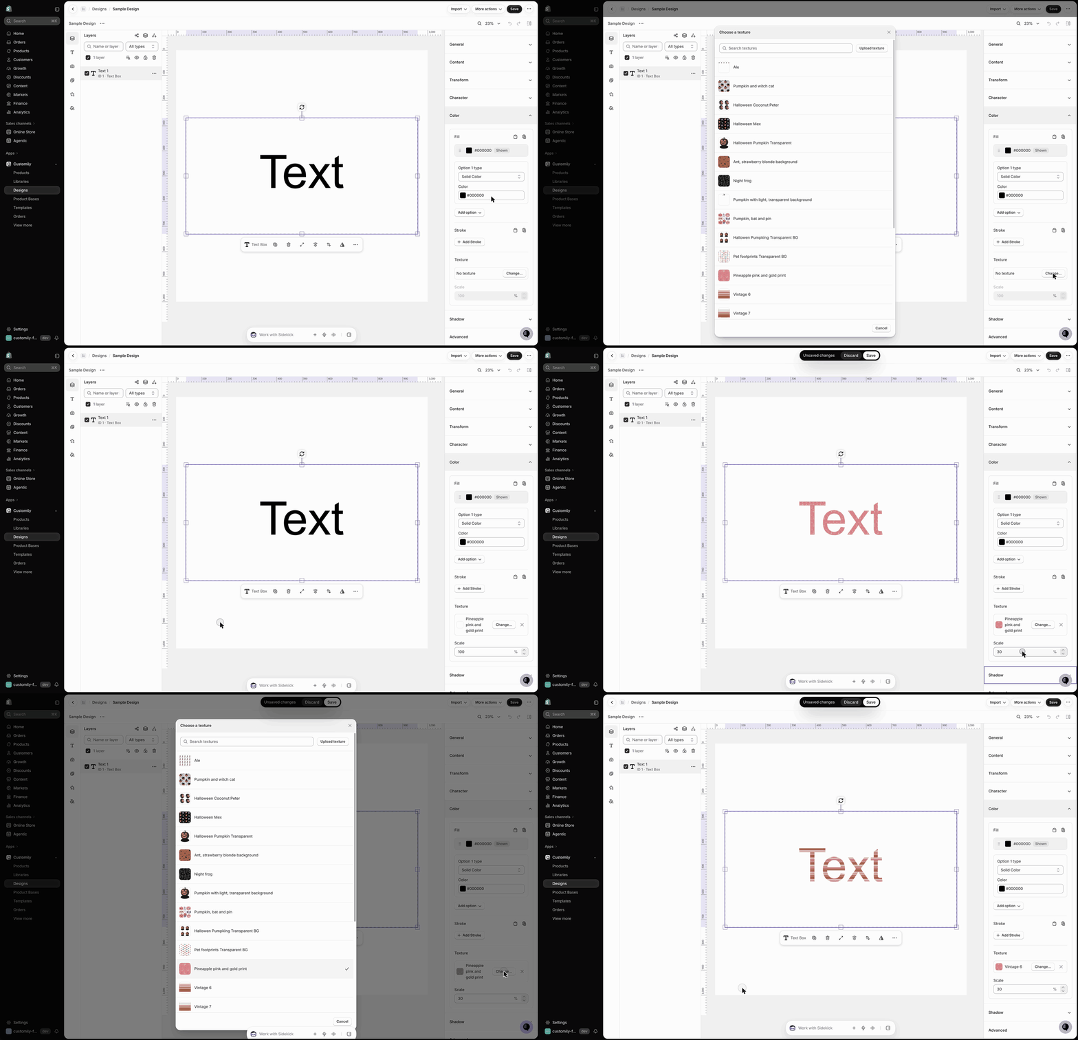
Tip
If you use a transparent PNG as your texture, the selected text color shows through behind the pattern. This is great for effects like metallic foil, brushed metal, or glitter.
Shadow
You can add a shadow to a text element to create depth, contrast, or a soft glow effect.
Choose between two shadow styles:
Drop shadow: Creates a sharp, defined shadow behind the text.
Blurred drop shadow: Creates a softer shadow with adjustable blur, which can also be used to create a glow effect.
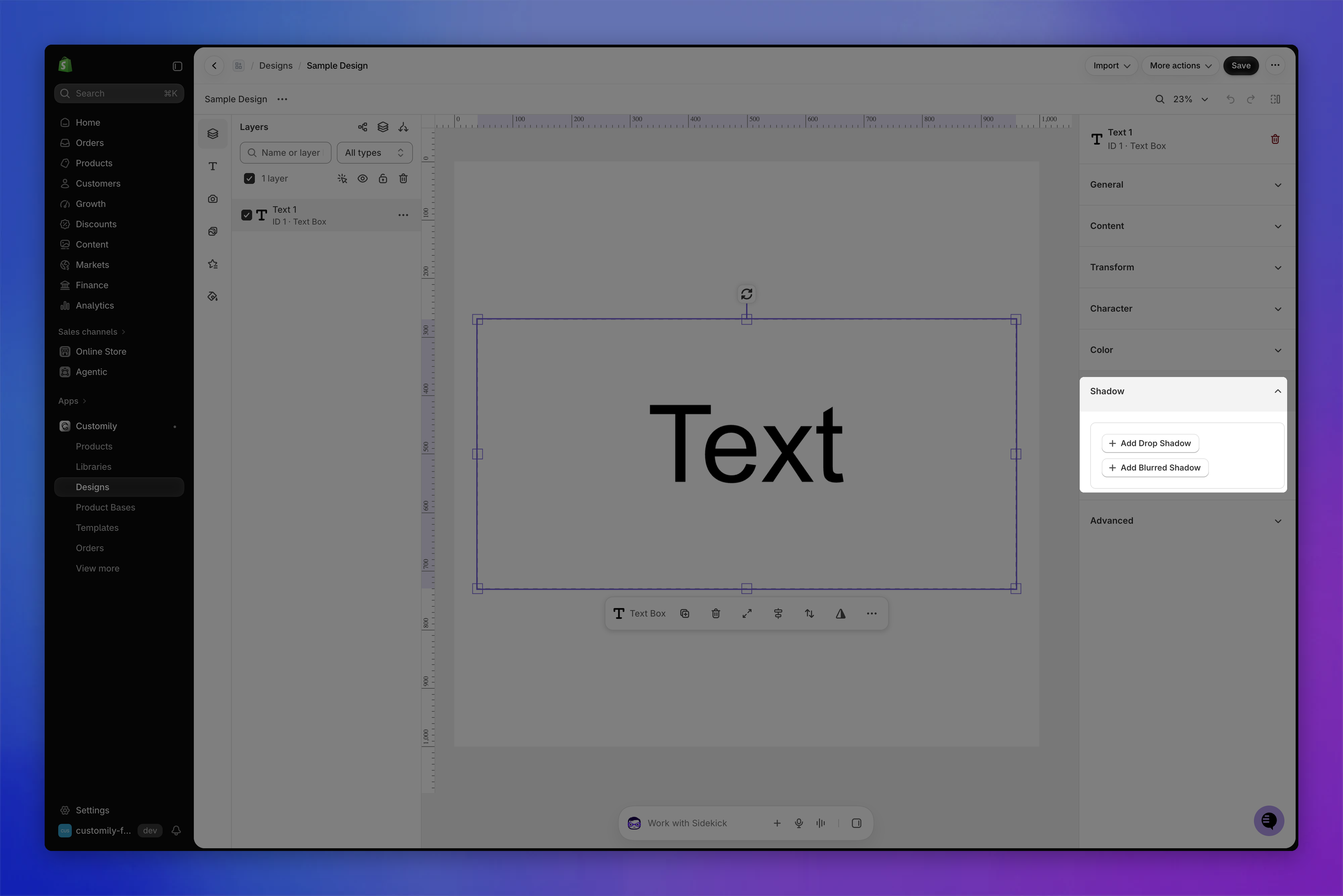
To apply a shadow:
Select the text element.
Expand the Shadow section.
Click Add Drop Shadow or Add Blurred Shadow. You can change the Type later.
Choose the shadow Color.
Adjust the Offset and Angle to position the shadow.
If using a blurred shadow, adjust the Blur under Softness to control how soft it is.
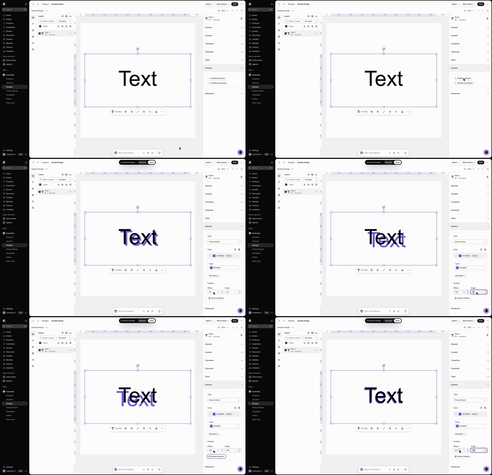
To remove a shadow, click Remove Shadow.
Tip
You can offer multiple shadow colors to shoppers by clicking Add option under the shadow color. For detailed instructions, see 📄 Add multiple color options to text.
Advanced
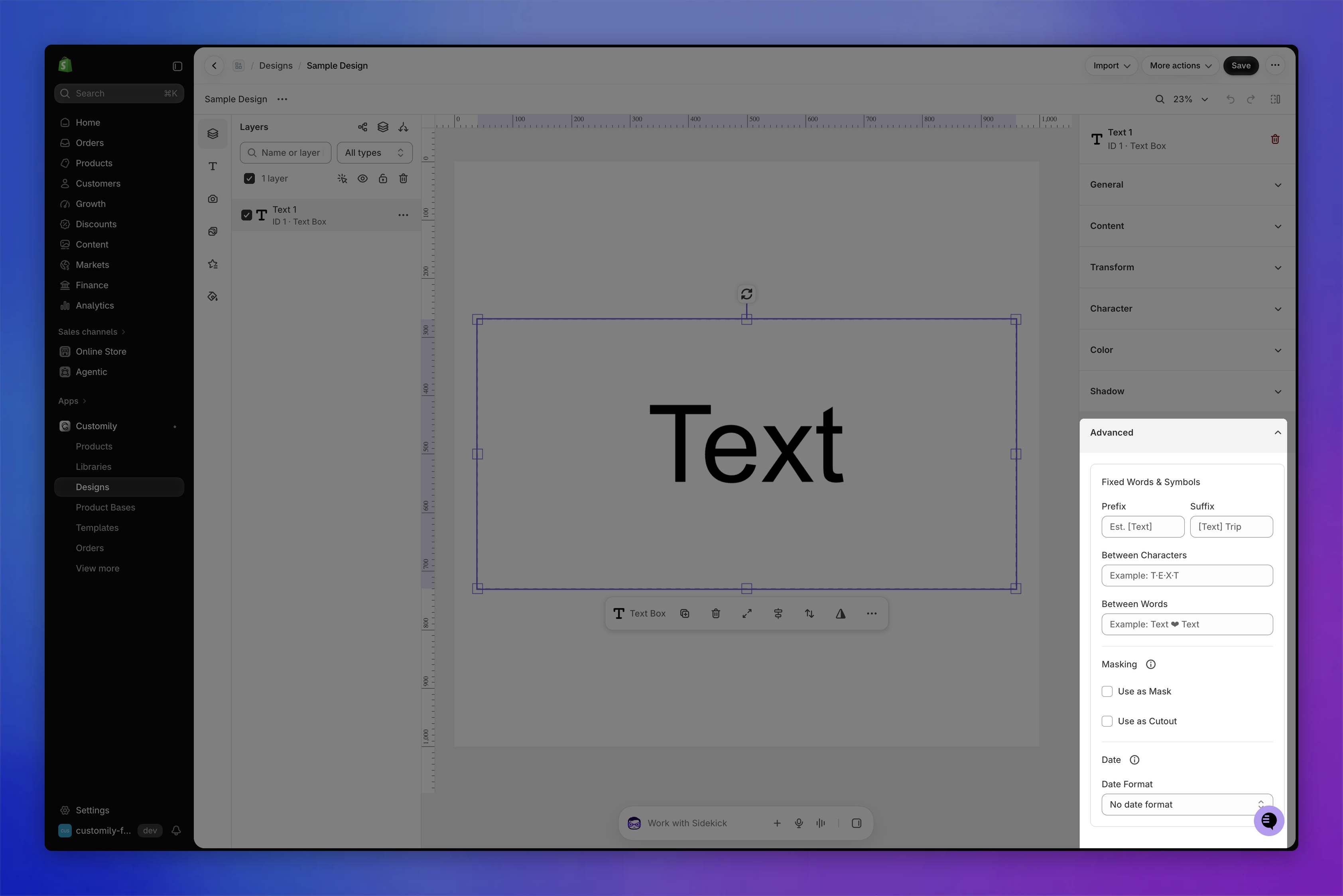
Select the text element and expand the Advanced section to configure fixed words and symbols, masking, and date formatting.
Fixed words and symbols
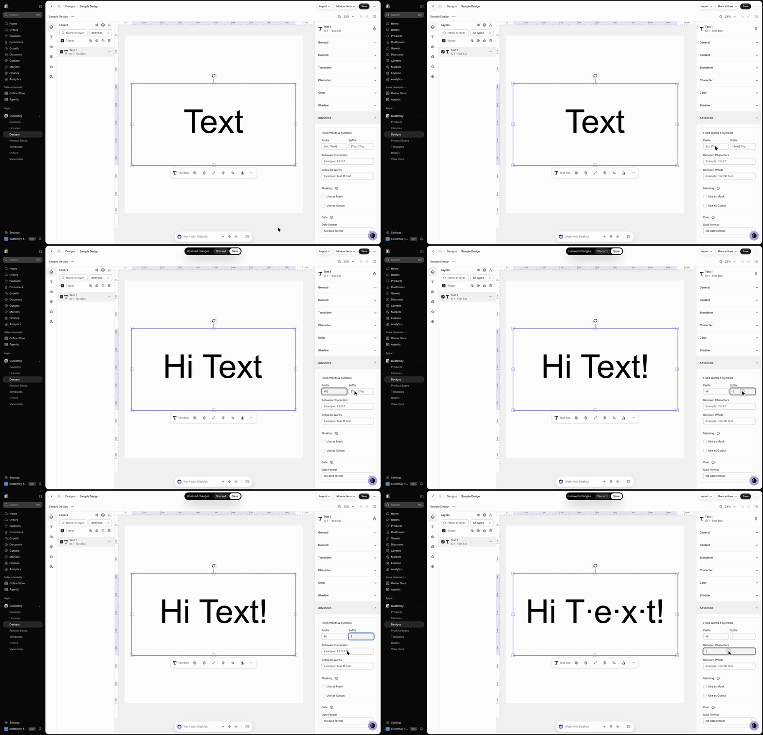
Use these settings to add text or symbols that appear automatically alongside the text entered by the shopper. These additions stay fixed and cannot be edited by the shopper.
Prefix: Adds text or symbols before the personalized text. For example, entering
Est.displays Est. 1985 when the shopper enters "1985".Suffix: Adds text or symbols after the personalized text. For example, entering
Familydisplays Johnson Family when the shopper enters "Johnson".Between Characters: Adds a character or symbol between each letter. For example, entering
·displays J·O·H·N instead of "JOHN".Between Words: Adds a character or symbol between words. For example, entering ♥ displays John ♥ Smith instead of "John Smith".
To add fixed words or symbols:
Select the text element.
Expand the Advanced section.
Enter the text or symbol in the corresponding field.
Uste text as mask
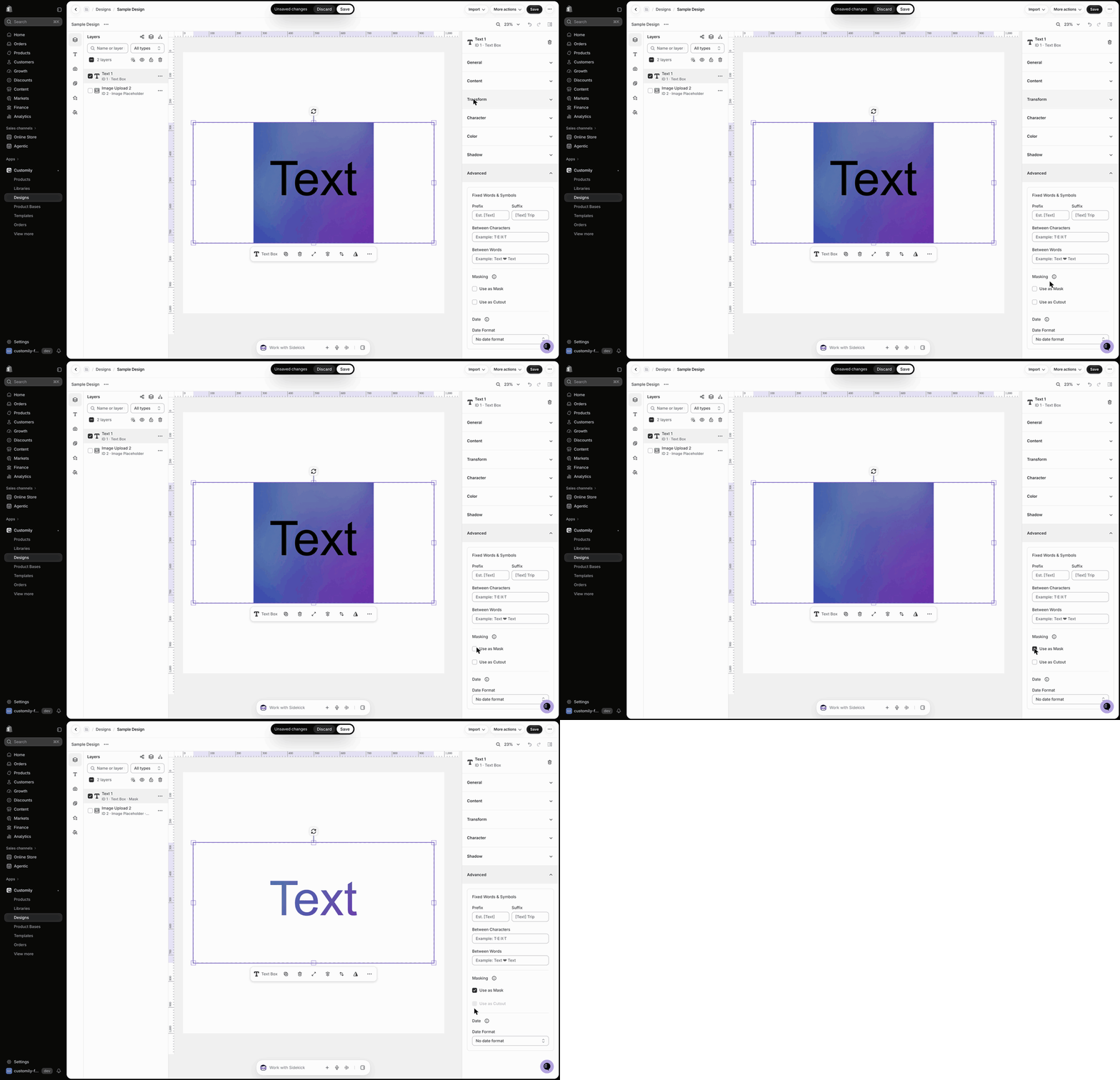
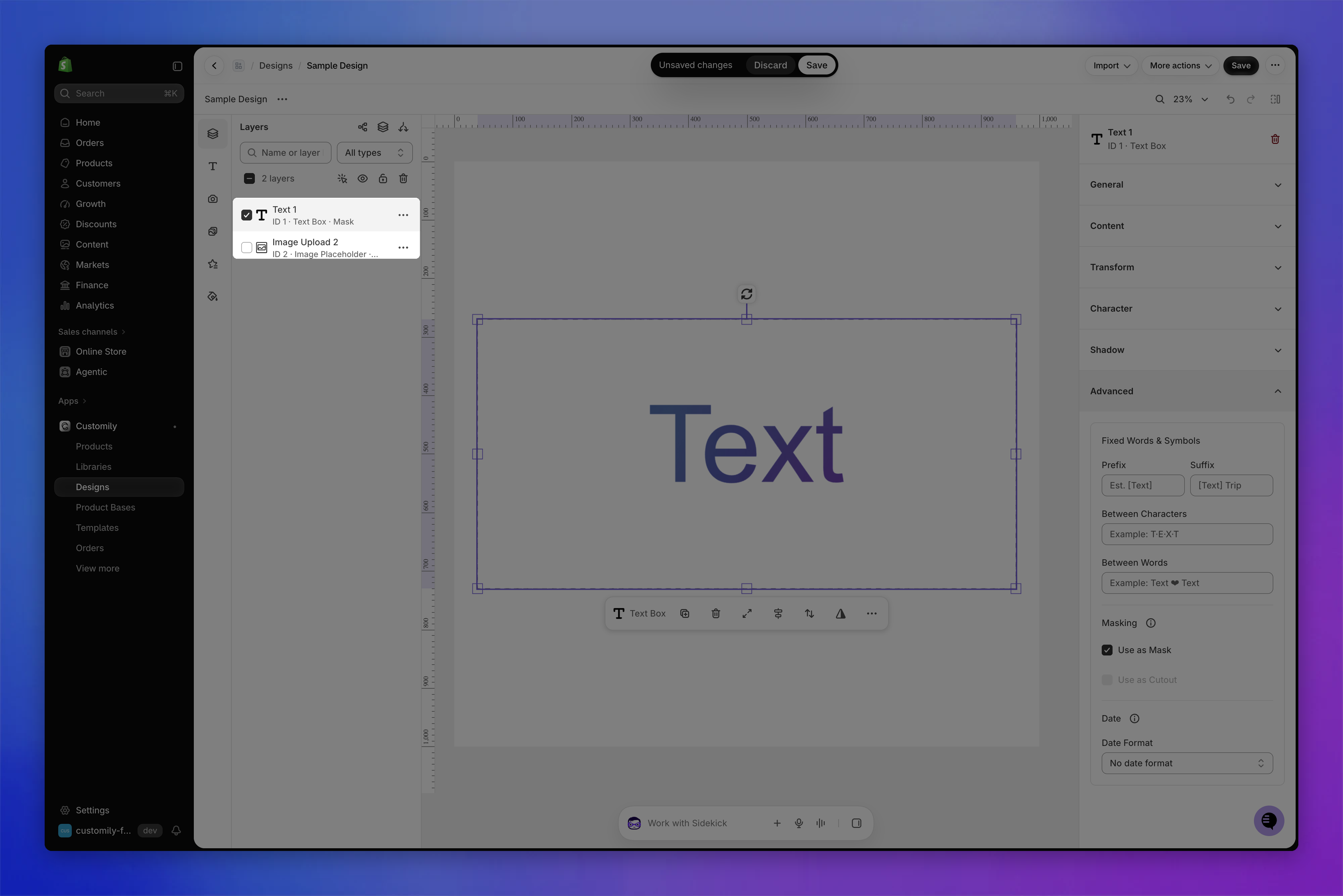
Use this setting to fill text with an image placed behind it. The image is only visible inside the letters, creating effects such as photo-filled names or messages.
To use text as a mask:
Add an image layer beneath the text layer. This can be an image upload (placeholder) or a dynamic image.
Select the text element.
Expand the Advanced section.
Under Masking, enable Use as Mask.
Note
Make sure the image behind the text is at least as large as the text box. If the image is smaller, parts of the text may appear empty because the image doesn't cover the entire text. While a text is used as a mask, its Color section is hidden.
Text layers used as masks show Mask next to their type in the Layers panel, and the image being masked is marked too.
Use text as a cutout
Use Use as Cutout to remove the shape of the text from an image or element behind it, creating a transparent area in the shape of the letters.
This is especially useful for cutout products, such as personalized metal signs, where the letters need to be cut out of the material.
Unlike Use as Mask, which displays an image inside the text, Use as Cutout creates a transparent opening where the text appears. You can only use one of the two at a time.
To use text as a cutout:
Place the text element over the image or element you want to cut out.
Select the text element.
Expand the Advanced section.
Under Masking, enable Use as Cutout.
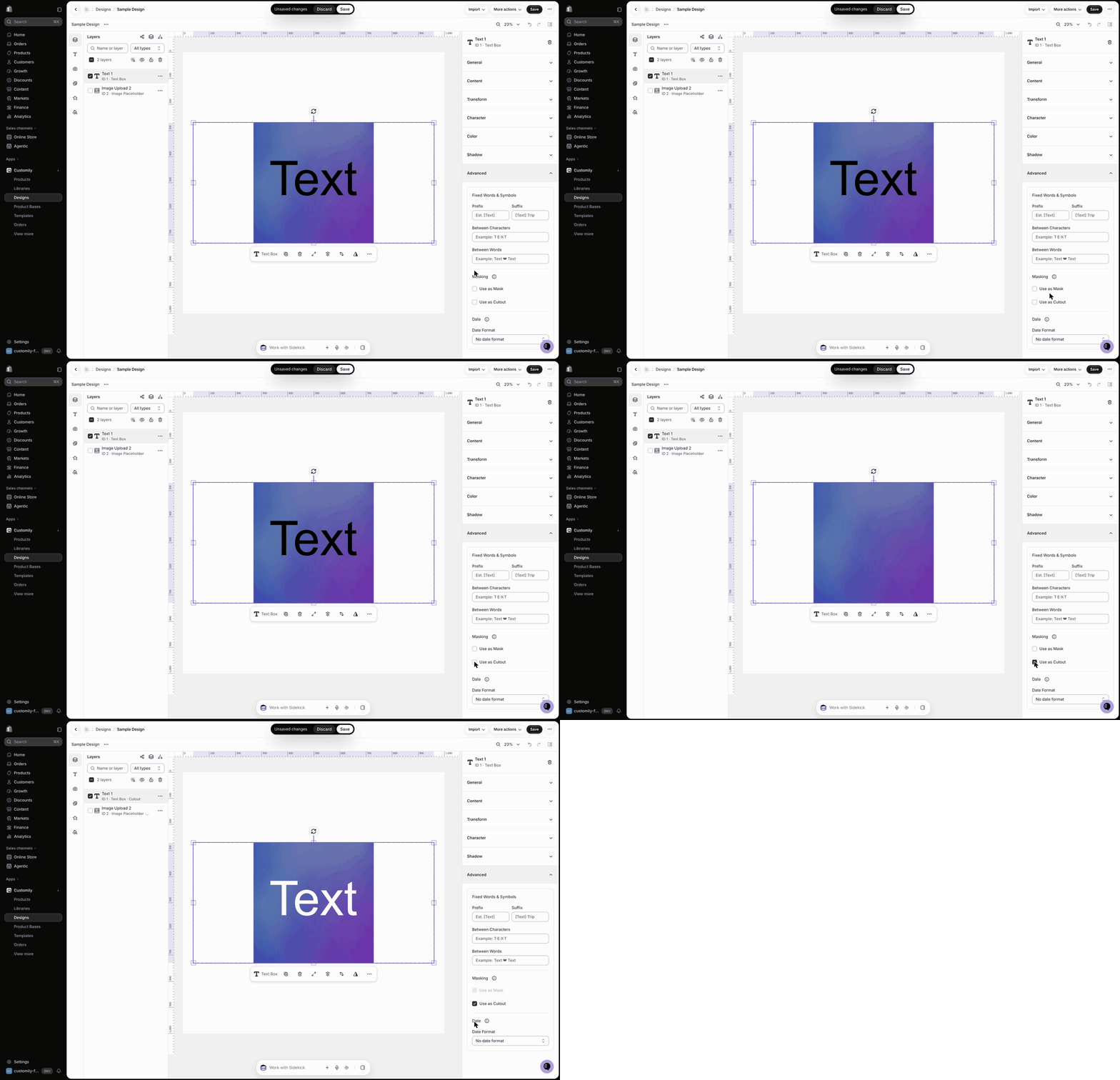
Text layers used as cutouts show Cutout next to their type in the Layers panel.
Date format
Use Date Format to choose how a shopper's selected date appears in a text box.
This setting is used when a Date Picker option is connected to a text element, allowing shoppers to personalize products with dates such as birthdays, anniversaries, or other special occasions.
To set the date format:
Select the text element connected to the Date Picker.
Expand the Advanced section.
Under Date, choose your preferred format from the Date Format list.
To learn how to connect a Date Picker to a text element, see 📄 Date Picker.