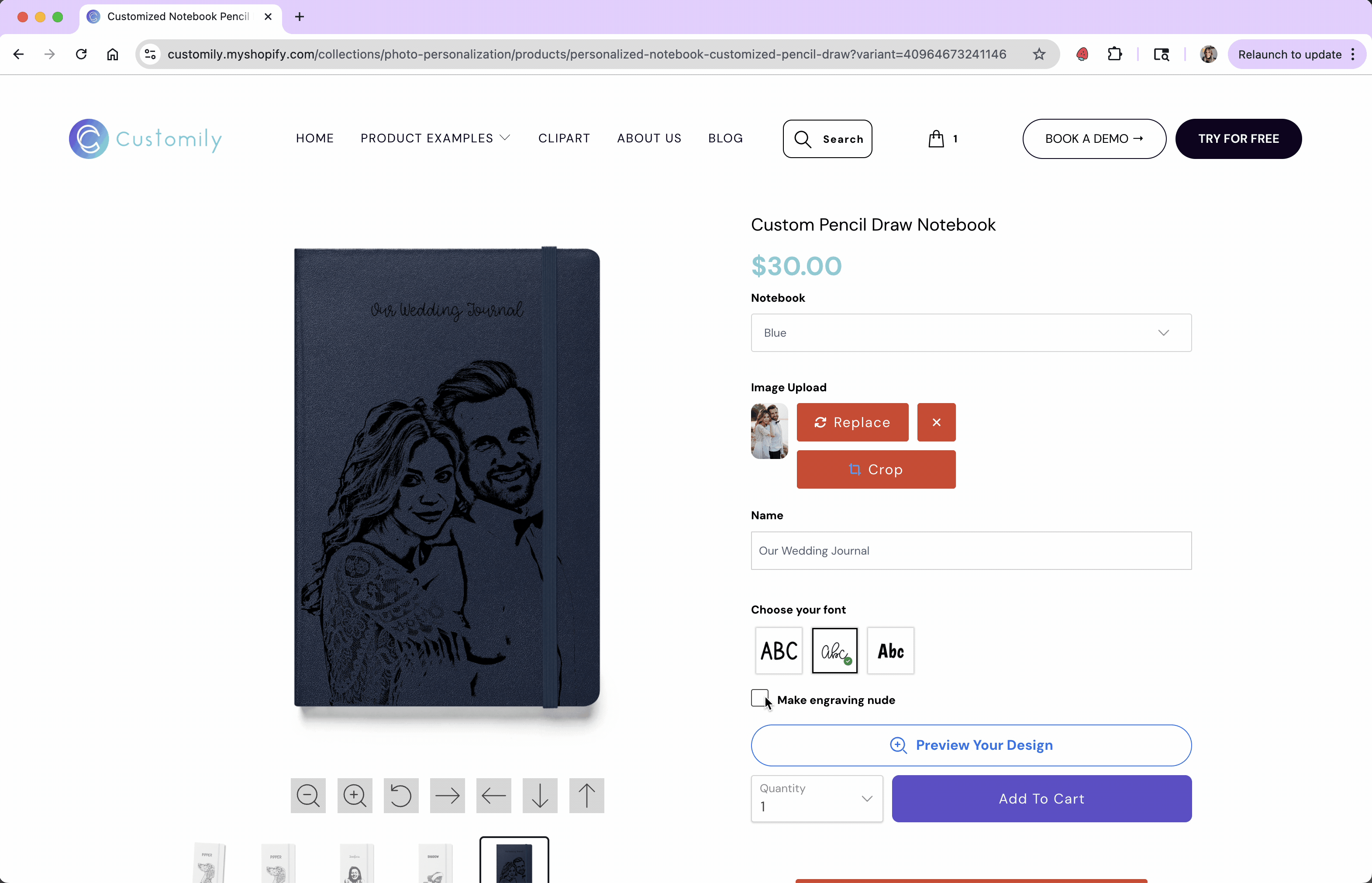
Checkbox
Last updated: April 28, 2026
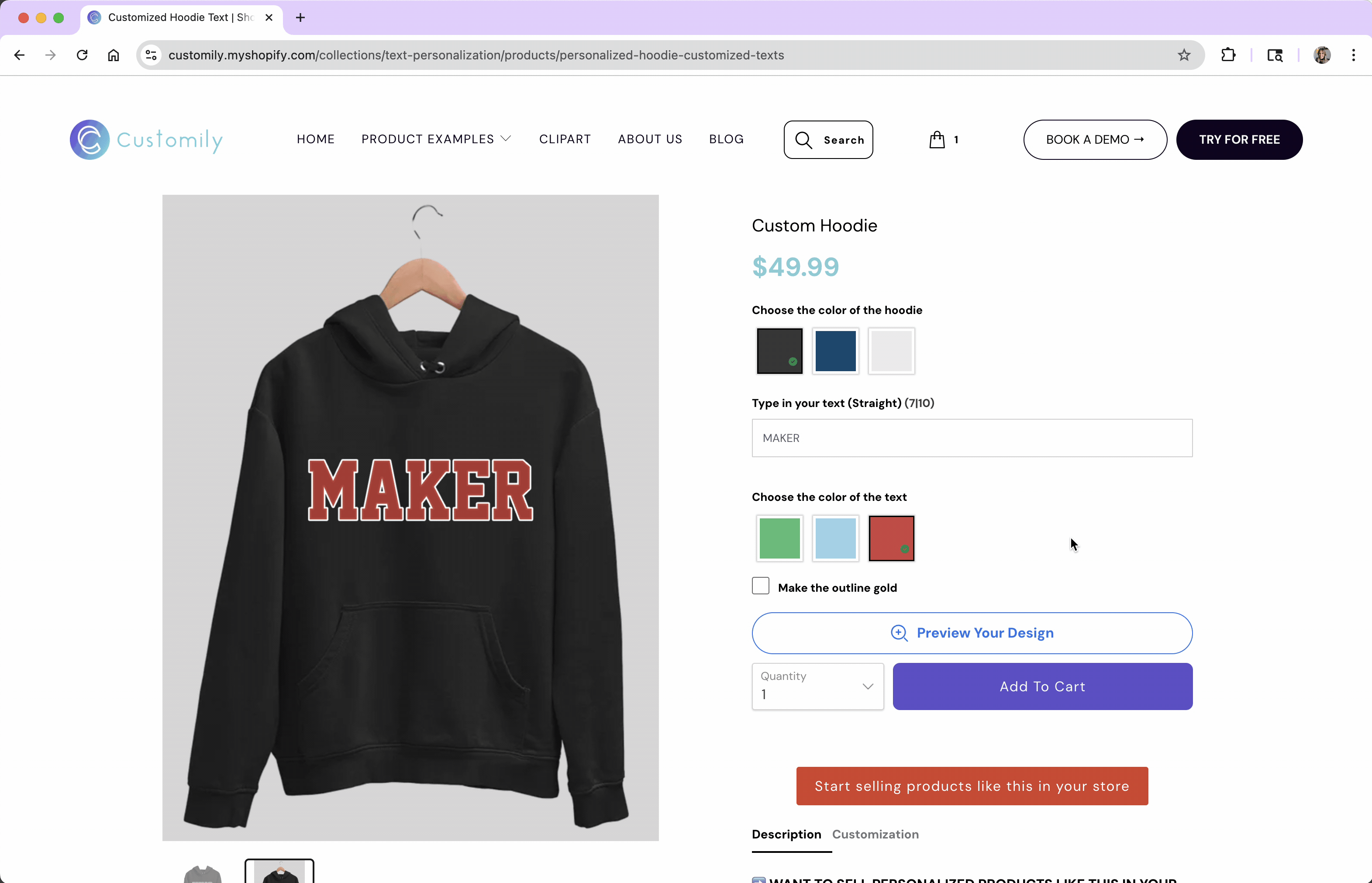
Checkboxes let shoppers turn something on or off in your design. They're perfect for optional features, like adding an accessory, toggling a design detail, or including an extra product in the order.
When a shopper checks the box, a specific personalization is applied. When it’s left unchecked, that change won’t happen — giving you full control over what’s added and when.
Another very common use of a checkbox is to reveal other options in the product, without applying any change to the design itself. For example, if you're designing custom stationery you could have a checkbox to:
“Add return address to the envelopes?”
If checked, a group of fields appears for the shopper to enter their address. If not, those fields stay hidden.
This setup is handled using Conditions, which lets you show or hide additional options based on the checkbox’s value.
All of this can be configured when you determine how the checkbox looks and behaves, and decide how it will be used to personalize.
In this article:
Settings you can configure on a Checkbox
When you select Checkbox as the option type, you’ll be able to configure how the option behaves and appears in your store.
To configure these, expand the option in your Option Set and scroll through the available settings.
Click any item below to jump directly to it:
🛠 Basic Settings
⚙️ Advanced Settings
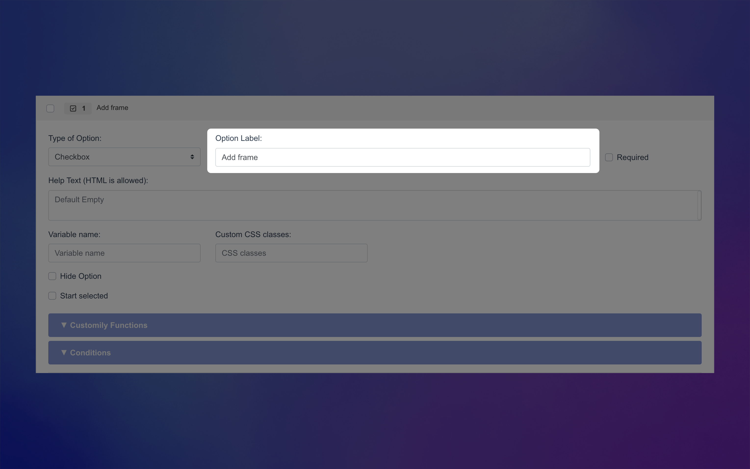
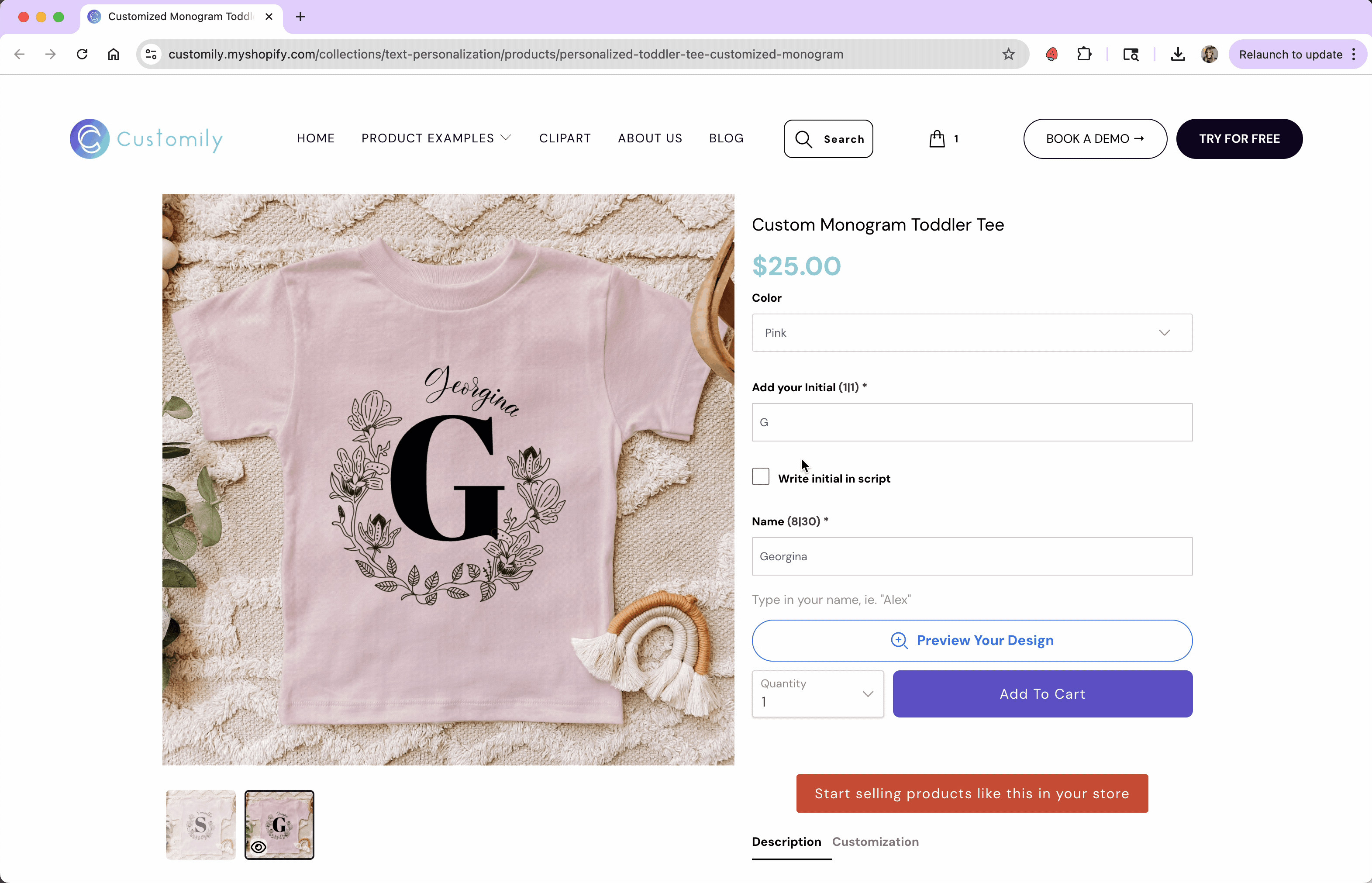
Label
Text that appears next to the checkbox your product page (e.g., “Add frame”)
Required
Make the checkbox mandatory for shoppers to proceed. This is most useful when you want them to confirm something before adding the product to the cart — for example, verifying that their personalization is correct or acknowledging a disclaimer.
An * next to the option label will indicate it is required on the storefront.

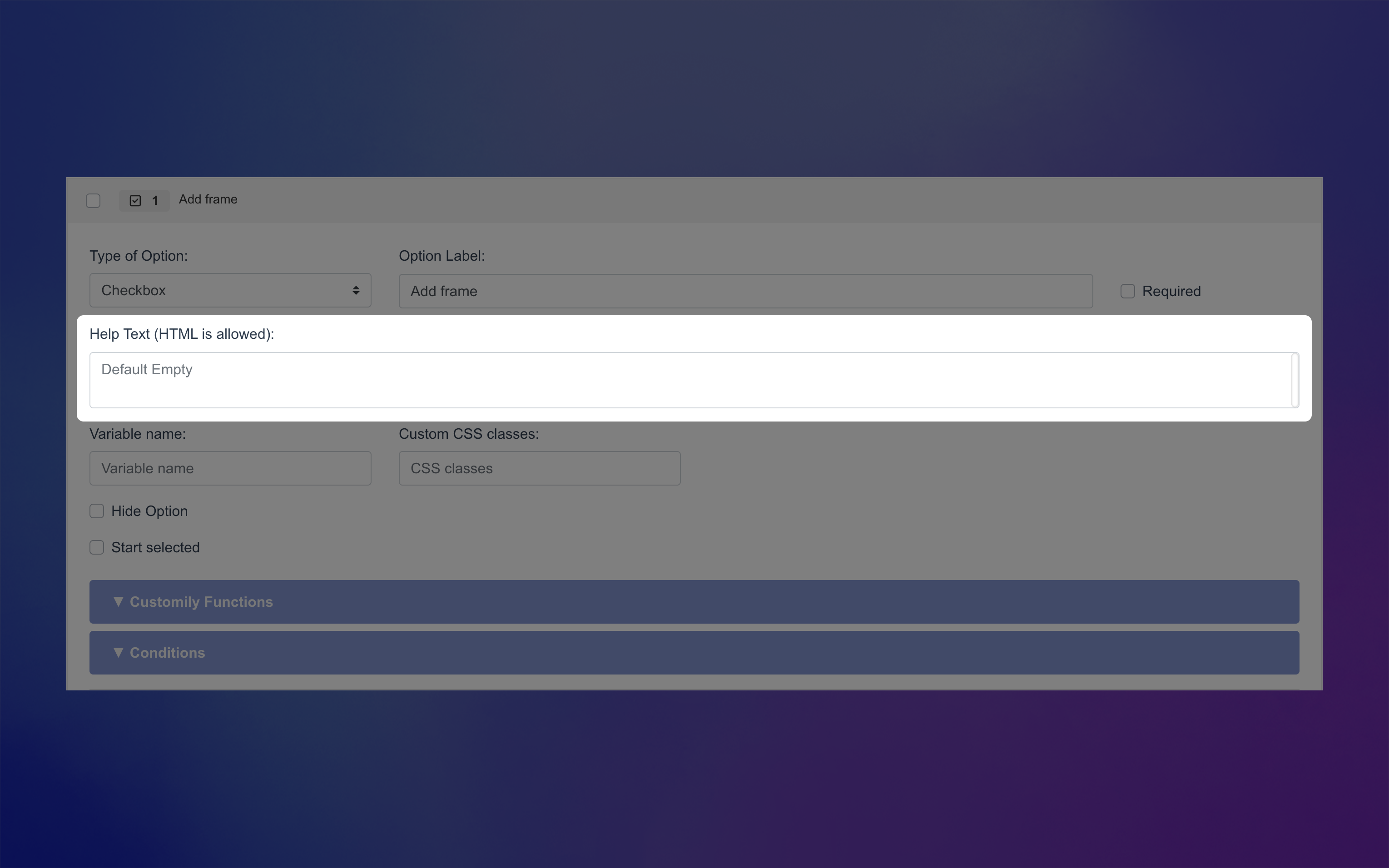
Help Text
Appears below the checkbox label to give shoppers extra guidance or context. This is especially helpful if the label is short and you want to provide details without cluttering the checkbox itself.
For example:
Label: “I confirm that the name and date are correct.”
Help Text: “Please review your personalization carefully — changes can’t be made after purchase.”Label: “Optional gift wrap (+$5)”
Help Text: “Your gift will be wrapped in festive paper and include a blank card.”
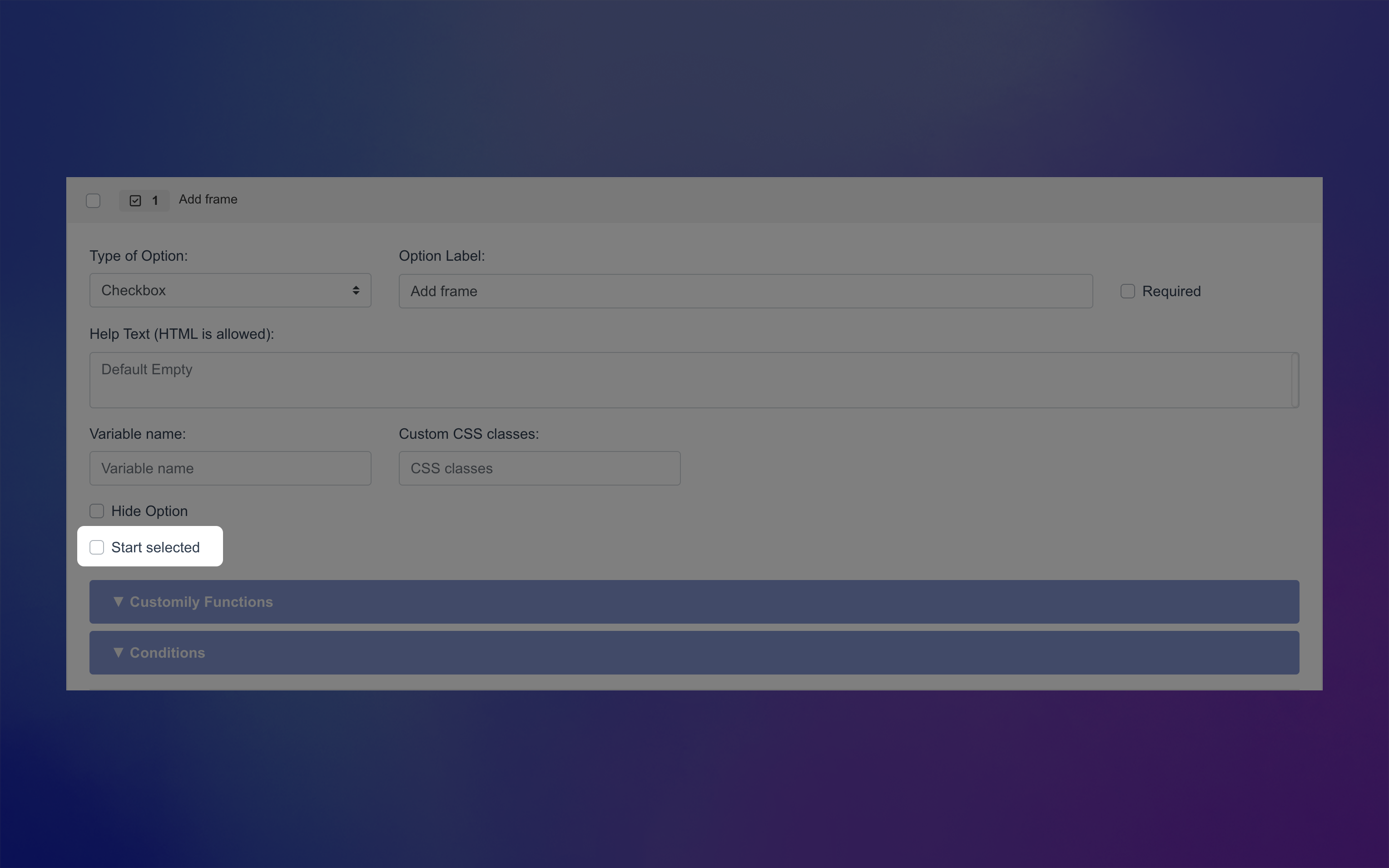
Start Selected (checked by default)
If enabled, the checkbox will be pre-checked when shoppers first see the product.
This is useful if you want a default selection (for example, including an optional feature by default) but still allow shoppers to uncheck it if they don’t want it.
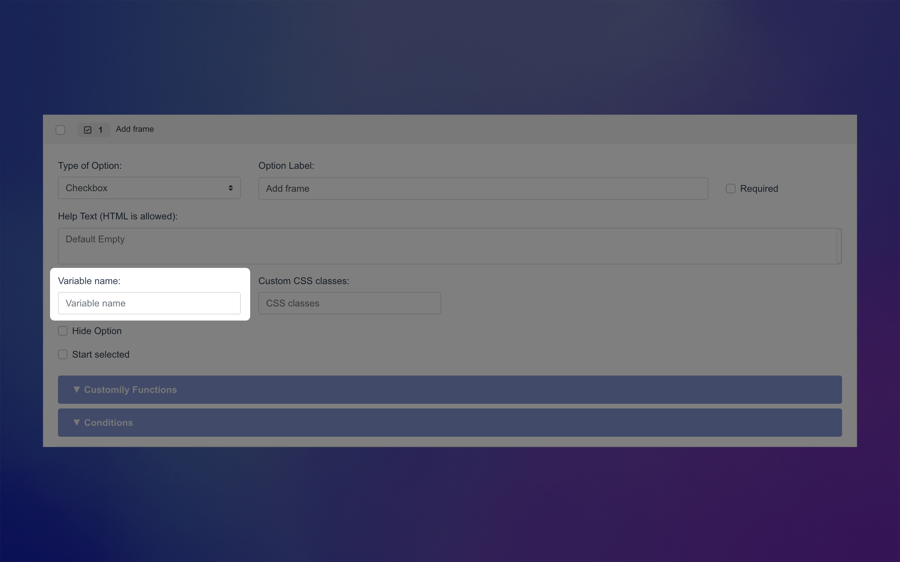
Variable Name (Advanced)
Assign a hidden variable to this option (not visible to shoppers). This allows you to pre-fill it via a URL, useful for marketing campaigns or sharing pre-configured links.
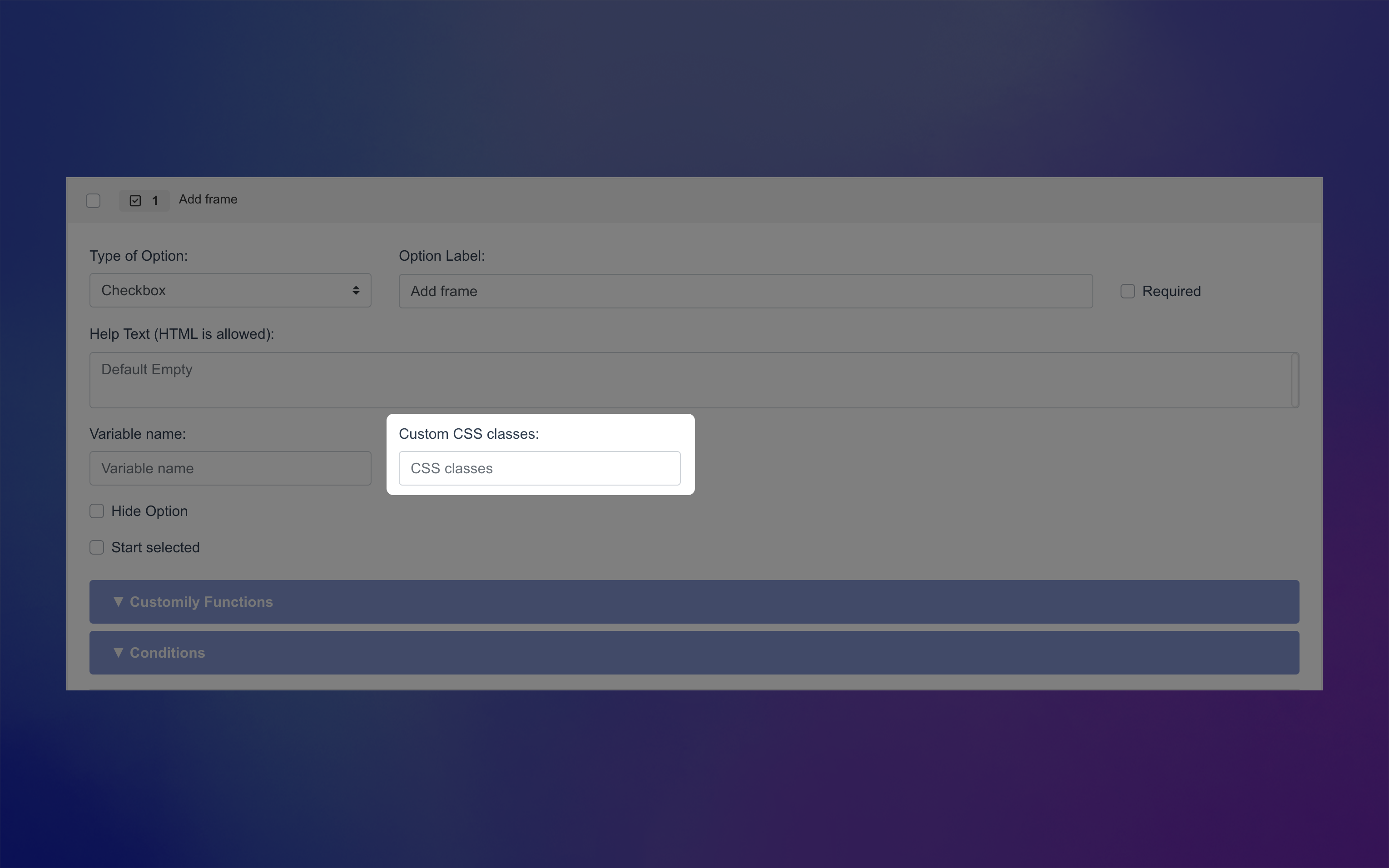
Custom CSS Class (Advanced)
Add a custom class name to target and style this option through CSS in your store’s developer settings.
Hide Option (Advanced)
Hide this option completely from shoppers — helpful when you want to include fixed image in the preview without letting customers change it.

How Checkboxes Can Be Used to Personalize
Checkboxes are great for simple, yes/no choices. A shopper either selects it or leaves it unchecked — and that single choice can trigger personalization in your design.
What the checkbox actually does depends on the function you assign to it. For example, a checkbox can toggle a design element on or off, switch a layout, or add an extra product to the cart.
You can learn more about functions and how they work here.
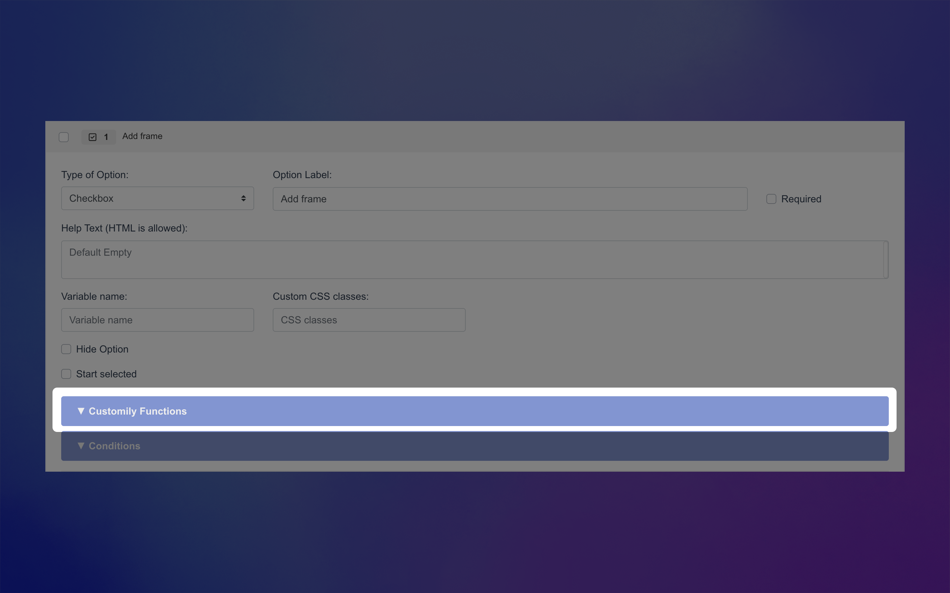
To assign a function to a Checkbox, expand the Function tab of your option and choose how it should interact with your template.
In many cases, checkboxes don’t use a function directly. Instead, they’re often used to hide or show additional options — for example, revealing a set of text fields only if the shopper wants to add a custom message — using conditions.
When you do assign a function, it will define how the checkbox interacts with an element in your design. Here are the functions that work with Checkboxes, click on each one to learn how they can personalize your product:
Text Fill and Outline Color
Updates the fill color or the outline color of a text element to one specific color when the box is checked.
Font Type
Changes the font of a text element to one specific font when the box is checked.
Dynamic Image / Dynamic Vector
Changes a preset image or vector in your design to one specific image or vector when the box is checked.
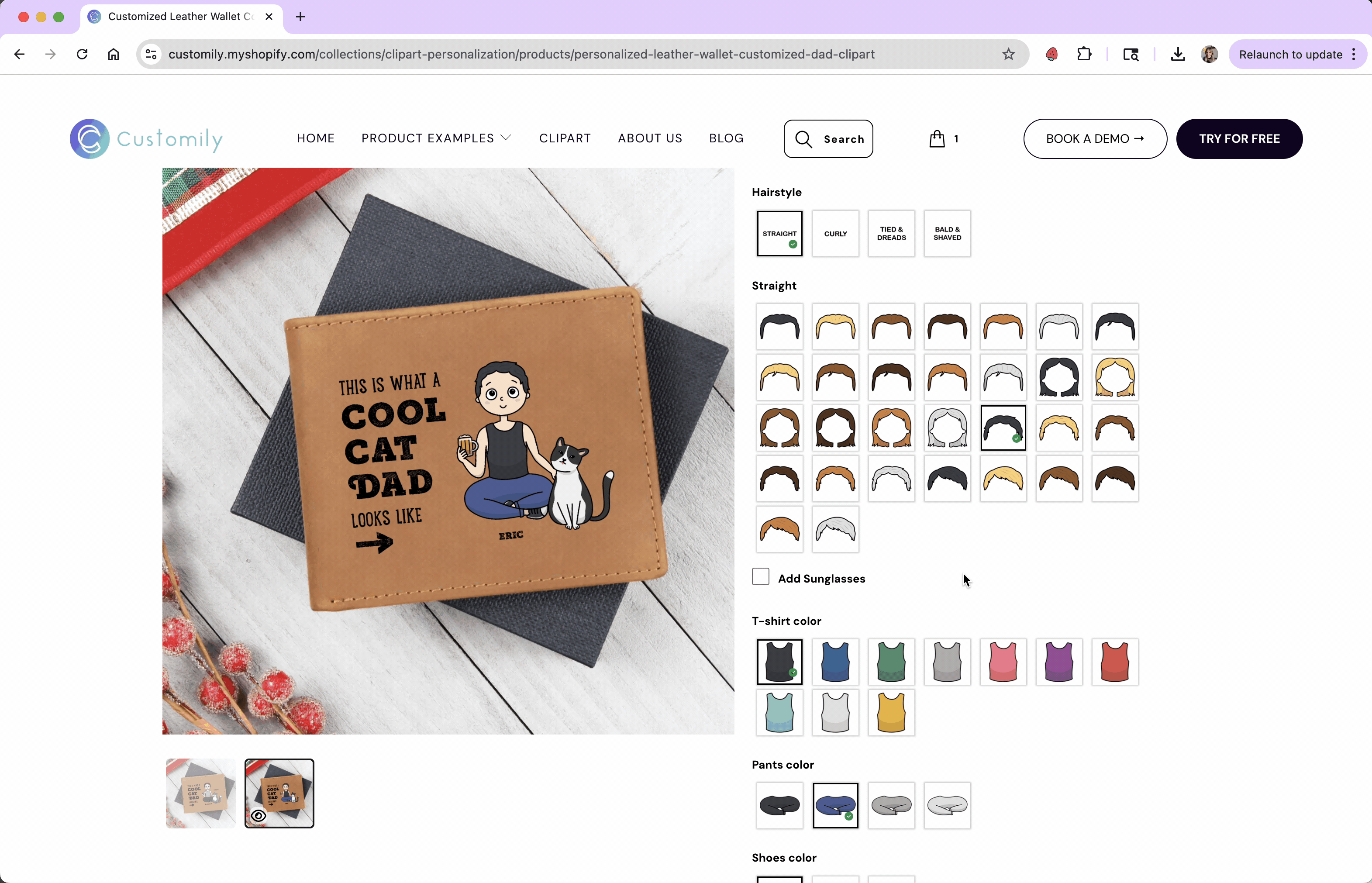
Image Color / Dynamic Vector Color
Changes the color of an Image upload if it is set to Single Color mode, or of a Dynamic Vector in Single Color mode to one specific color when the box is checked.
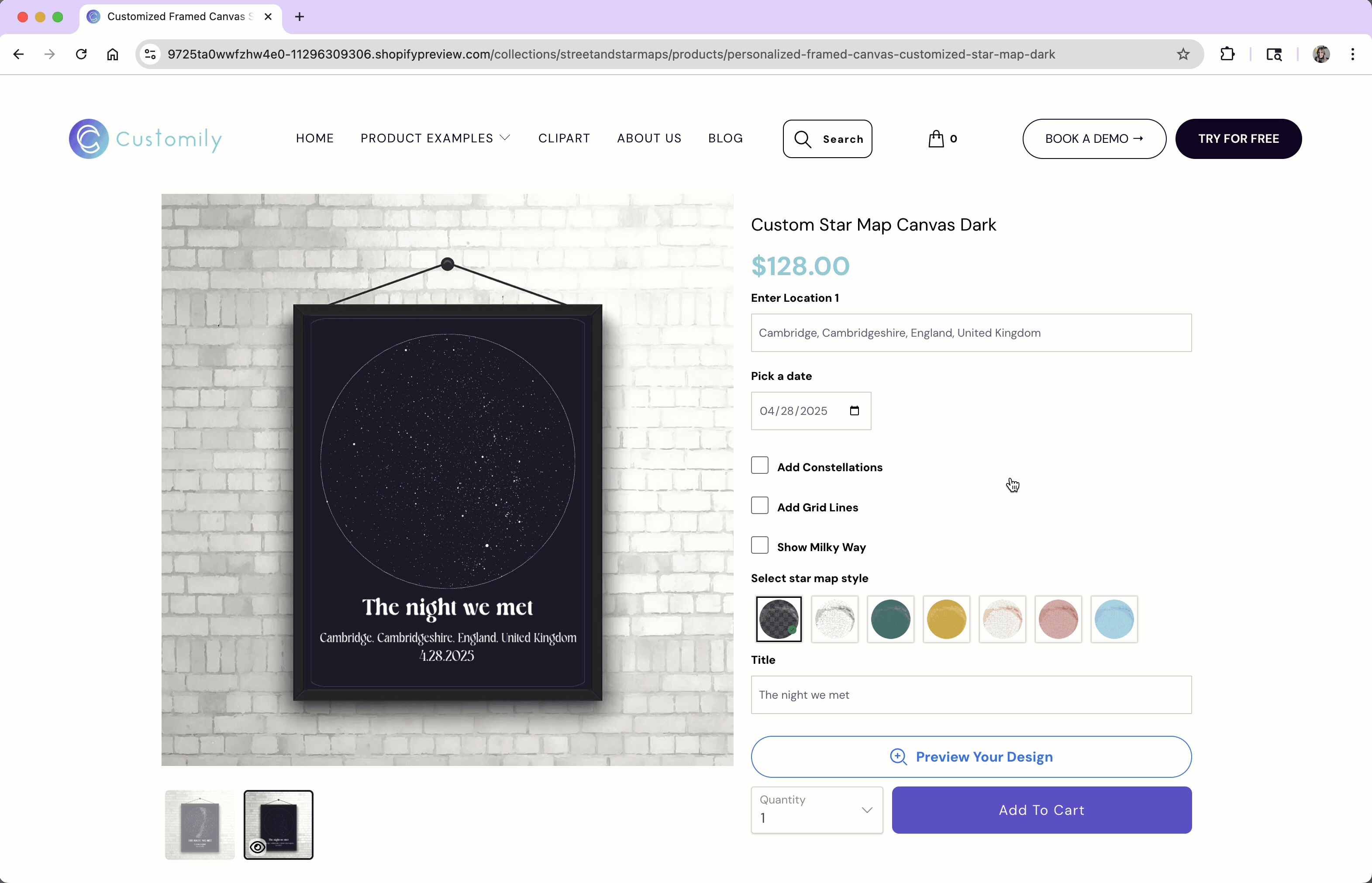
Star Map Display
Toggles optional design aspects of a star map — like the Milky Way, grid lines, or constellation outlines. Use this function to let shoppers decide whether they want these decorative elements included in their star map.
Add Shopify Product
Adds a specific Shopify product to the cart when the box is checked — perfect for upsells like gift wrapping or accessories.