Customize multiple selection swatches
Last updated: October 1, 2026
Multiple Selection Swatches let shoppers select the same or different choices multiple times. Each selection is added to an available slot in the preview, where shoppers can rearrange or remove their selections.
Customize Multiple Selection Swatch styles
Multiple Selection Swatches use the same styles as regular swatches. Depending on the type of swatches used in your option, they inherit either your image and color swatch styles or your text swatch styles, including their size, shape, colors, and other appearance settings.
They also use the same Layout setting that controls whether swatches wrap onto multiple rows or remain in a horizontally scrollable row.
See 📄 Customize swatchesto learn how to configure these styles.
Let shoppers remove selections from swatches
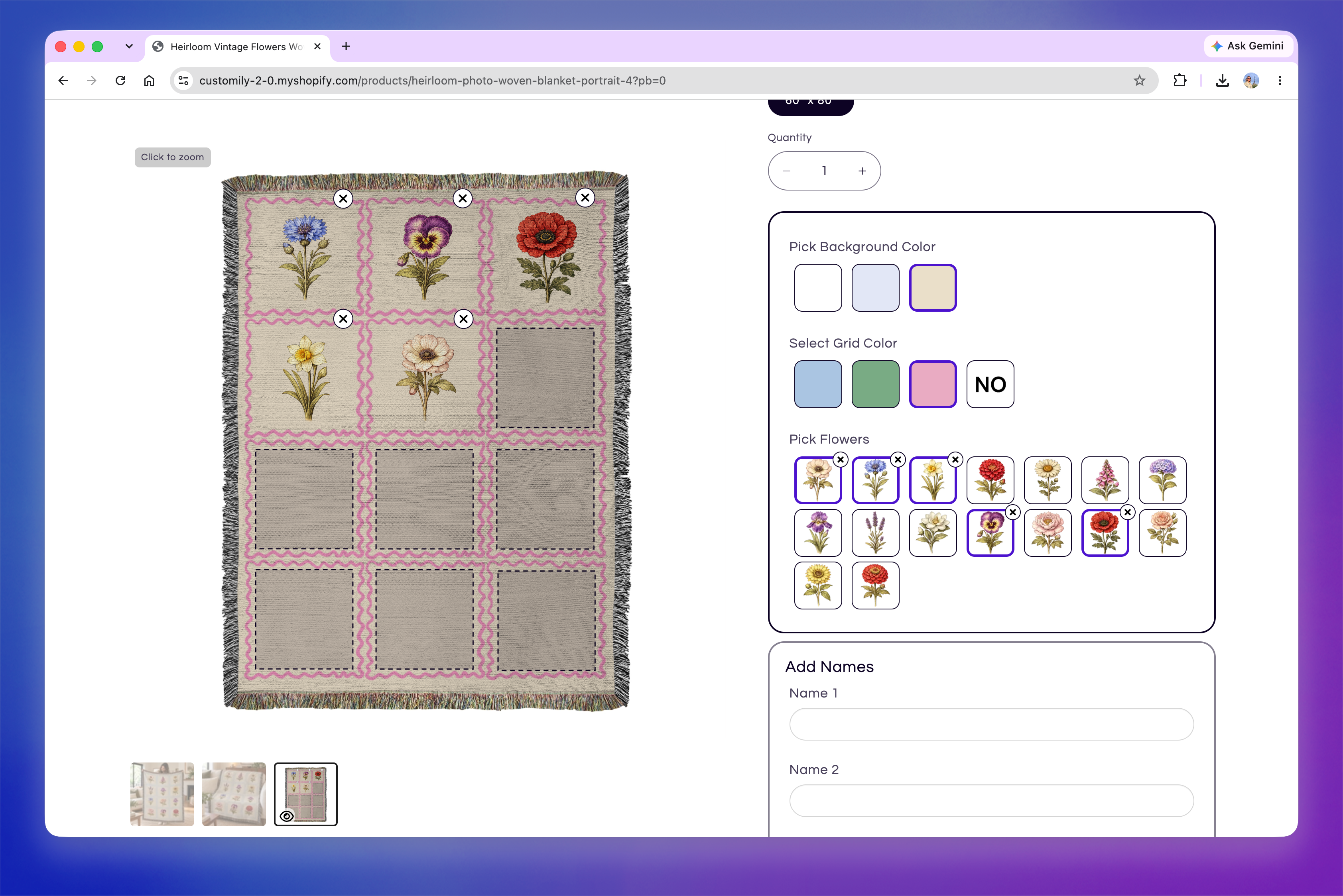
By default, shoppers can remove selections using the delete icon on the corresponding slot in the preview. Selecting the same swatch again doesn't remove it. Instead, it adds another instance of that selection, since Multiple Selection Swatches allow the same choice to be selected multiple times.
If you want shoppers to also remove selections directly from the swatches, go to Store Settings > Styles → Swatch Styles and turn on Allow deleting from Multiselect Swatch Option.
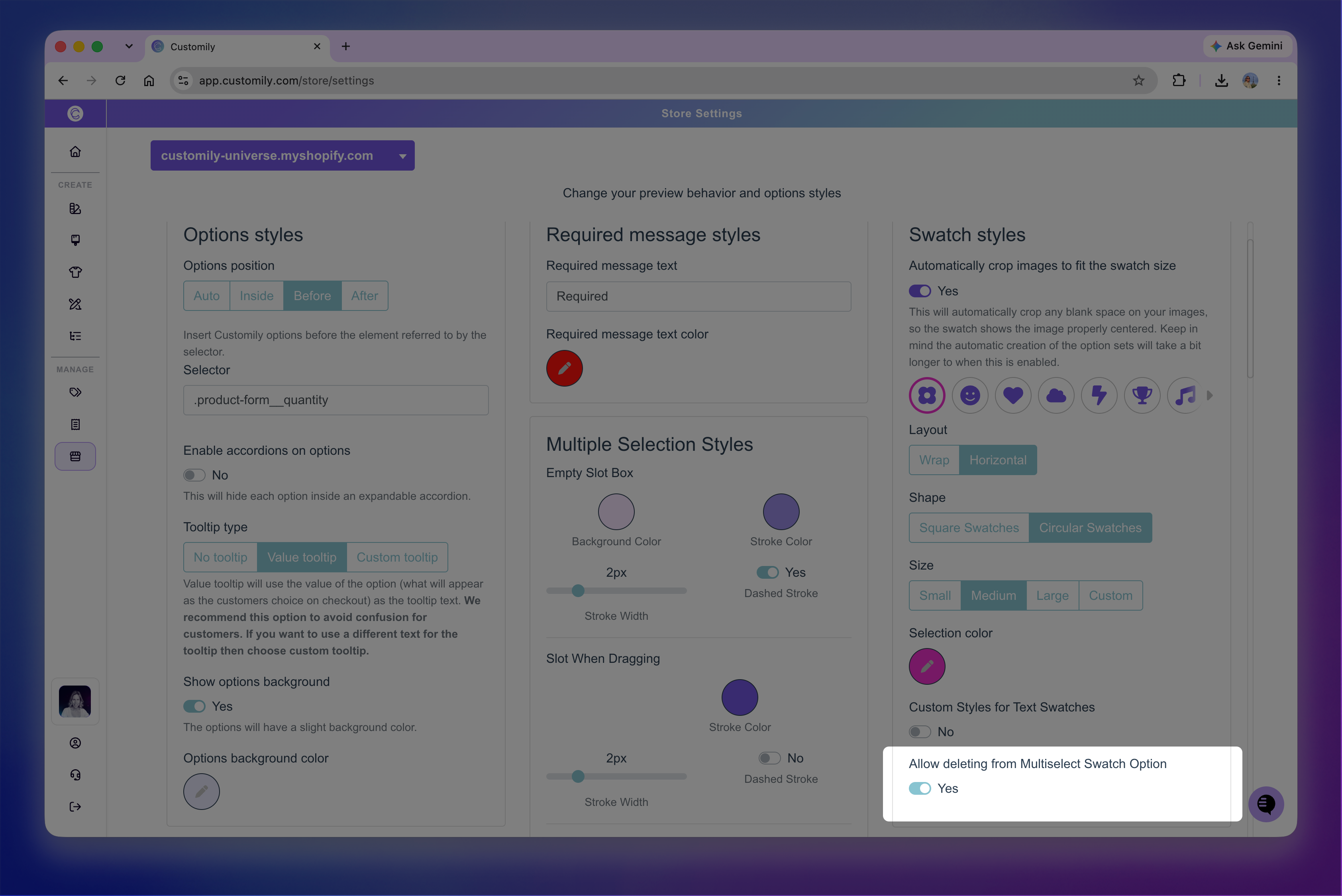
When enabled, an X appears on selected swatches, allowing shoppers to remove an instance of that selection without using the preview.
Customize Multiple Selection slots in the preview
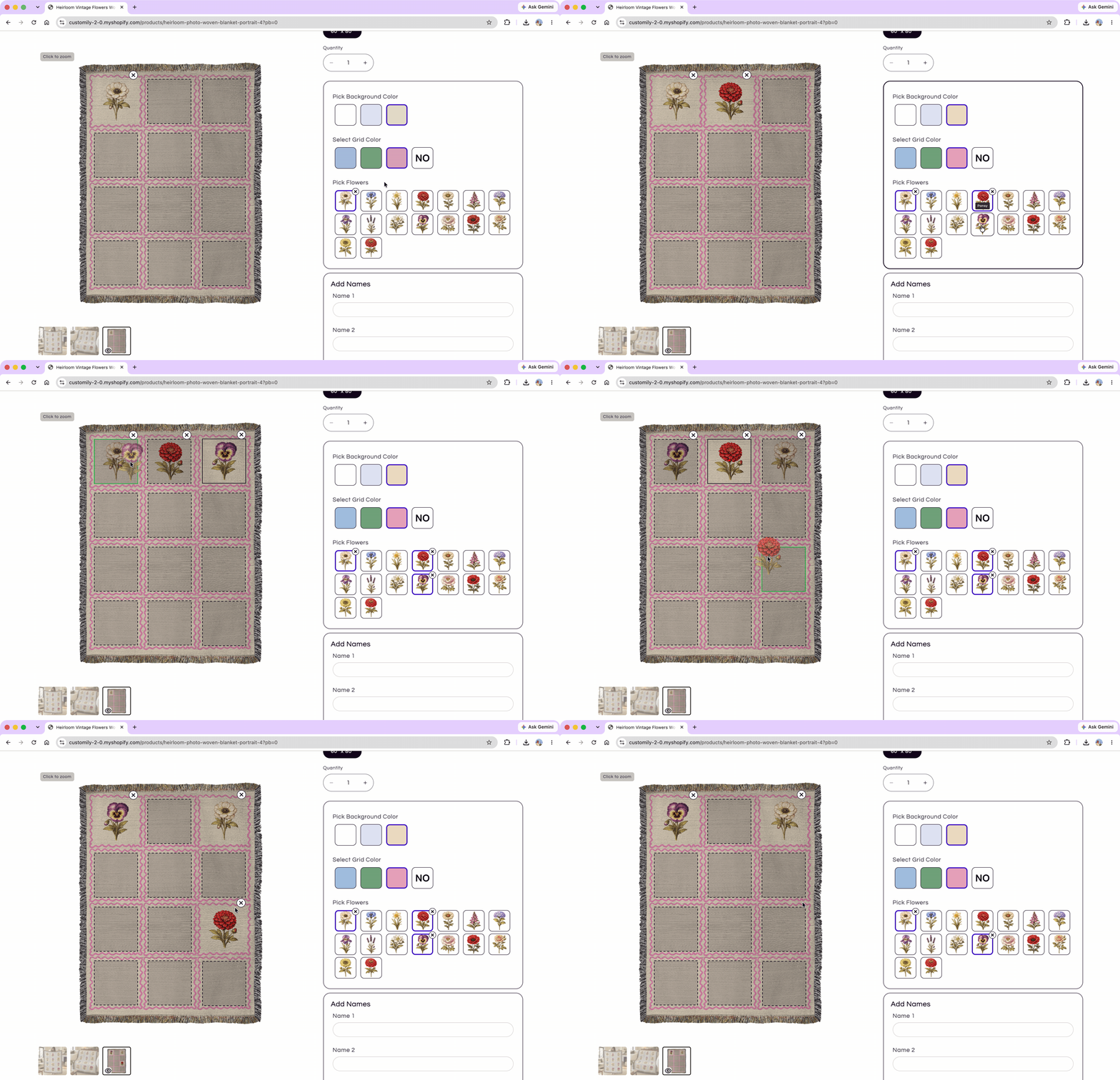
Each Multiple Selection setup contains a number of slots in the preview, with each slot corresponding to a dynamic image in the design. Slots remain empty until a choice is selected.
As shoppers make selections, they fill the available slots. Shoppers can then drag selections between slots to rearrange them, swap selections between occupied slots, or remove them using the delete icon.
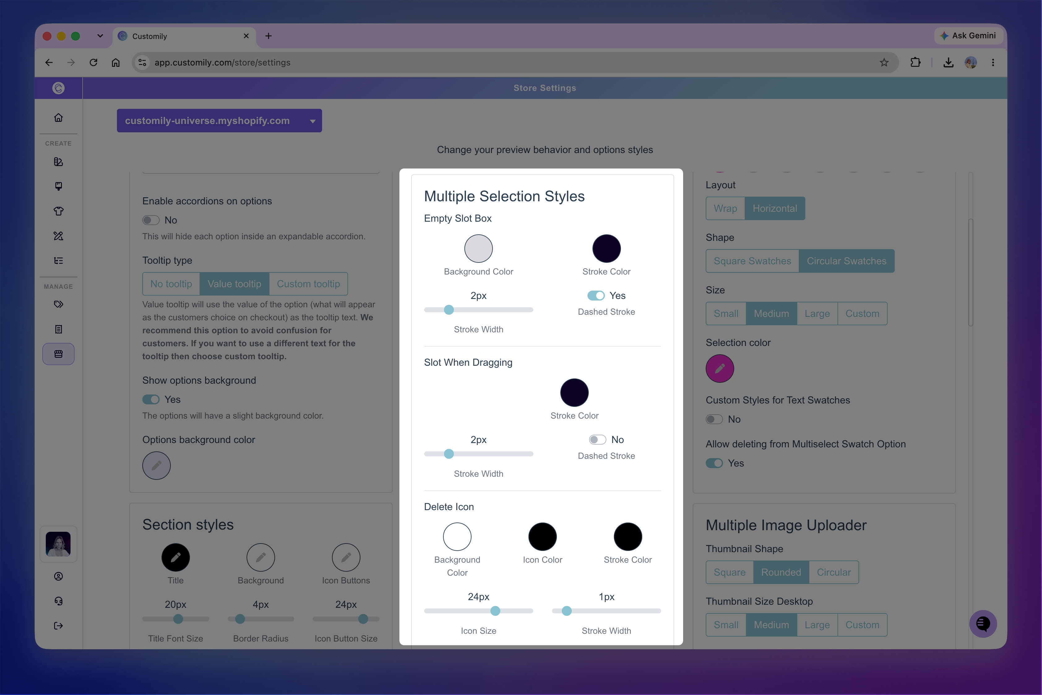
Use Store Settings > Styles → Multiple Selection Styles to customize how the different slot states and controls look.
Customize empty slots
Use Empty Slot Box to customize how slots look before a selection is added.
You can customize:
Background Color: Changes the background color of empty slots.
Stroke Color: Changes the border color.
Stroke Width: Changes the thickness of the border.
Dashed Stroke: Displays the border as a dashed line.
Tip
Use a background color with some transparency so empty slots don't cover the preview underneath. If you don't want a background at all, set the opacity of Background Color to 0%.
Customize slots while dragging
Use Slot When Dragging to customize how the active slot looks while a shopper is dragging a selection across the preview.
You can customize:
Stroke Color: Changes the border color of the active slot.
Stroke Width: Changes the thickness of the border.
Dashed Stroke: Displays the border as a dashed line.
Customize the delete icon
Use Delete Icon to customize the delete button displayed on filled slots in the preview.
You can customize:
Background Color: Changes the background color of the delete button.
Icon Color: Changes the color of the x.
Stroke Color: Changes the button's border color.
Icon Size: Changes the size of the x.
Stroke Width: Changes the thickness of the button's border.