Customize sections and navigation
Last updated: September 29, 2026
If your Option Set uses sections to organize personalization options into steps, you can customize how those sections behave, how shoppers navigate between them, and how they look on your storefront.
Note
The settings in this article only affect Option Sets that use sections.
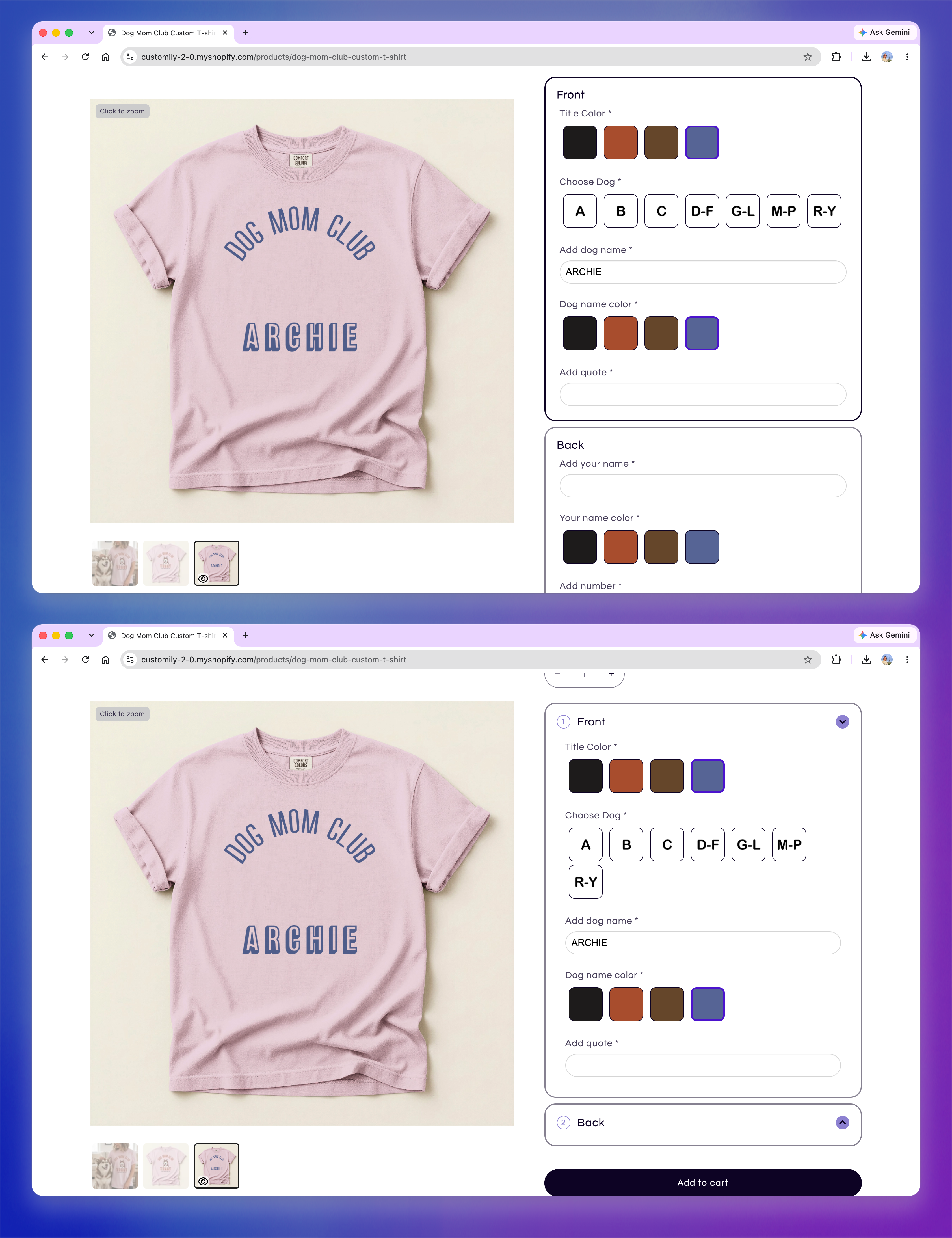
Display sections as accordions
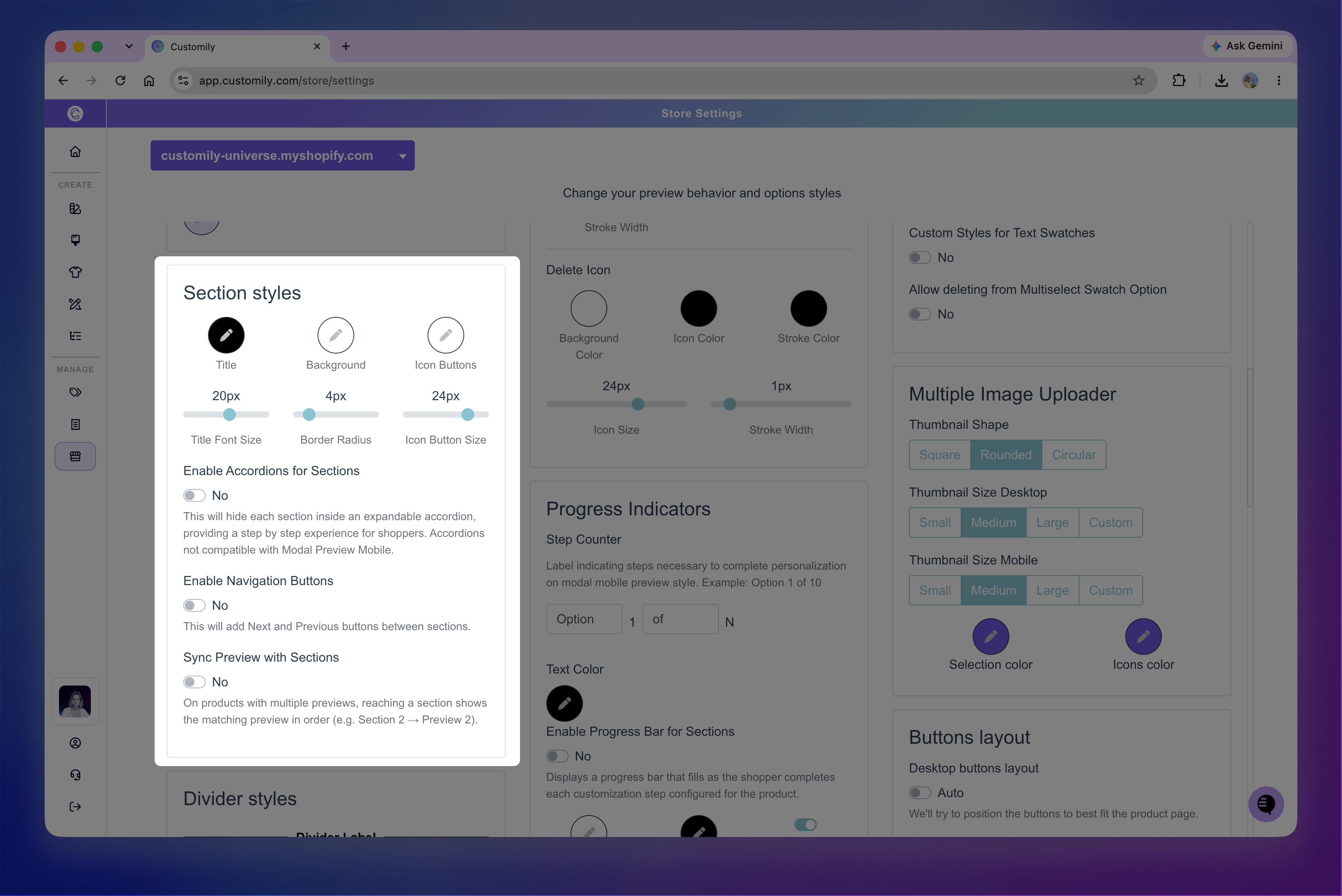
Go to Store Settings > Styles, then turn on Enable Accordions for Sections to make each section collapsible.
The first section starts expanded, while the remaining sections display only their titles. When a shopper opens another section, the current one collapses, so only one section is expanded at a time.
Note
Section accordions don't apply to Modal Preview on mobile. This experience already guides shoppers through personalization step by step. If your Option Set uses sections, shoppers move through one section at a time instead of one option at a time.
Add navigation buttons between sections
Turn on Enable Navigation Buttons to add Next and Previous buttons that guide shoppers through the sections of the personalization form.
The first section displays Next, sections in between display both buttons, and the last section displays Previous.
How the sections behave depends on whether you're also using section accordions.
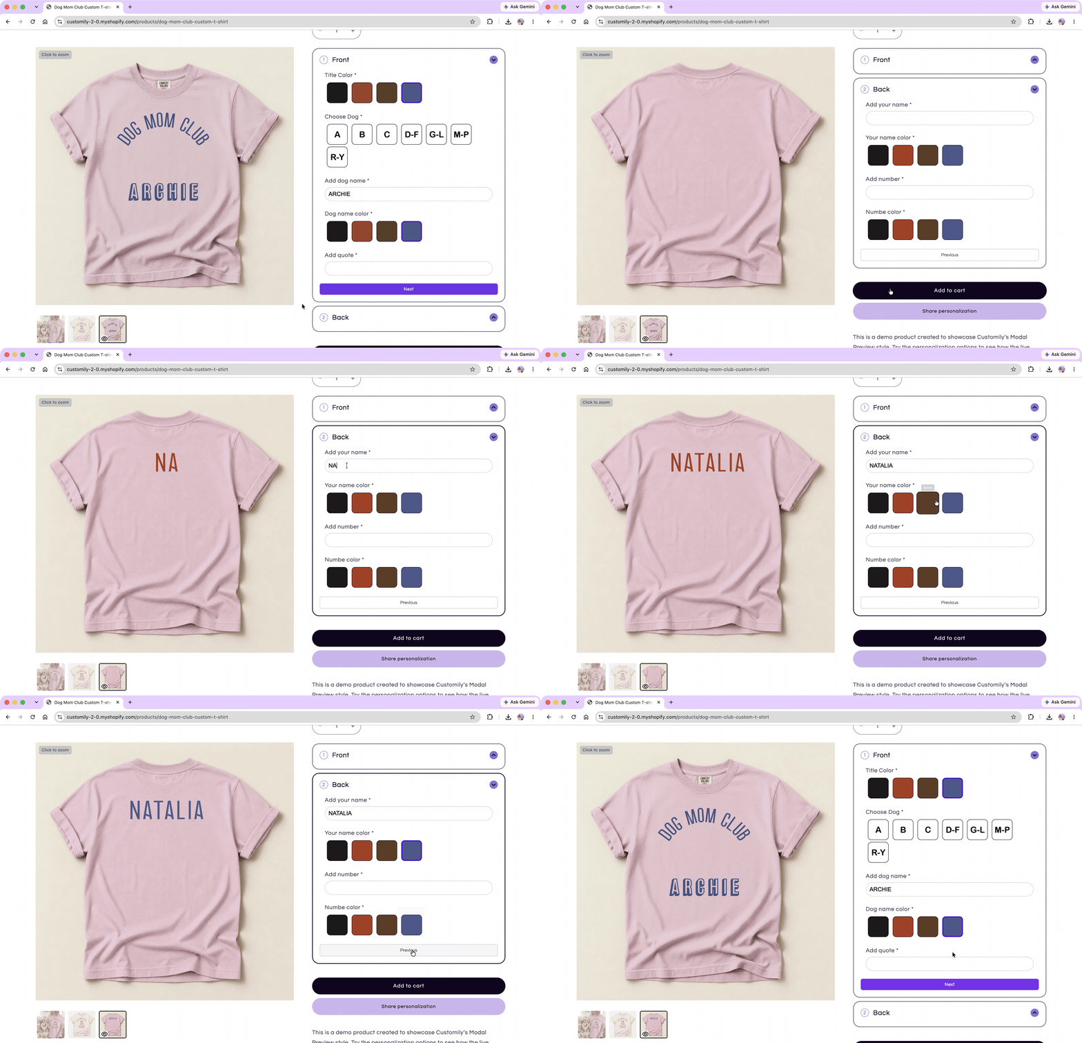
With section accordions
When Enable Accordions for Sections is turned on, selecting Next or Previous collapses the current section and expands the corresponding section.
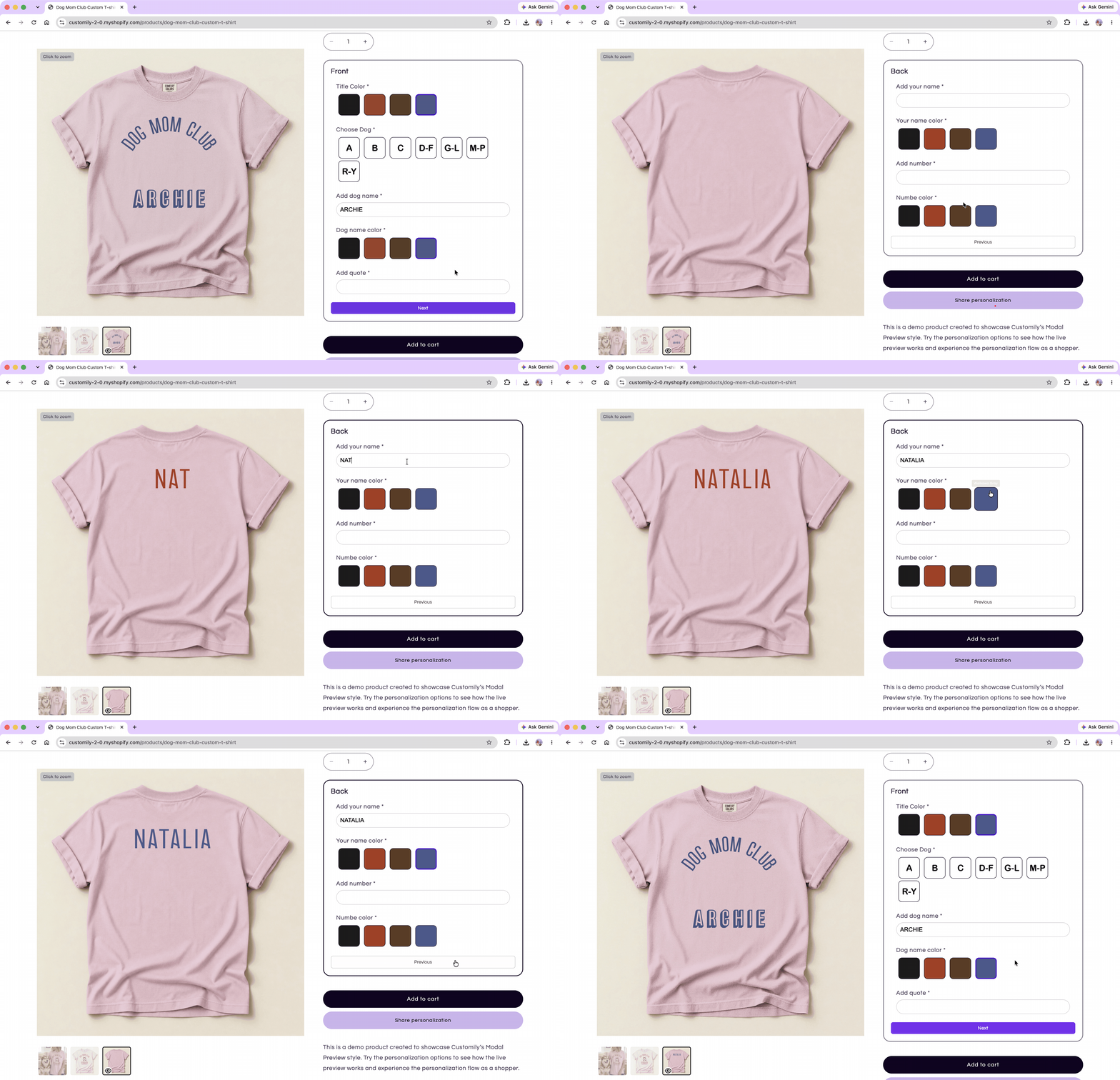
Without section accordions
When navigation buttons are used without section accordions, only one section is displayed at a time. Shoppers use Next and Previous to move through the personalization flow.
Note
Shoppers can move between sections without completing required options. Required options are validated when they try to add the product to their cart.
Customize the appearance of sections
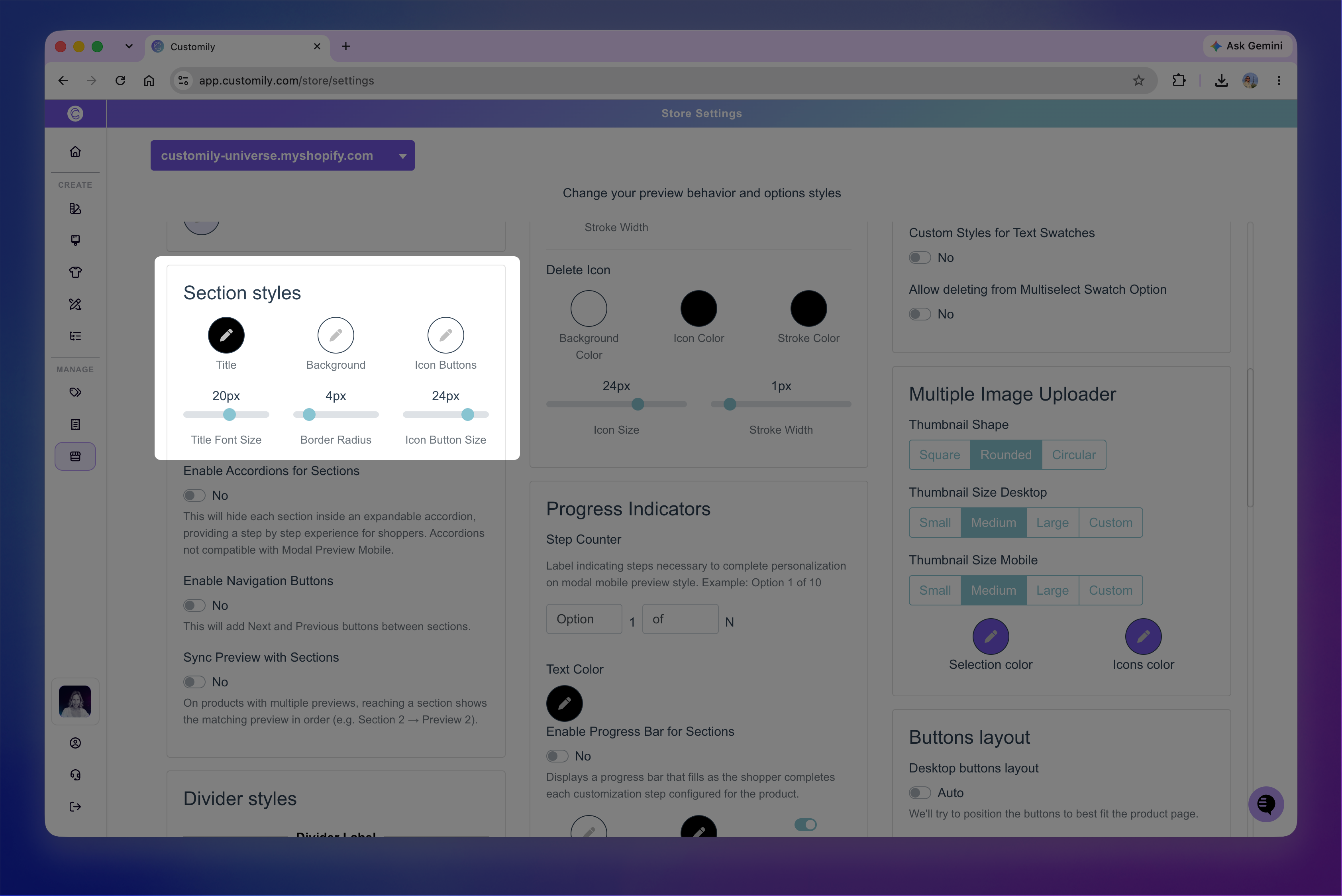
Go to Store Settings > Styles to customize how sections appear on your storefront.
You can adjust:
Title color: Changes the color of section titles.
Background color: Adds a background color to each section.
Title Font Size: Changes the size of section titles.
Border Radius: Controls how rounded the corners of each section are.
Icon Buttons color: Changes the color of the numbered icons and expand/collapse arrows used with section accordions.
Icon Button Size: Changes the size of these icons.
Sync sections with the preview
If your product has multiple previews, turn on Sync Preview with Sections to coordinate each section of your Option Set with a preview. This is useful when different sections personalize different views of the product, such as the front and back.
Go to Store Settings > Styles, then turn on Sync Preview with Sections.
Customily matches sections and previews based on their order:
The first section displays the first preview.
The second section displays the second preview.
The third section displays the third preview, and so on.
The order is always sequential, so you can't assign a section to a different preview.
When shoppers see one section at a time, such as when using section accordions or navigation buttons, the preview changes as they move between sections.
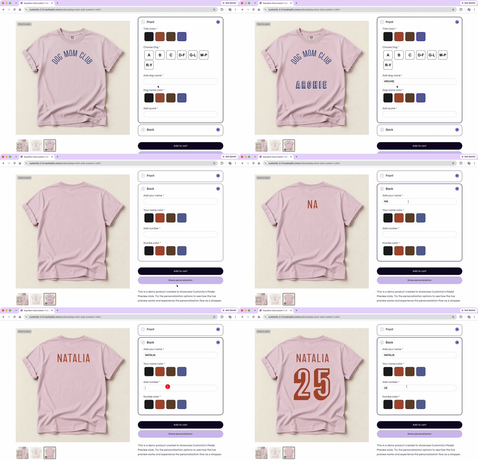
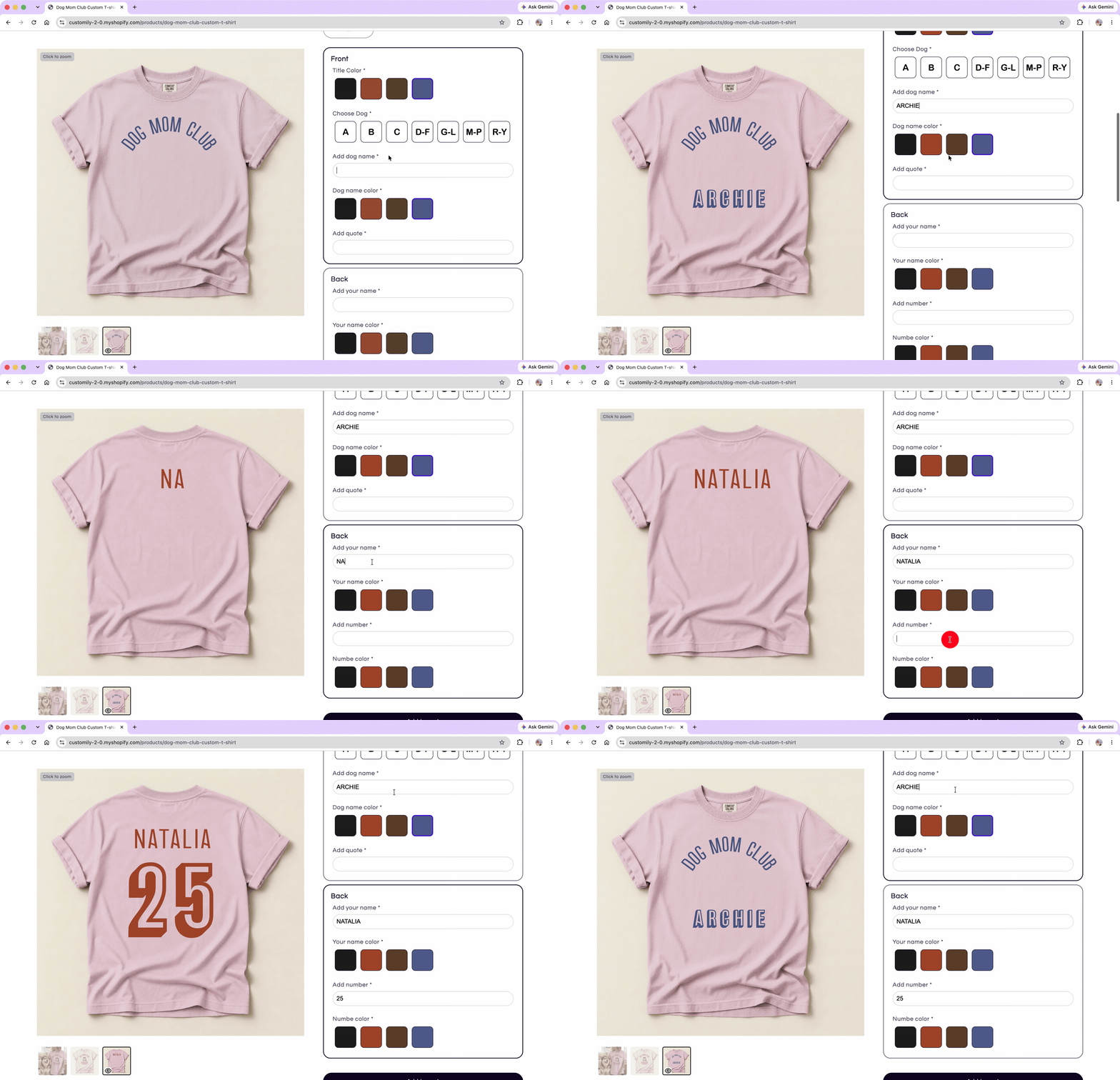
When all sections are visible, the preview changes as shoppers interact with a different section.
Tip
There are other ways to let shoppers switch between multiple previews, including using a swatch ot dropdown option. See 📄 Templates with multiple previewsto learn more about configuring and controlling multiple previews.