Customize swatches
Last updated: October 1, 2026
Customize how swatches are arranged and styled in your personalization options. You can control the layout used by all swatches, then customize image and color swatches or text swatches separately.
Go to Store Settings > Styles → Swatch Styles to configure your swatches.
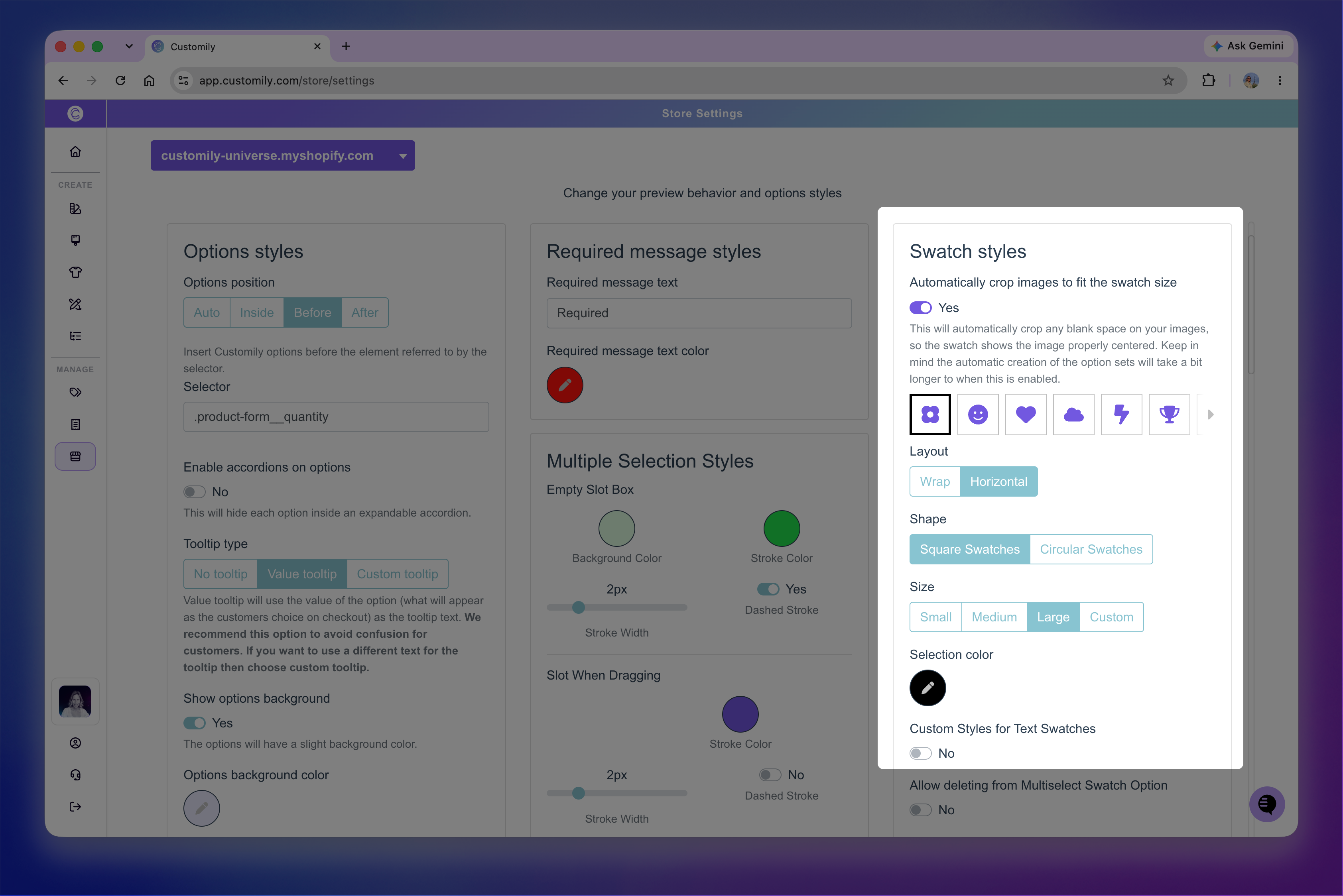
Choose how swatches are displayed
Use Layout to control how swatches are arranged when there are more choices than fit in the available space.
Wrap: Displays swatches across multiple rows.
Horizontal: Keeps swatches in a single row that shoppers can scroll horizontally.
This setting applies to image, color, and text swatches.
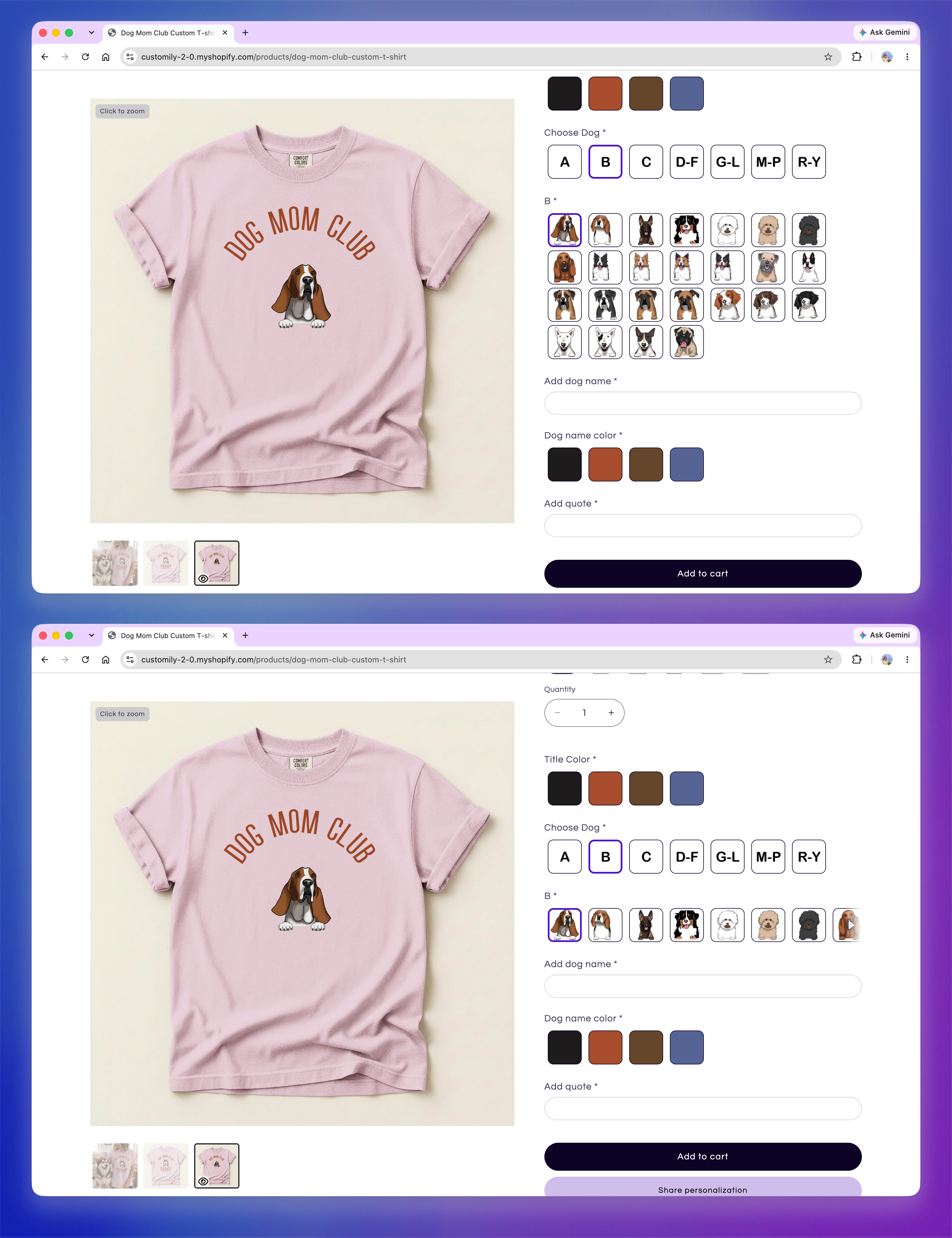
Customize image and color swatches
Use the swatch style settings to customize the appearance of image and color swatches. As you make changes, the preview in the settings shows how your swatches will look like in both their default and selected states..
You can customize:
Shape: Displays swatches as squares or circles.
Size: Changes the size of each swatch.
Selection color: Changes the color used to indicate the selected swatch.
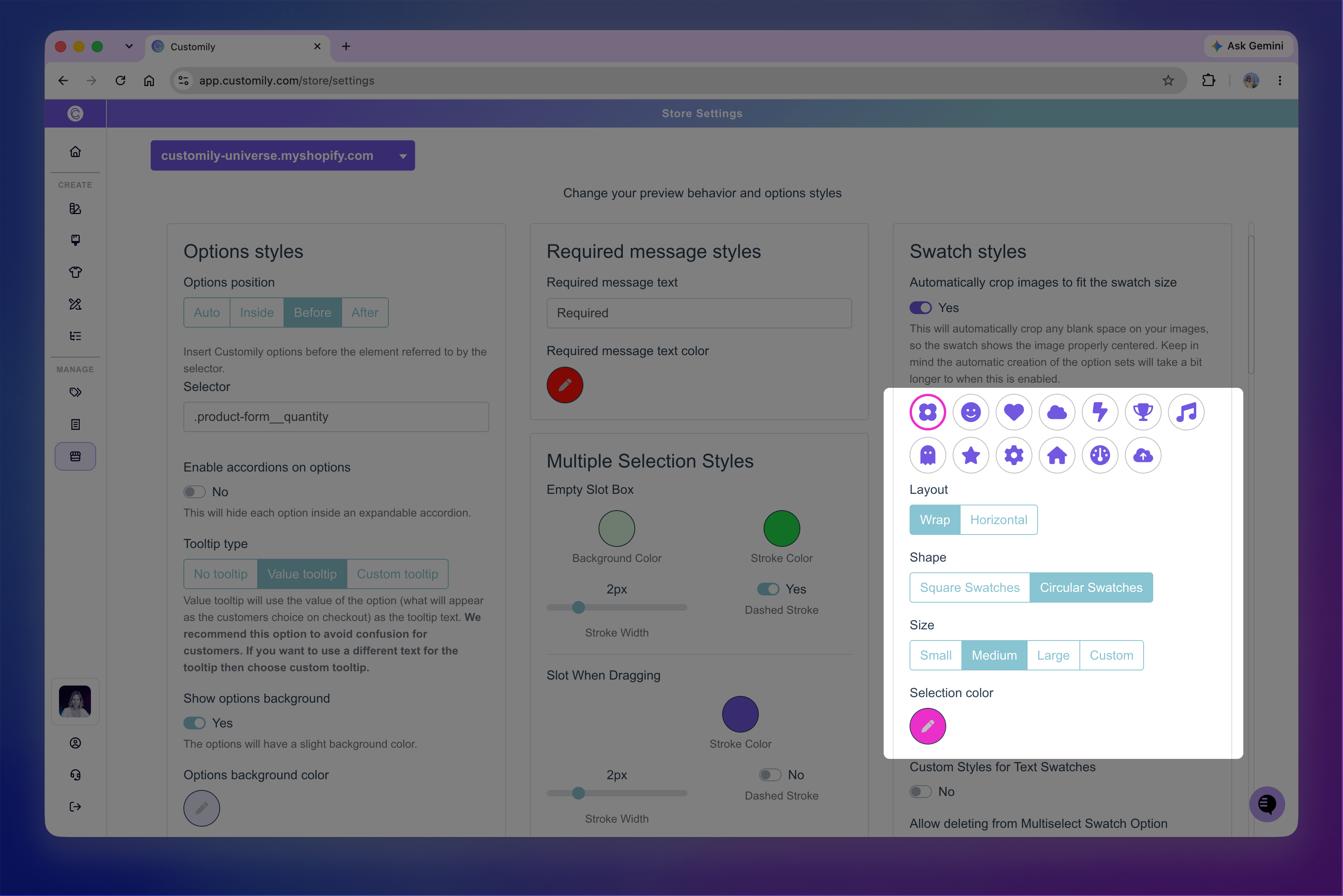
Tip
These settings apply to all image and color swatches in your store. If you want to style a specific swatch option differently, assign it a custom class in the Option Set and target that class with CSS in Developer Settings.
Crop images to fit the swatch
Turn on Automatically crop images to fit swatch size when your image swatches contain transparent or empty space around the visible content.
Customily removes the empty area when displaying the swatch, allowing the visible content to fill the available space more consistently. This doesn't change the source image or how it is positioned in the design.
This is especially useful when your clipart images have different amounts of transparent space around them. Without cropping, artwork with more empty space can appear much smaller inside the swatch. Automatic cropping removes that extra space so the visible artwork fills the swatch more consistently.
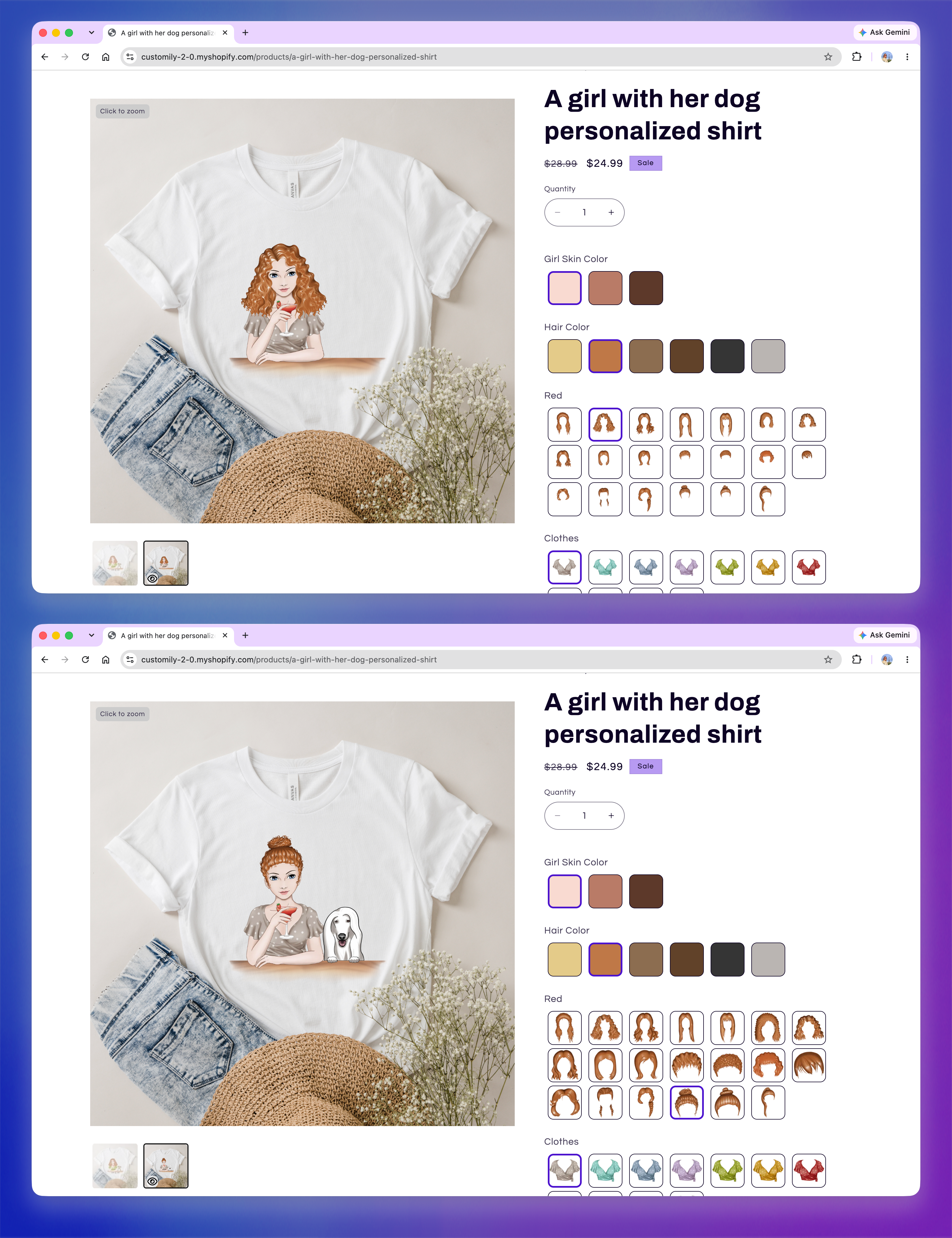
Important
This setting only applies when an Option Set is created. Turning it on won't update swatches in existing Option Sets. To apply automatic cropping to an existing setup, turn on the setting and create the Option Set again.
Customize text swatches
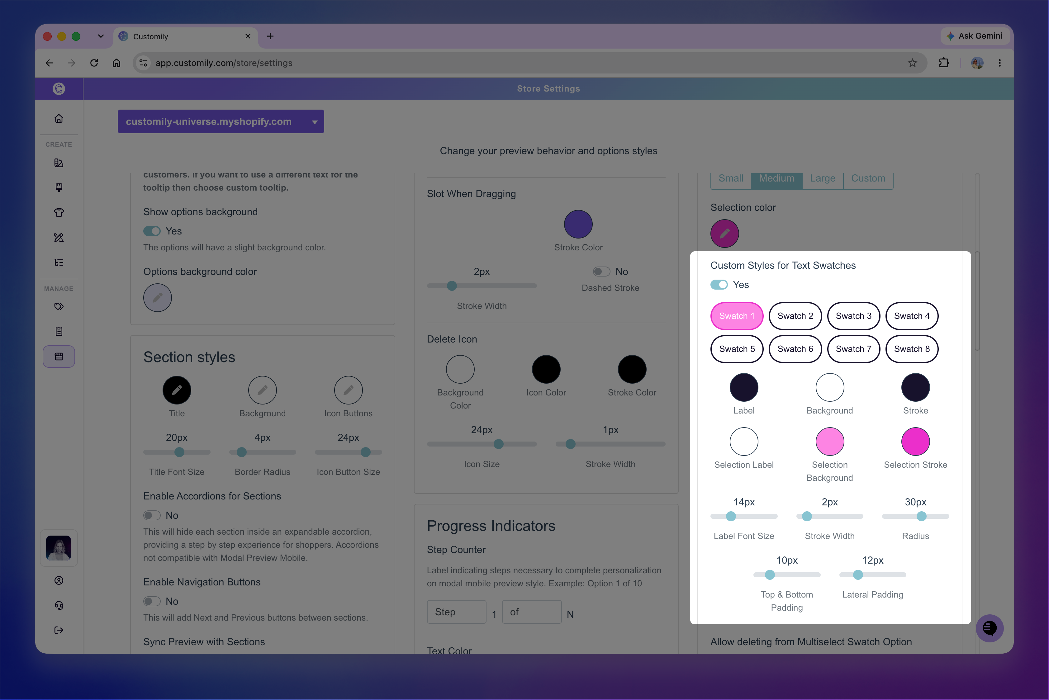
Turn on Custom Styles for Text Swatches to customize the appearance of text swatches. As you make changes, the preview in the settings shows how your text swatches will look in both their default and selected states.
You can customize:
Label: Text color.
Background: Background color.
Stroke: Border color.
Selection Label: Text color when the swatch is selected.
Selection Background: Background color when selected.
Selection Stroke: Border color when selected.
Label Font Size: Size of the swatch text.
Stroke Width: Thickness of the swatch border.
Radius: Roundness of the swatch corners.
Top & Bottom Padding: Vertical space around the text.
Lateral Padding: Horizontal space around the text.
Tip
These settings apply to all text swatches in your store. If you want to style a specific text swatch option differently, assign it a custom class in the Option Set and target that class with CSS in Developer Settings.