Configure Product Specific Settings
Last updated: October 12, 2026
By default, your products use the settings configured for your store. However, you can customize certain settings for individual products without affecting the rest of your store.
Product Settings let you override store-wide settings, such as the preview style and optional personalization, as well as configure product-specific features, customize styles, and add custom JavaScript.
To get started, go to Products, open the product you want to customize, and click Product Settings in the upper-right corner.
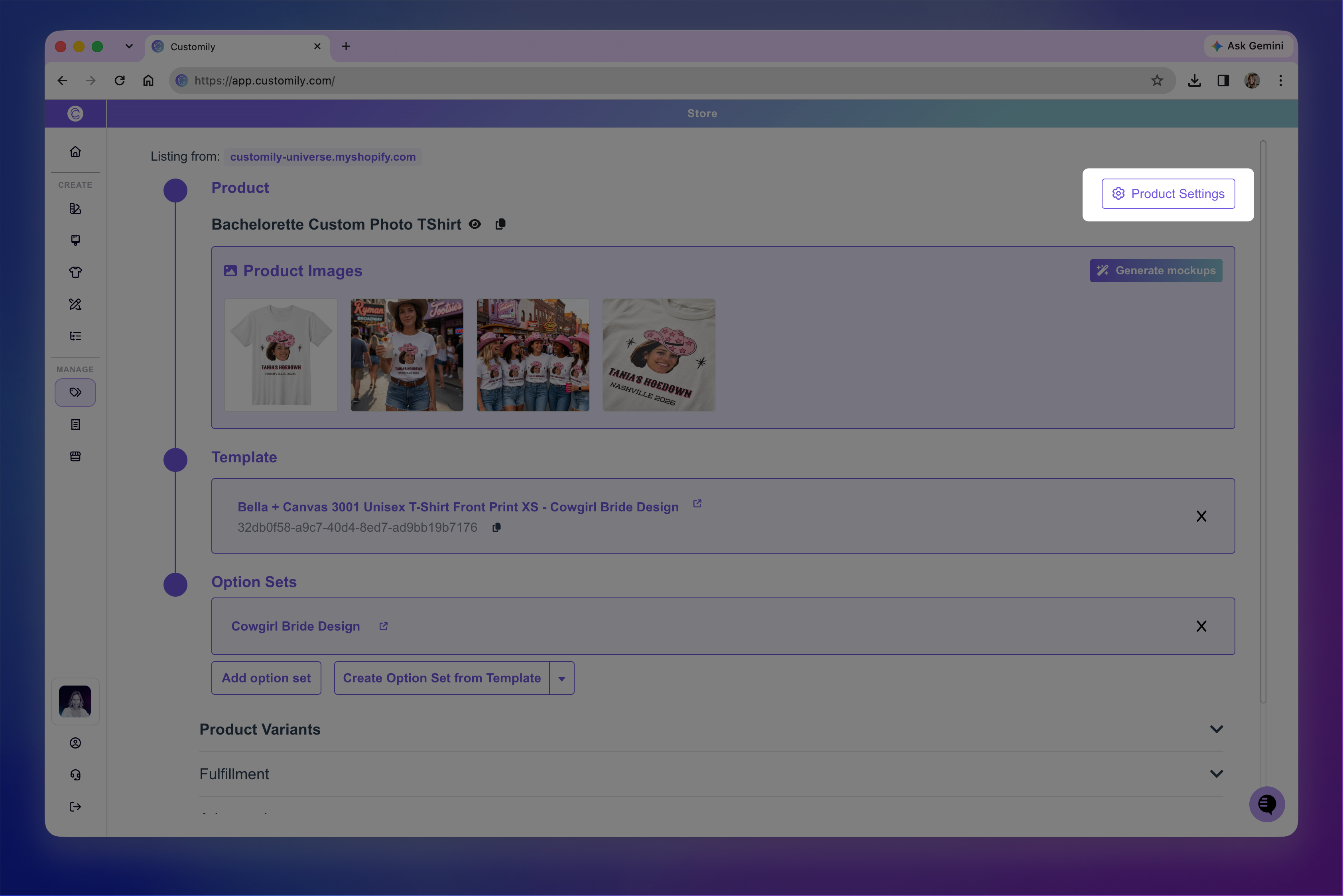
The settings are organized into three tabs: Preview Behavior, Styles, and Developer Settings.
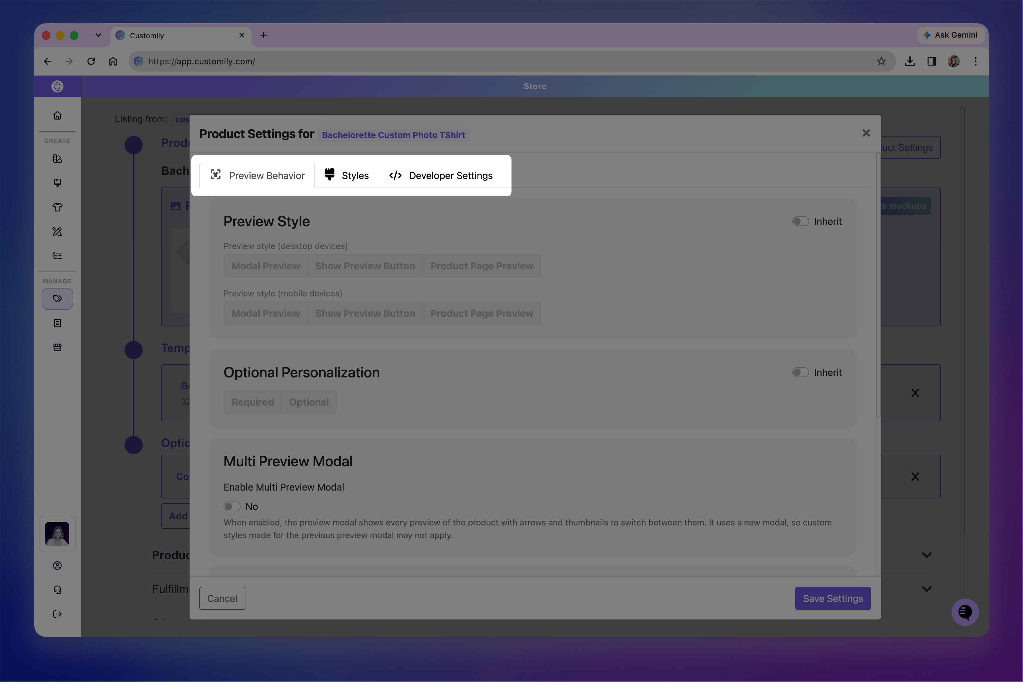
Once you've finished customizing the settings, click Save Settings.
Your changes will apply to this product only. Other products will continue using their existing settings.
Preview Behavior
Control how shoppers interact with personalization and previews on this product.
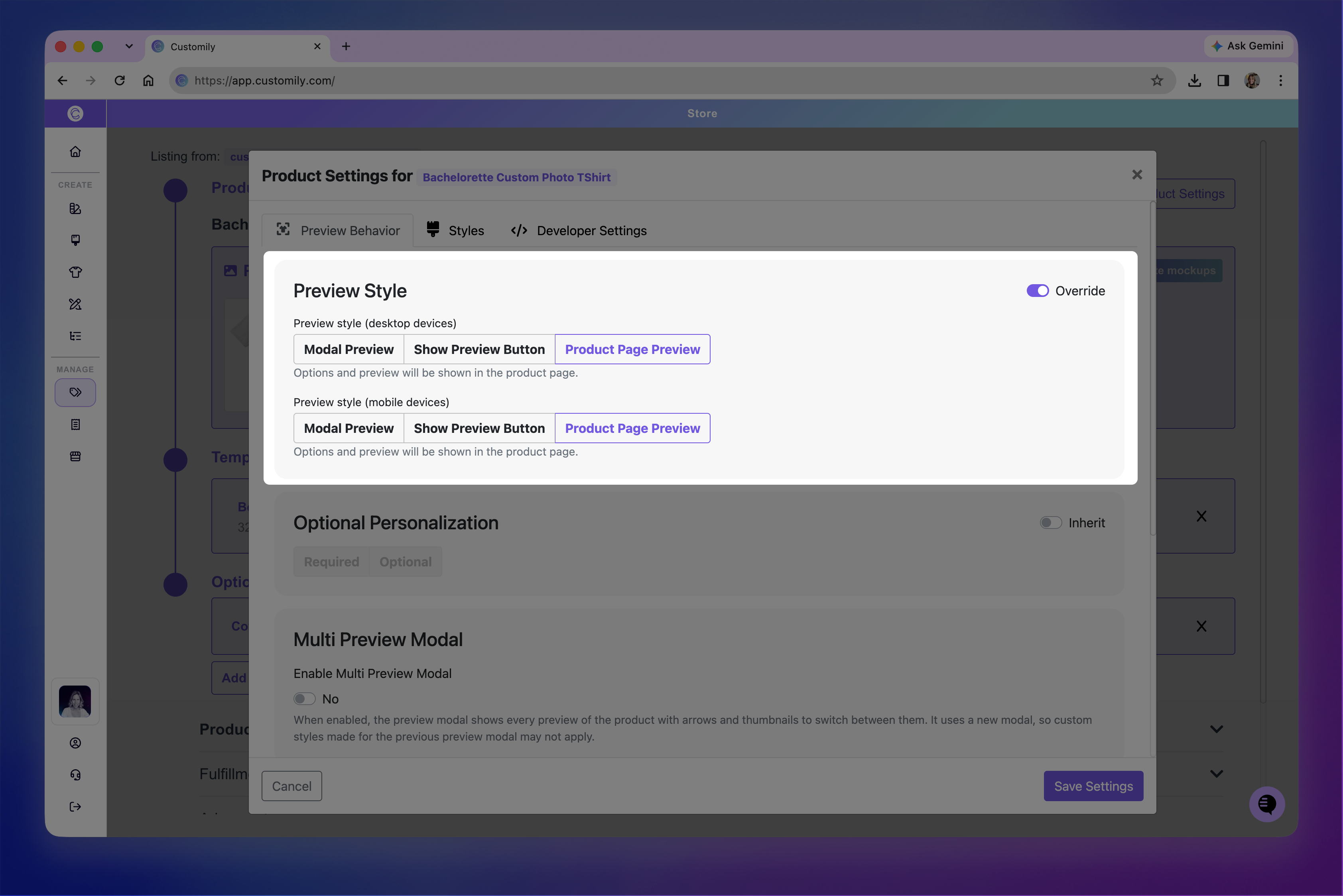
Preview Style
Choose how the personalization preview appears on desktop and mobile devices.
By default, the product inherits your store-wide preview settings. Turn on Override to choose a different preview style for this product. You can select different styles for desktop and mobile.
See 📄 Choose your Preview Styleto learn about the available preview styles and how they work.
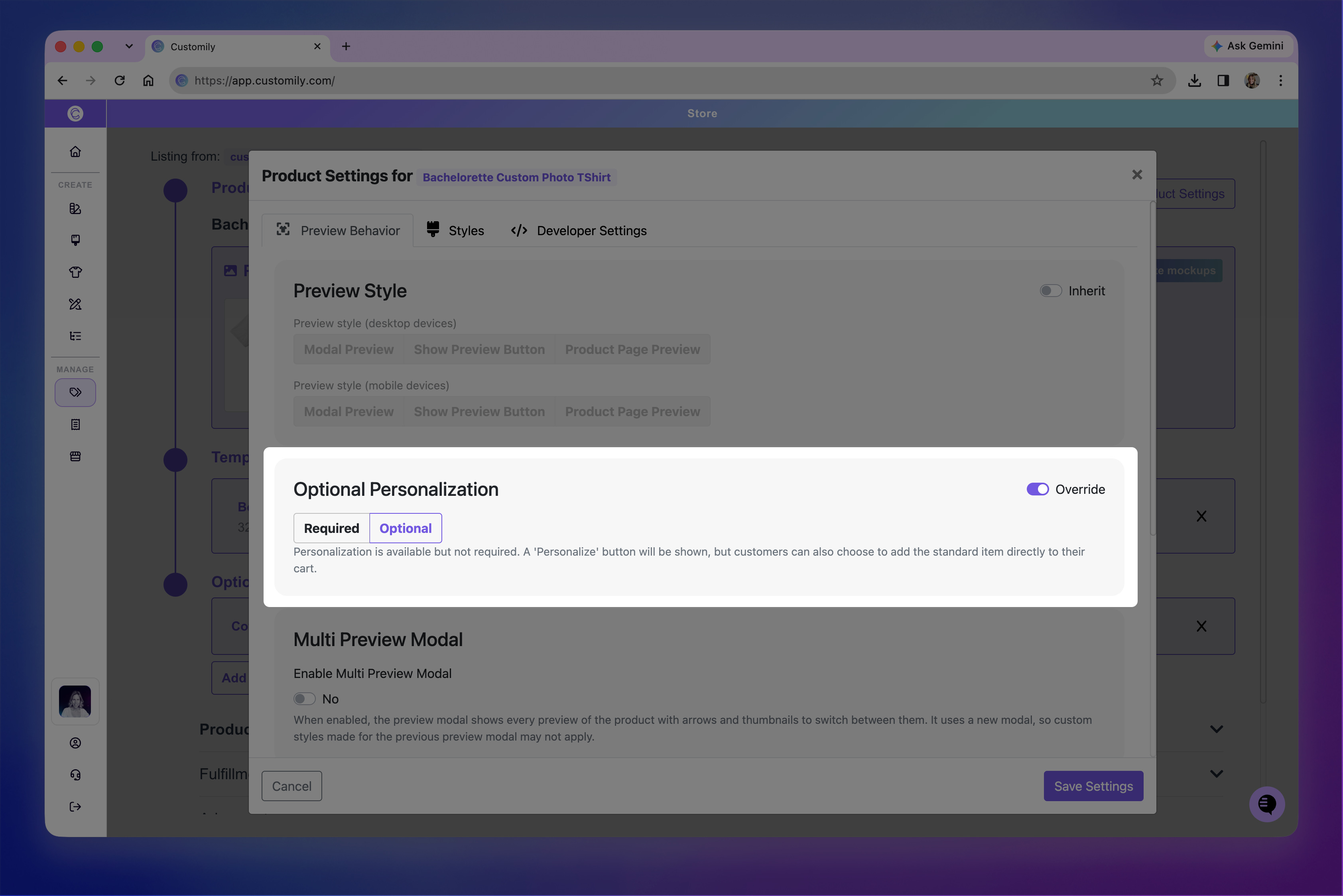
Optional Personalization
Choose whether shoppers must personalize this product or can purchase it without personalization.
By default, the product inherits your store-wide setting. Turn on Override, then select Required or Optional.
For example, you might want personalization to be required for most products but optional for a t-shirt that shoppers can purchase either with or without a custom name.
See 📄 Make personalization optionalin the Preview Behavior documentation for more information.
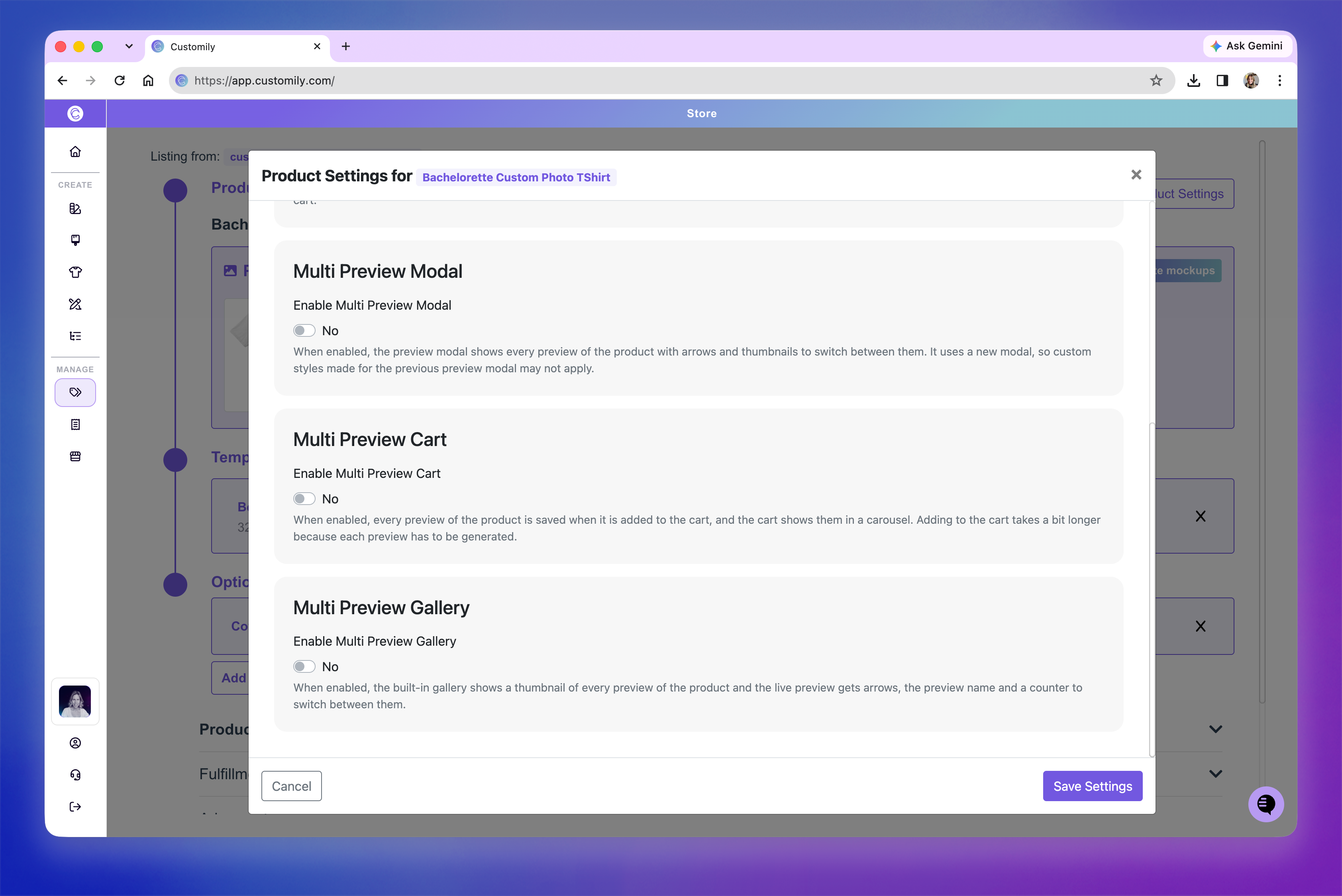
Display Multiple Previews
If your product has multiple previews, you can enable additional features to change how shoppers see them in the preview dialog, cart, and product gallery.
These settings are configured individually for each product and replace the default behavior in the corresponding area when enabled.
Multi Preview Modal: When shoppers click Show Preview Button, the preview dialog displays all product previews, with arrows and thumbnails to switch between them.
Multi Preview Cart: Saves all product previews when the item is added to the cart and displays them in a carousel.
Multi Preview Gallery: Displays thumbnails for each preview in the product gallery, with navigation controls to switch between them.
Note
Multi Preview Modal uses a different preview dialog, so custom styles applied to the standard preview dialog may not carry over.
Styles
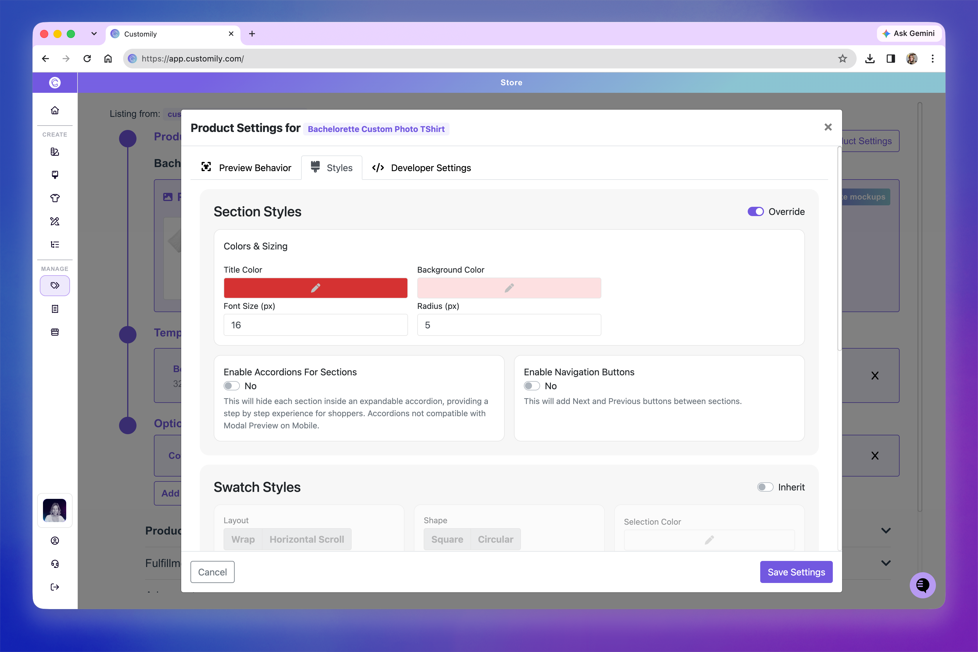
Customize the appearance of personalization options for this product without changing your store-wide styles.
You can adjust:
Section Styles: Adjust section colors, backgrounds, titles, and navigation buttons. See 📄 Customize sections and navigation.
Swatch Styles: Customize the layout, shape, size, and selection appearance of image and color swatches. See 📄 Customize swatches.
Text Swatch Styles: Customize the colors, borders, typography, and spacing of text swatches. See 📄 Customize swatches.
Turn on Override for the section you want to customize, then adjust its settings.
Developer Settings
Use Developer Settings to add custom JavaScript that applies to this product.
This is useful when you need product-specific behavior or integrations without applying the same code across your entire store.
Enter your code in the Custom Javascript editor.