Customize dividers
Last updated: October 1, 2026
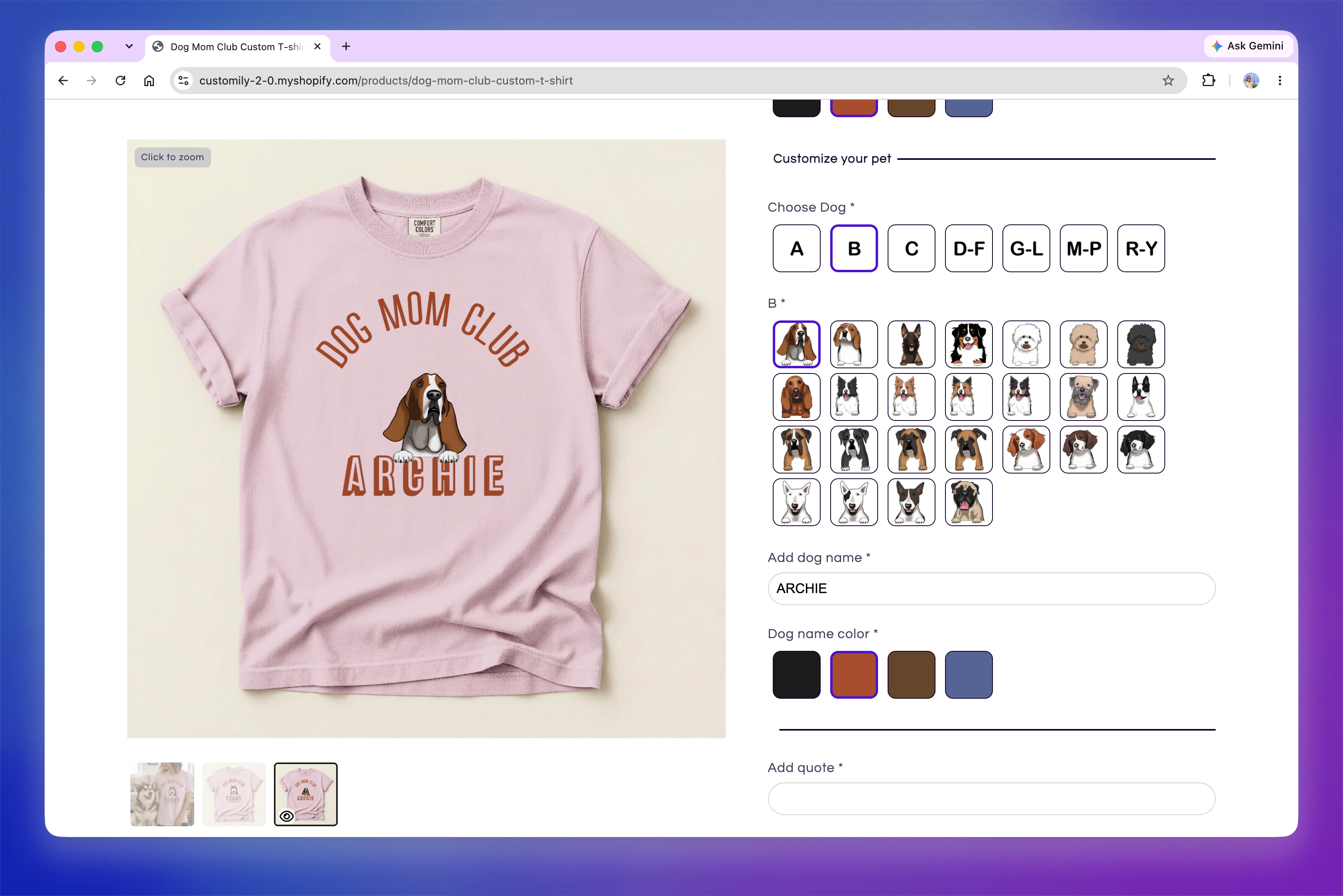
Dividers add a visual break between personalization options, making longer Option Sets easier to scan. You can use them on their own or together with sections.
A divider can include text to identify the options that follow, or it can be displayed as a line on its own to simply create a visual break.
Note
If you're using Modal Preview on mobile without sections, we don't recommend using dividers. Since shoppers move through the Option Set one element at a time, a divider appears as its own step in the personalization flow.
If your Option Set uses sections, dividers can still be used within those sections.
Customize divider styles
Go to Store Settings > Styles → Divider Styles to customize how dividers appear across your store.
You can customize:
Text Align: Positions the divider text to the left, center, or right.
Text color: Changes the color of the divider text.
Line color: Changes the color of the divider line.
Rounded Ends: Rounds the ends of the divider line.
Font Size: Changes the size of the divider text.
Line
Width: Changes the thickness of the divider line.
Padding: Adjusts the space above and below the divider.
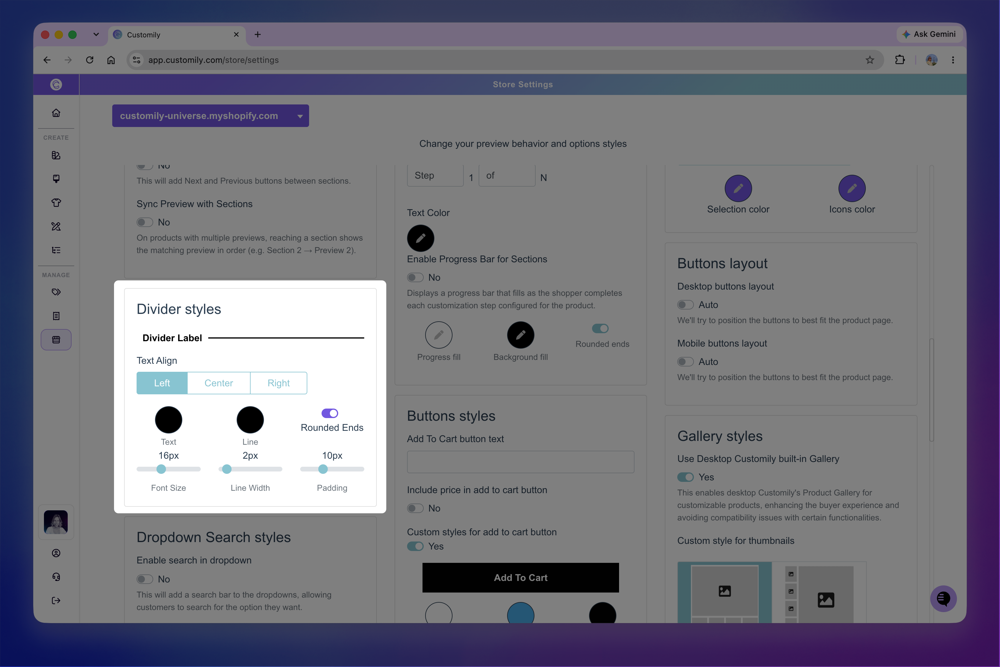
Changes made here apply to all dividers in your store.
Tip
If you want to style specific dividers differently, you can assign them a custom class in the Option Set and target that class with CSS in Developer Settings.