Customize image upload options
Last updated: October 1, 2026
Customize how image upload options look and behave on your storefront. You can style upload buttons, control how uploaded images are displayed and adjusted, and customize the appearance of the Multiple Image Uploader.
Customize upload buttons
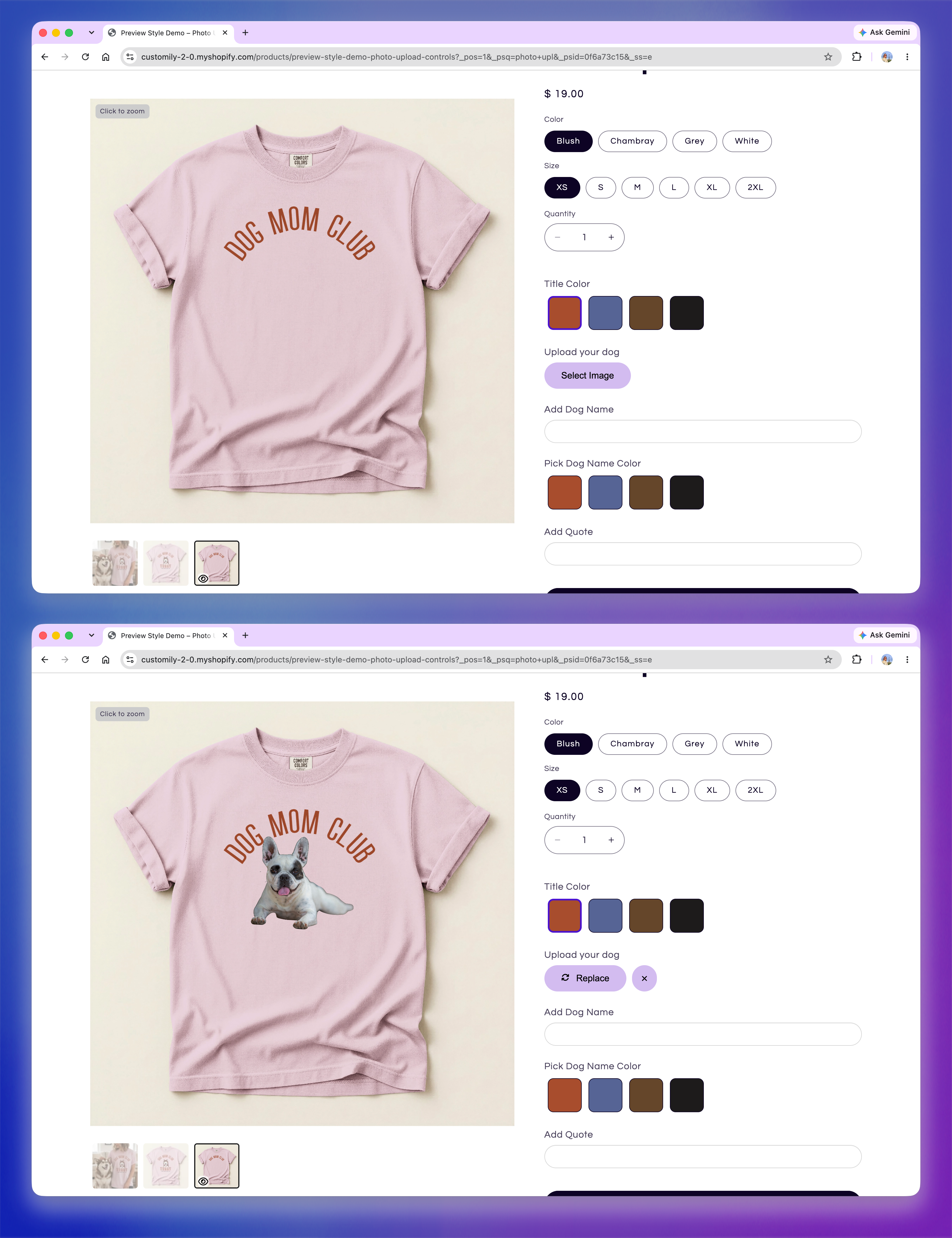
By default, an image upload option displays a button shoppers can use to select an image. After an image is uploaded, the button changes to Replace, allowing them to choose a different image.
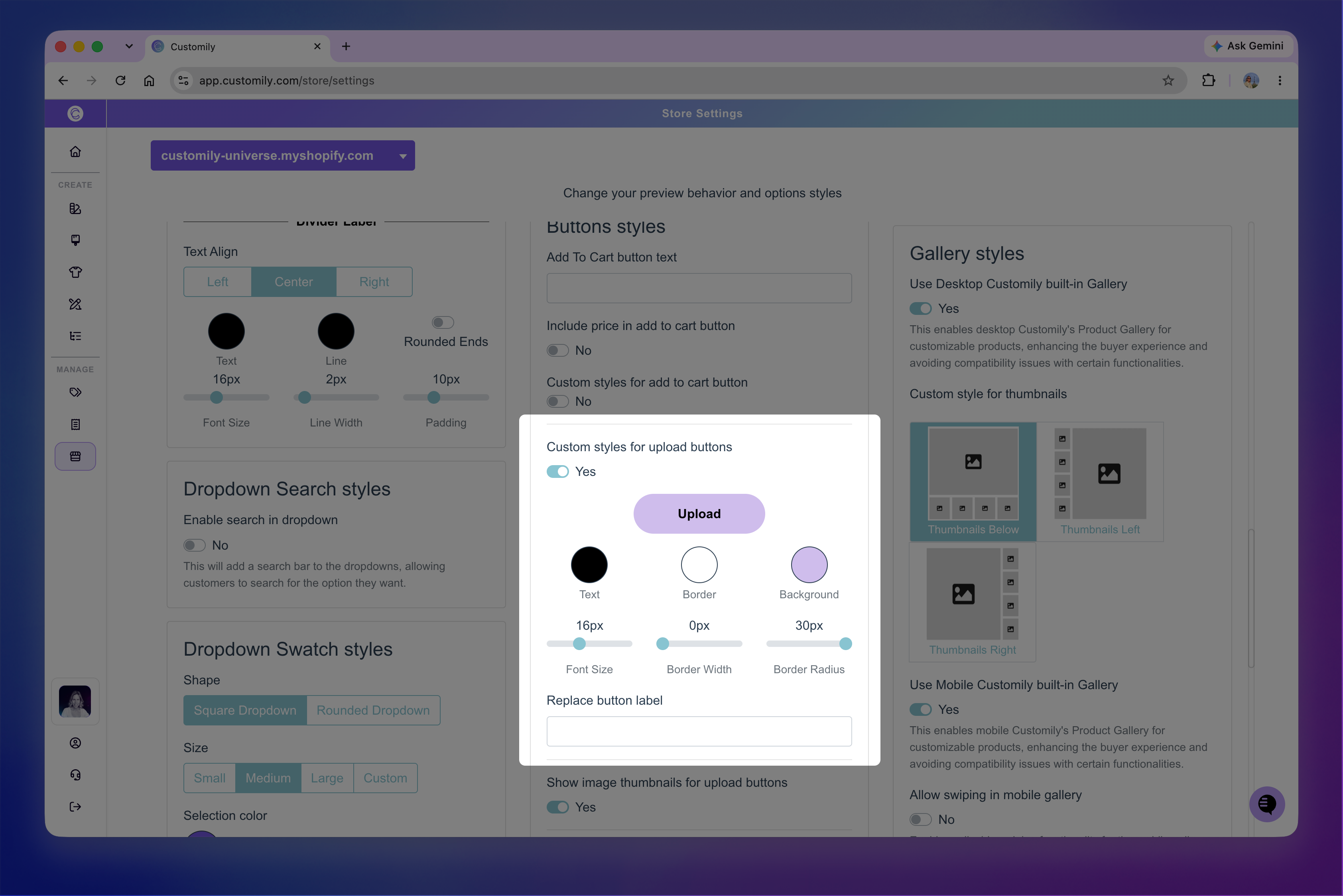
Go to Store Settings > Styles, then turn on Custom styles for upload buttons to customize:
Text: Button text color.
Border: Button border color.
Background: Button background color.
Font Size: Size of the button text.
Border Width: Thickness of the button border.
Border Radius: Roundness of the button corners.
You can also use Replace button label to change the text displayed after an image has been uploaded.
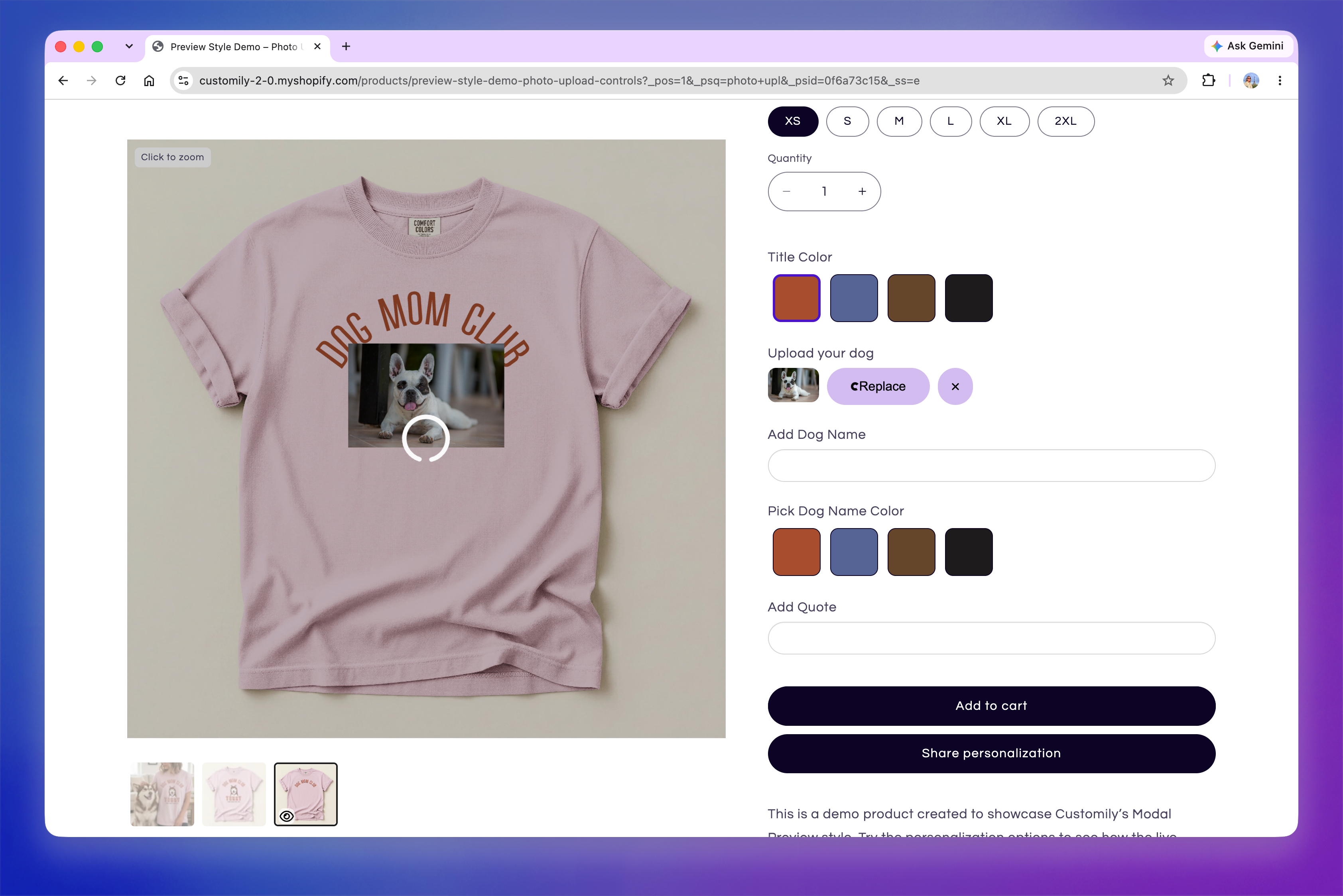
Before an image is selected, shoppers see the upload button. Once an image is uploaded, Customily displays a thumbnail of the uploaded image along with controls to replace or remove it.
Show the uploaded image thumbnail
If you want shoppers to see a small preview of the image they've selected, you can display a thumbnail next to the upload controls.
Go to Store Settings > Styles and turn on Show image thumbnails for upload buttons.
The thumbnail shows the original image as it was uploaded, and updates when they replace it. If the design applies a filter or image effect, that effect is shown in the product preview but isn't applied to the thumbnail.

Note
There are no built-in style settings for the uploaded image thumbnail. If you want to customize its appearance, you can use custom CSS in Developer Settings.
Customize the image adjustment experience
Customize how the preview behaves while shoppers adjust an uploaded image. These settings can help focus attention on the image placeholder, provide a dedicated adjustment view, and automatically zoom into the image after upload.
They don't change how shoppers resize, rotate, or reposition the image. See 📄 Customize image upload manipulation in the previewto learn more about the controls available for manipulating uploaded images.
Focus attention on the image placeholder
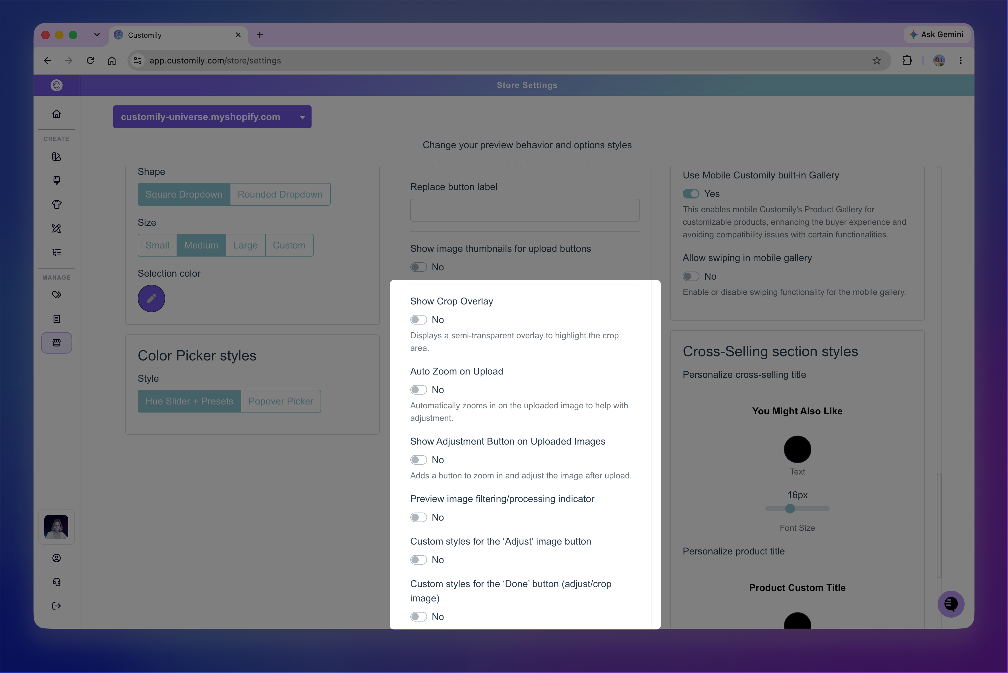
Go to Store Settings > Styles and turn on Show Crop Overlay to darken the rest of the product preview while leaving the image placeholder visible.
This helps shoppers focus on the area they're adjusting while still seeing where the image sits within the design.
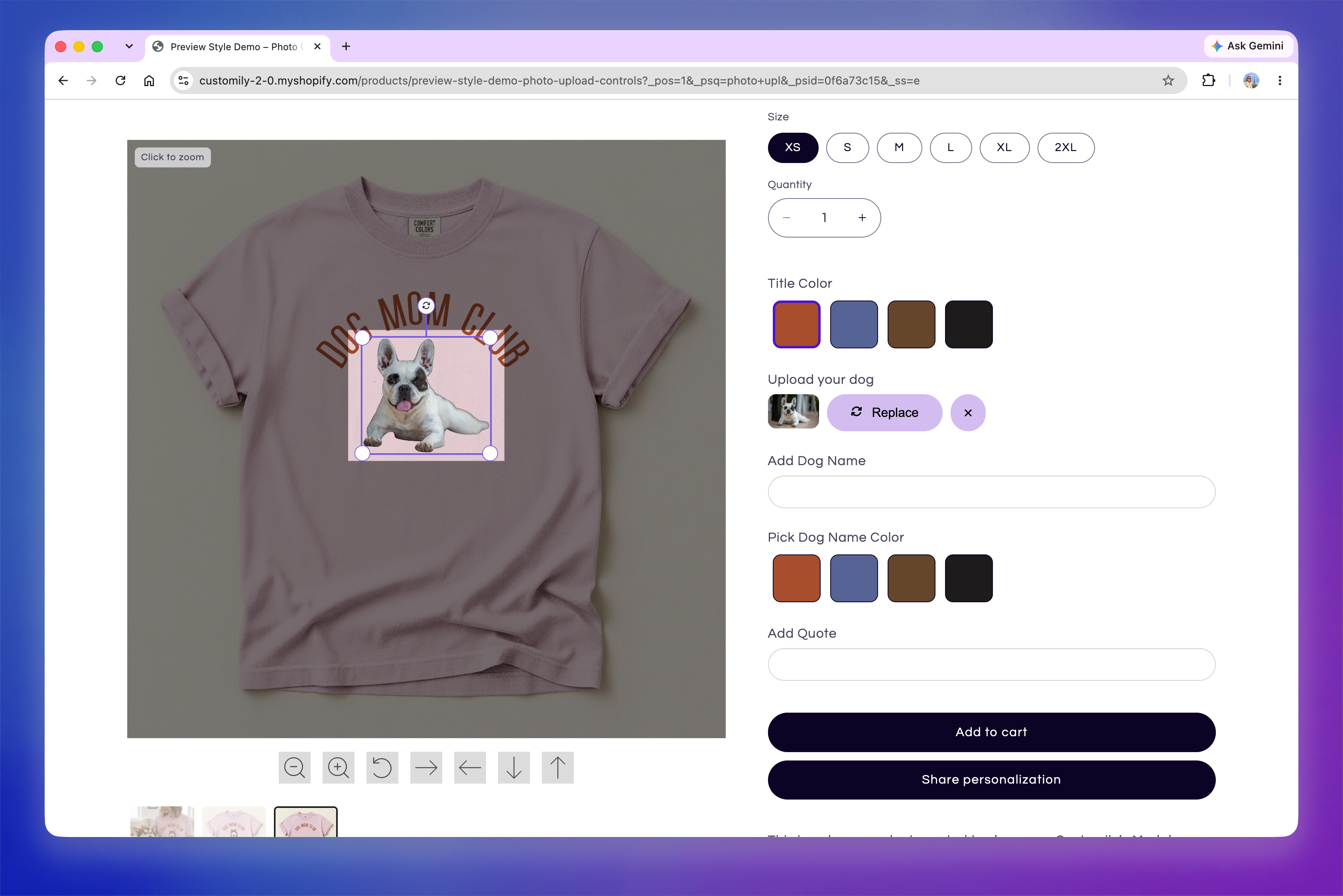
Note
The crop overlay works best with square or rectangular image placeholders. If your placeholder uses a shape mask, the overlay still follows the rectangular bounds of the placeholder, which may not align with the visible shape of the image.
Add an adjustment button
Turn on Show Adjustment Button on Uploaded Images to display an additional button below the upload controls after an image has been uploaded.
When shoppers click the button, the preview zooms into the image placeholder, giving them a closer view while they adjust the image. When they're finished, they can use the Done button to return to the full product preview.
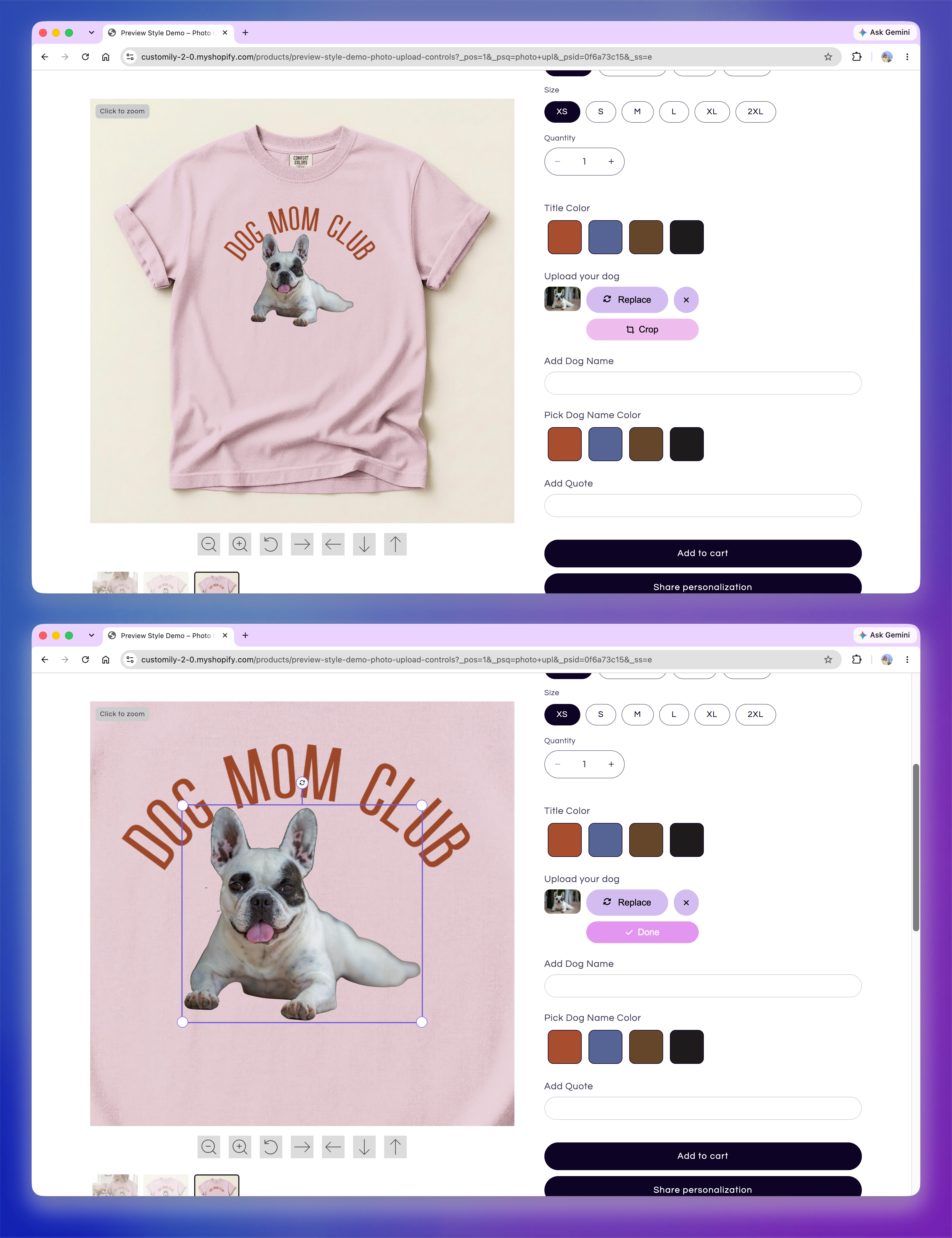
Customize the adjustment buttons
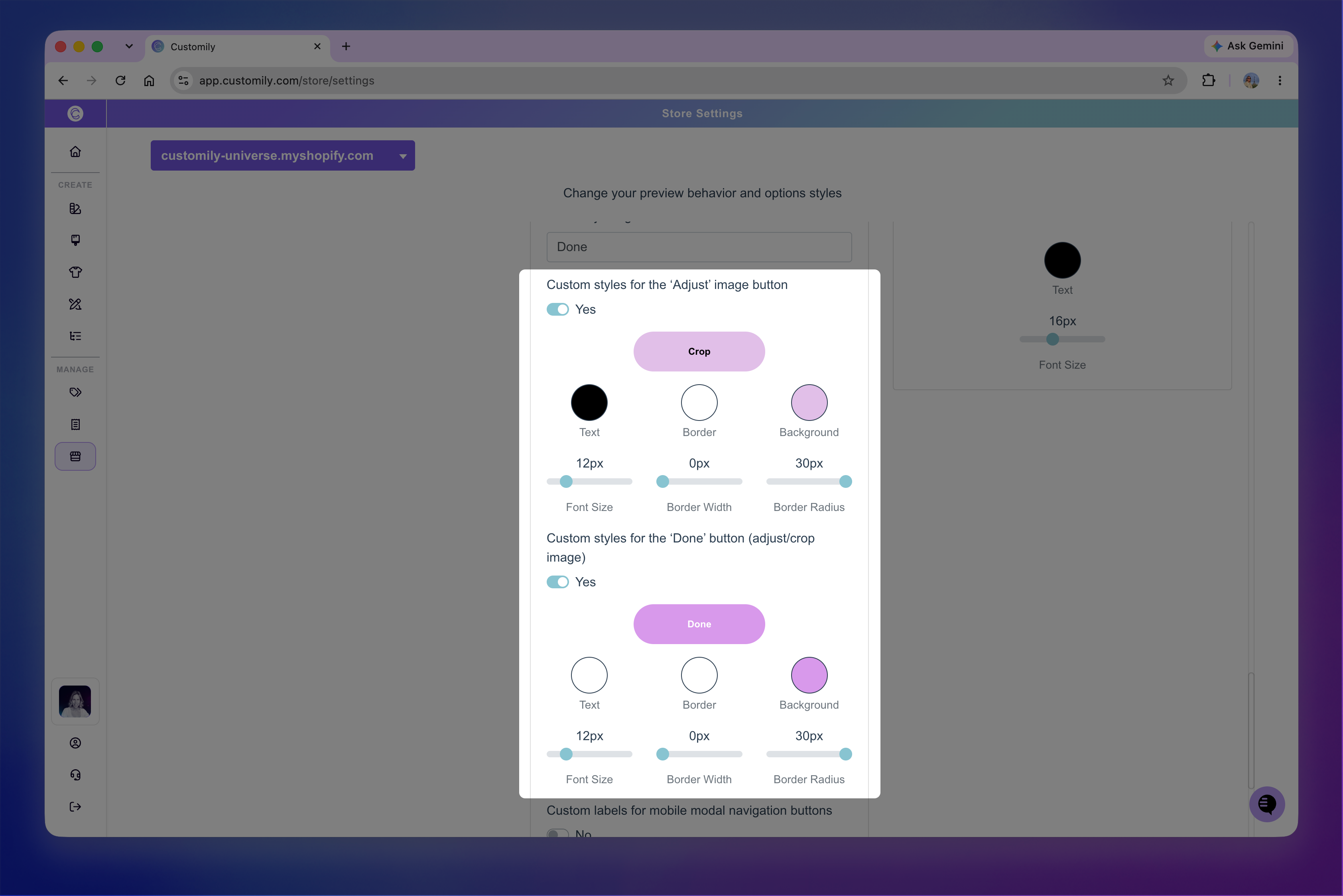
You can change the labels used to enter and exit the adjustment view and customize the appearance of both buttons.
Use Adjustment button label and Done adjusting button label to change their text.
Turn on Custom styles for the 'Adjust' image button and/or Custom styles for the 'Done' image button to customize their appearance. Both buttons support the same style settings:
Text: Text color.
Border: Border color.
Background: Background color.
Font Size: Size of the button text.
Border Width: Thickness of the border.
Border Radius: Roundness of the corners.
Automatically zoom in after upload
If you want shoppers to enter the closer adjustment view immediately after uploading an image, turn on Auto Zoom on Upload.
With Auto Zoom enabled, Customily automatically zooms into the image placeholder as soon as the image is uploaded. Shoppers can make their adjustments and use Done to return to the full preview.
Note
Auto Zoom on Upload only works when Show Adjustment Button on Uploaded Images is enabled. Without Auto Zoom, shoppers can still enter the same zoomed adjustment view by clicking the adjustment button.
Customize the image processing indicator
If your design applies an AI filter or image effect to an uploaded image, processing may take a few moments. You can display a loading indicator during this time so shoppers know their image is still being processed.
Go to Store Settings > Styles and turn on Preview image filtering/processing indicator.
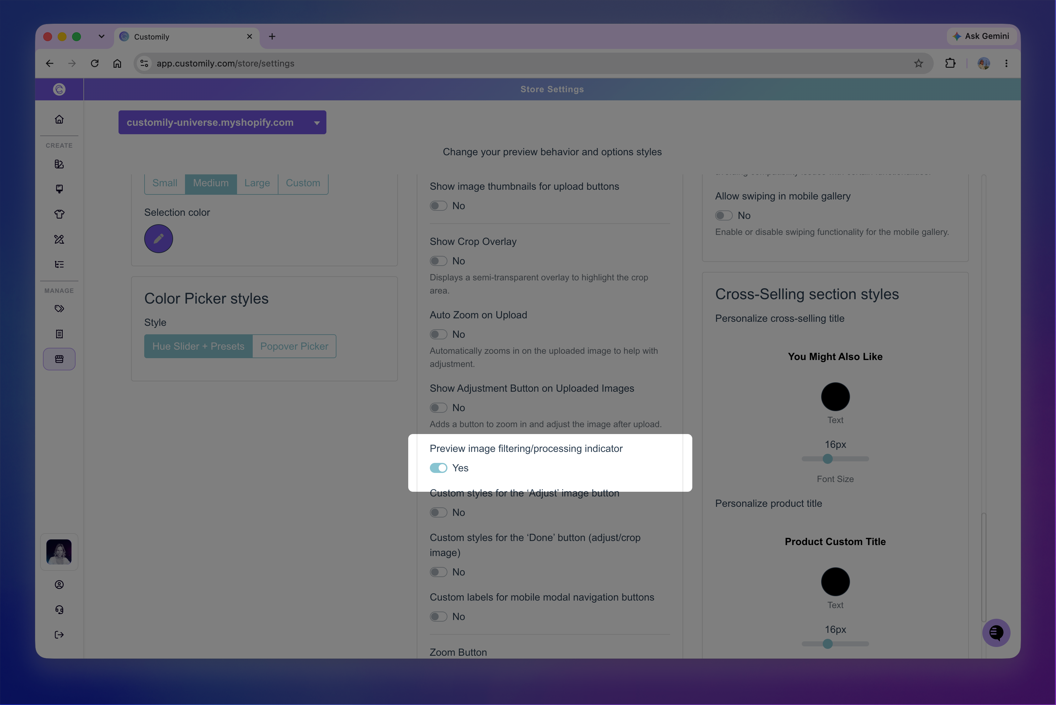
While the effect is being processed, the original uploaded image remains visible in the preview with the loading indicator over it. Once processing is complete, the indicator disappears and the preview updates to show the processed image.
Customize the Multiple Image Uploader
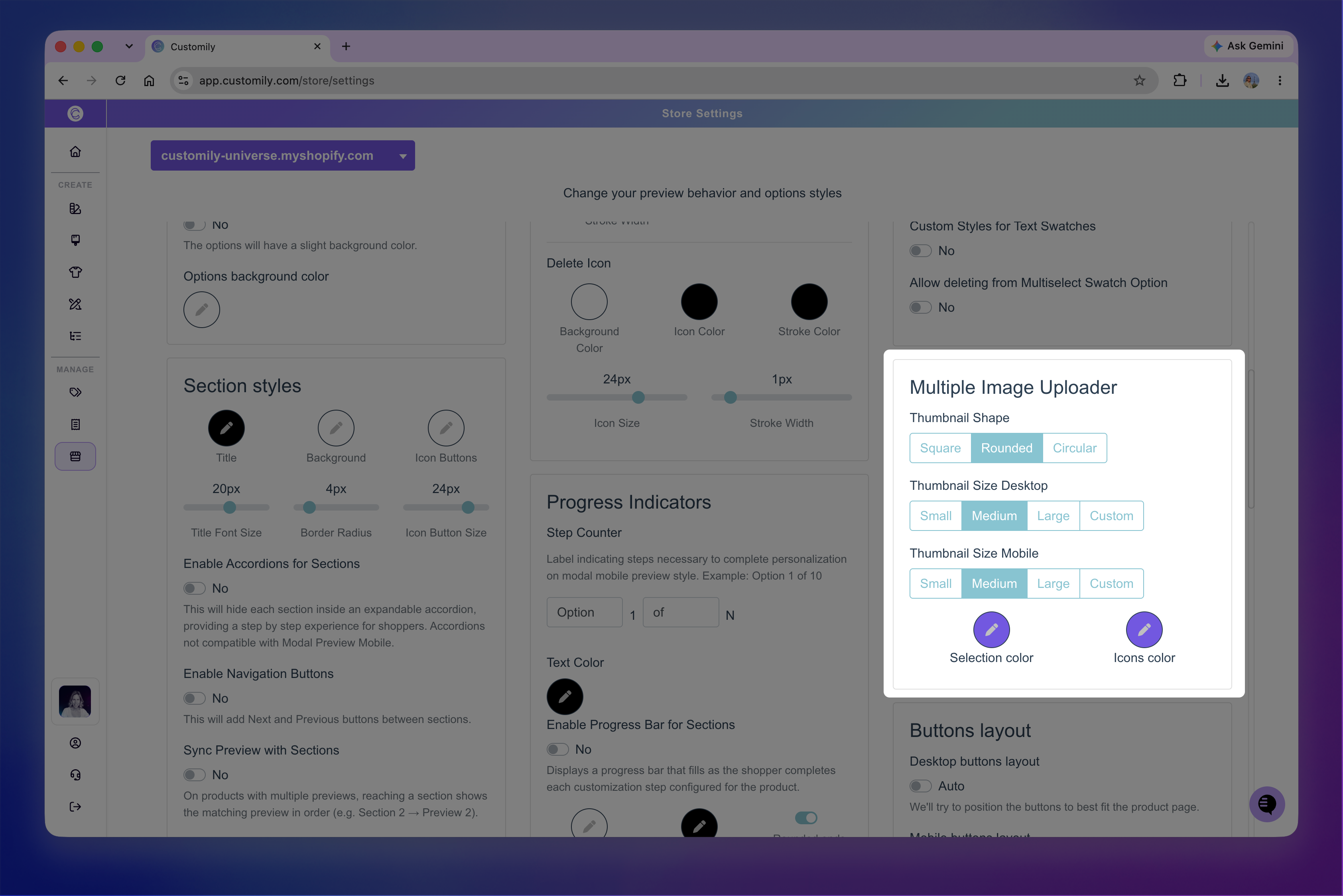
The Multiple Image Uploader is an alternative image upload option that displays uploads as larger thumbnail-style slots. It can be used for a single image or allow shoppers to upload multiple images, depending on how the option is configured.
As shoppers add images, each upload appears as a thumbnail. If more images can be added, an additional upload slot remains available until the maximum number of images has been reached.
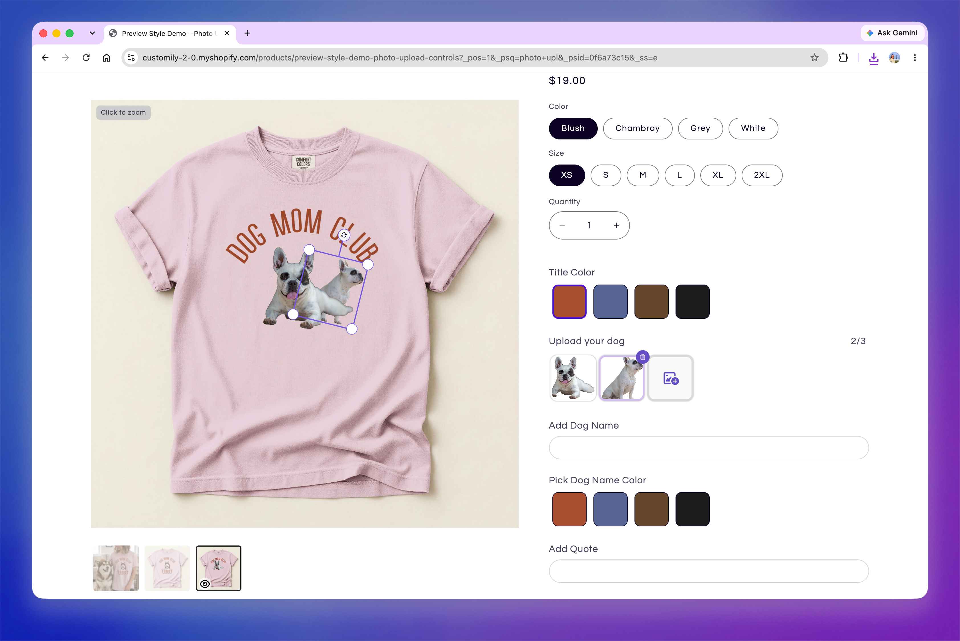
Uploaded thumbnails show the image after any configured filter has been applied. Shoppers can select a thumbnail to work with that image, drag and drop images between thumbnails to rearrange them, or use the trash icon to remove an image.
Go to Store Settings > Styles → Multiple Image Uploader to customize:
Thumbnail Shape: Changes the shape of the upload slots and image thumbnails.
Desktop size: Changes their size on desktop.
Mobile size: Changes their size on mobile.
Selection color: Changes the highlight used to identify the currently selected image.
Icons color: Changes the color of the upload and delete icons.